A conversation with Ian Stell

"Where the occupant expects a certain stasis
there is in its place a gentle side-to-side rising and falling motion. "


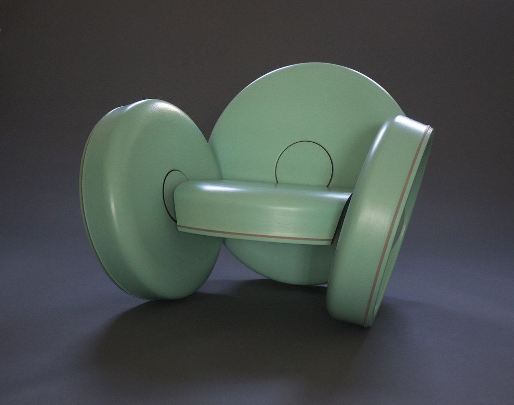
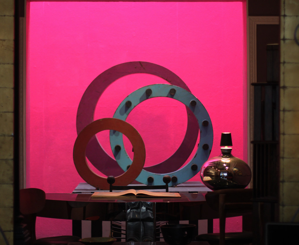
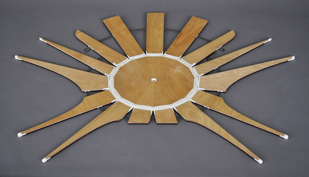
"Whirl, by Ian Stell"


WHIRL. The perfect chair circle.

Ian Stell: Whirl has had a slow gestation. It was born out of a life-long curiosity about the basic shapes employed within simple machines and tools. A wheel is arguably the most succinct emblem of harnessed energy. Whirl is composed of two pairs of bowl-like wheel forms. Two smaller ones act as armrests; a larger one is employed as a backrest, and its twin is cropped as a seating surface. The backrest is, of course, what is novel about this ensemble. Where the occupant expects a certain stasis there is in its place a gentle side-to-side rising and falling motion. As the outlying members are linked to the center with high performance go-kart bearings, a slight push will cause the empty chair to spin for a surprisingly long time.


The matters concerning your recent works?

My RISD thesis topic ties my current work with an early chapter in my life. From the ages of eight to thirteen, I sang with the children’s choruses of the New York City, and Metropolitan Opera Companies. My memory of singing in a large group–feeling like a thread entwined within sonic fabric–is a rich one. I’m exploring parallels between choral score and performance and the often complex, dynamic structures present in my designs.


RISD. Can you talk about the program, pros and cons? Any advice for someone beginning to make objects?

RISD is an extraordinary place. To give a sense of the culture, this morning I had in-depth conversations about my work with a senior research engineer from Brown (there’s a great deal of reciprocity between the art school and the university) and an art history professor/performance artist from Venice. The Furniture Design program is a jewel. About ten years ago, it broke off from the Industrial Design department, and what distinguishes it from its parent is that its founders believe that great design is the fruit of both intelligent eyes and hands. In other words they believe as I do that it’s imperative for design students to learn how to build. This isn’t merely because it makes for higher quality products. Each time an experienced designer gains knowledge of a fabrication technique–whether it be from the bronze age or the twenty-first century–it’s like adding another color to their pallet­. It shapes thoughts and decisions at the naissance of every new idea.


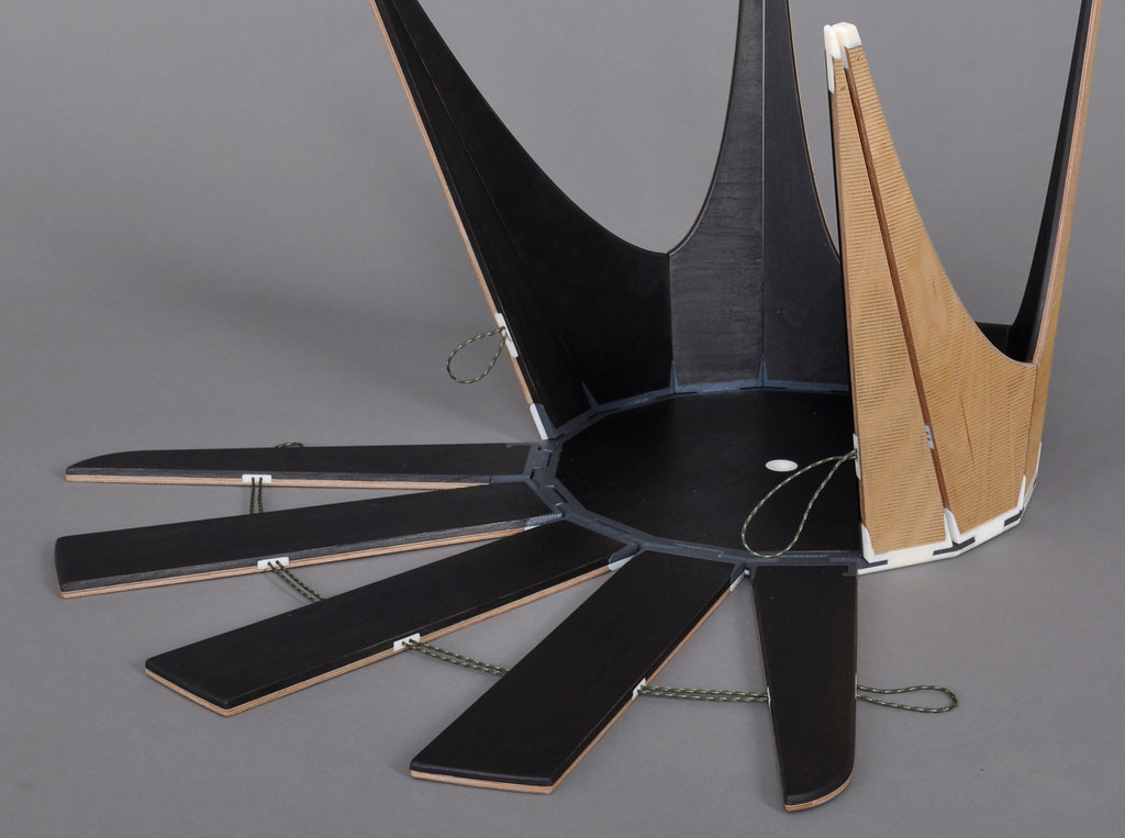
The Femten Chair. Why would someone want to turn a chair inside out?

Ian: The objects I make tend to have complex, and often open-ended programs. I imagine it would be nice if it took a moment for them to find their job and home. I’ve designed and built several different forms that have pivoting members encircling a central plane. This radial folding pattern allows them to assume a number of shapes. Femten spends a fair amount of its time splayed flat on a wall. In this configuration, it almost becomes a drawing, or a diagram of its functional structure. Folding chair typology is for the most part binary: Store, deploy, store again. Other things can be accomplished by incorporating hinges into seating. This design has the ability to act as a backed chair or a stool/table, for multiples to nest in either of these configurations, to ship flat at half an inch thick, and–like a flower–to turn itself inside out.


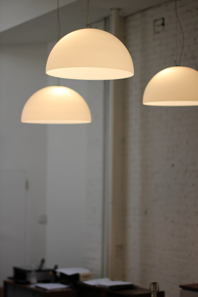
Designing and building bars and restaurants? What was your favorite part of the process?


I studied painting and sculpture at the Art Institute of Chicago, and after graduated I moved back to Manhattan, where I was raised. Soon after, A sculptor friend, Michael Drury, and I had the somewhat naive notion that we could support our art-making endeavors by opening a bar on the lower east side. This first venture, Orchard, had a brief, but rich heyday. It was a tiny place, nestled amid roll gates on a street that was otherwise deserted at night. We hosted parties with the full spectrum of New York culture–from George Plimpton to Moby. The attention we received for this first venue inspired us to open two more bars (Double Happiness and Palais Royale), and a restaurant (Wyanoka). We designed and built these spaces ourselves (from floor to ceiling, including all of the plumbing and electrical work) without any formal training in, or exposure to the design or building trades. Looking back, it was as if we were making narrative artworks about bars and restaurants, rather than fulfilling the brief of an entrepreneurial business plan. The physical results were generally charming and quirky. Sometimes our solutions were extraordinarily impractical and at other times they were incredibly effective in unusual ways. But it was out of this experience that I developed a fascination with making objects that can be touched and manipulated as well as experienced visually.


THE LAST WEE SEE EYE TO EYE. your objects have a poetry that I connect more with artists, than designers

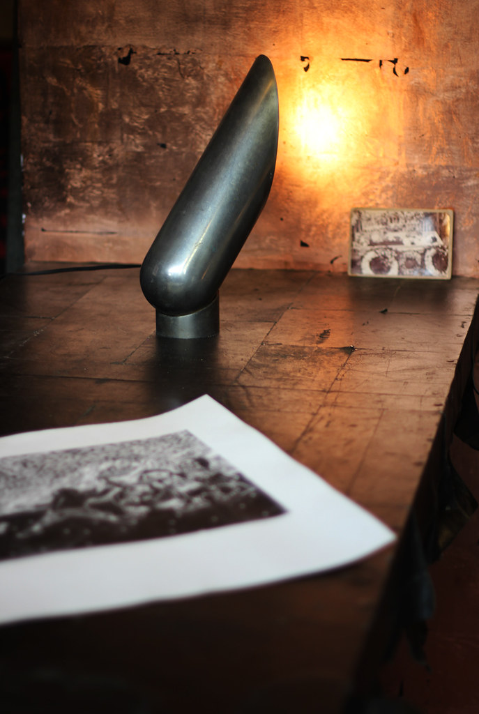
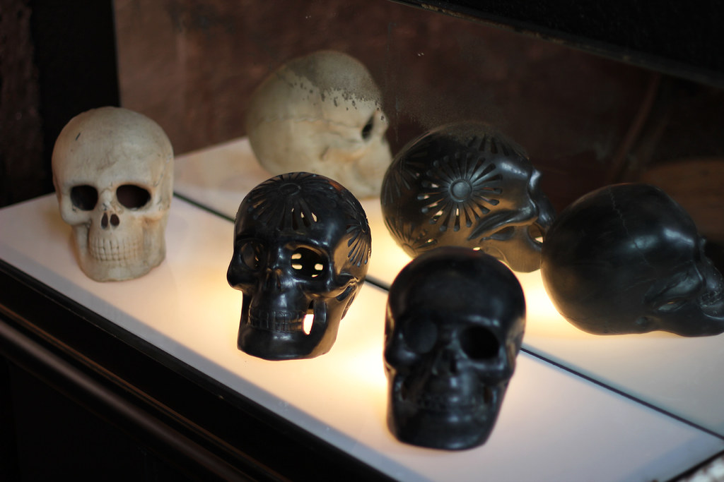
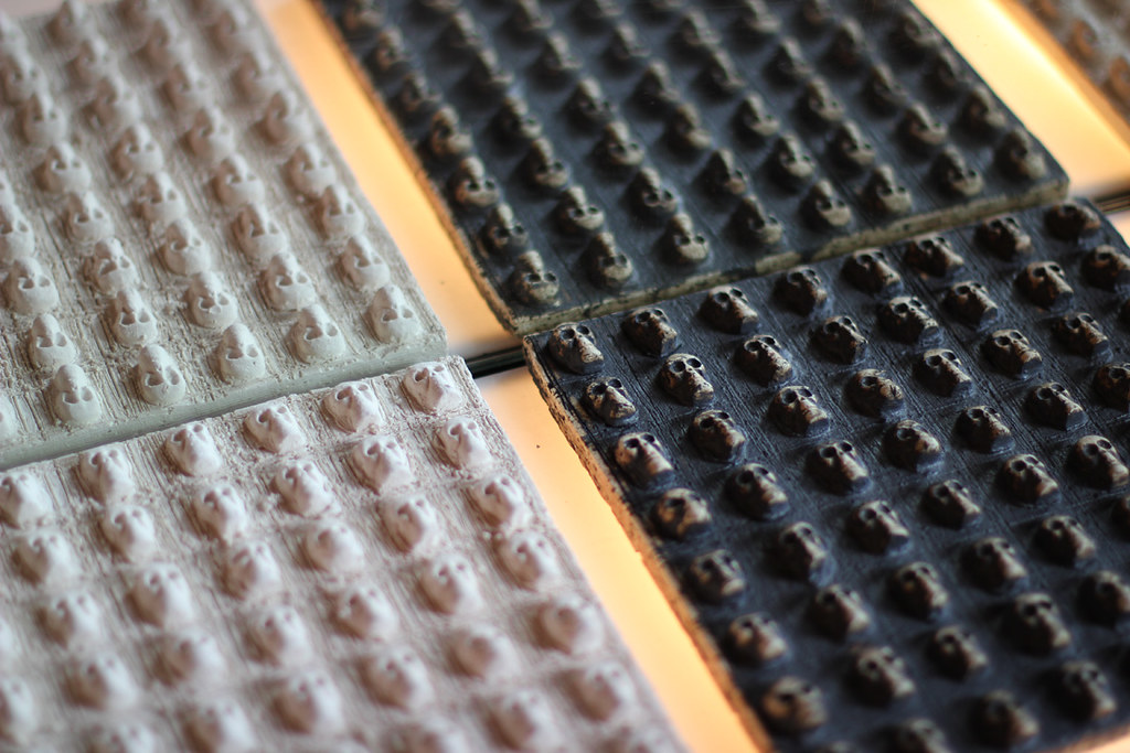
I think there are many of us these days that define ourselves as either designers or artists more because of external circumstances than by what we think, feel or create. These could be who our friends are at a given moment or even our financial circumstances, among myriad other factors. Forty years after Warhol’s moment, and almost a century after Duchamp’s, it’s striking that such delineations are still so pronounced. But at the same time I think there might be some kind of vitality gained through pushback. I think of the brilliant, if intractable, Richard Artschwager. I’m drawn to anamorphosis because it’s multiple irreconcilable things at the same time. It can be an evocative abstract form, while at the same time precise encoded information. It can be text, texture and textile. When I discovered that anamorphic text could be layered at perpendicular angles (Newdrift Bench) and still, improbably, be legible in both directions, a broad range of possibilities opened. I feel like I’m just starting to explore this. Somehow I picture The Last We See Eye To Eye as part of something larger – maybe as an excerpt of a mile long novel/fence, or perhaps it’s a scale model of a skyscraper façade.


for more info, go to Ian Stell's site.


-----------
You have read this article conversation with Ian Stell / ian stell / product design / RISD with the title April 2012. You can bookmark this page URL https://gigibytes.blogspot.com/2012/04/a-conversation-with-ian-stell.html. Thanks!
"The exhibition, staged in Diao's studio, brings together a number of paintings dating from 1984 until recent years contextualized by Diao's personal belongings, collection and living space."

"The work is only complete when it is
seen, received, and hopefully argued over.
" - David Diao


"There was a period around the beginning of the 80s when I didn’t do any work. The all-animating principles of newness and originality underlying modernism really broke down for me. Things only opened up again when I realized that the abstract painting I was making was already a type. Even abstraction, which tries not to be representation, was a kind of representation… I’d been interested in the Russian avant-garde." - David Diao (here)


David Diao: Franklin Street, 5th fl, 1974-2012
2 - 13 May, 2012

Curated by Pavel S. Pyś (Curator, Henry Moore Institute), in collaboration with Tanya Leighton. Tanya Leighton Gallery is delighted to announce David Diao: Franklin Street, 5th fl, 1974-2012. The exhibition, staged in Diao's studio, brings together a number of paintings dating from 1984 until recent years contextualized by Diao's personal belongings, collection and living space. Born in China in 1943, Diao moved to Hong Kong with his grandparents when he was six and joined his father in New York in 1955. He has worked in Lower Manhattan since the early 1960s, and first attracted attention with a solo exhibition at Paula Cooper Gallery in 1969. David Diao: Franklin Street, 5th fl, 1974-2012 resulted from close conversations between Diao and Pyś and celebrates a period of 38 years of work in his TriBeCa studio, highlighting key strands of Diao's work, his relationship to the studio and the city.

72 Franklin Street, New York, NY 10013


-------------
You have read this article tanya leighton with the title April 2012. You can bookmark this page URL https://gigibytes.blogspot.com/2012/04/the-exhibition-staged-in-diaos-studio.html. Thanks!
"Engineered entirely to fulfill the dream of desire, these are not equations for your histories. These are not designed out of of your educations. These aren't even close to being good ideas.

Instead the art in this show is open, wide open."

- Sarah Braman @ International Art Objects, LA


1. Sarah Braman @International Art Objects "These Days" March 31 to May 5, 2012 "Wrong has been a wellspring for this woman's art from the beginning. Her structures are without external logic. This isn't to say they are whimsy, or that they can't stand up, it's more that their purpose is perfectly none. They are simply discordant with all things useful including all art that gives a darn about itself, its purpose, or placement.

These objects are a bit without, like a badly raked zen garden or a leaky sensory depravation chamber. Dust bunnies so big you can spray paint a carrot on them." - Rupert Winkelsnap, March 2012


2. Stunning contemporary bronze console table created and made by the craftsmen in the Old Plank Workshop. via Old Plank Workshop, Chicago (photo altered and digitized for optimized viewing)


-------------------

You have read this article forms never lie / sarah braman with the title April 2012. You can bookmark this page URL https://gigibytes.blogspot.com/2012/04/engineered-entirely-to-fulfill-dream-of.html. Thanks!

GRAY Gallery

....
an evening with the

Decorative Arts and Design Council at GRAY Gallery


Gray Gallery hosted an exquisite event last night with LACMA's Decorative Arts and Design Council celebrating the works of two ceramicists, N.Y.'s Peter Lane and L.A. based Antoinette Faragallah. Both artists work in a parallel dialogue in regards to form and structure, though each have their own distinct and fantastic outcomes. Their works are earthy, textural, and when installed into the gallery give the illusion of an underwater surreal-luscious landscape.

Specific sculptures have been transformed into lighting, gracefully illuminating the ceilings and glass cubes, while the spectacular 30 foot-plus, hand-built ceramic wall by Peter Lane gives the room a serious foundation for contemplation. Peter spoke about his own work, how it was constructed on the floor of this studio, and his amazement upon install in Los Angeles for Gray Gallery. Peter also gave a warm "thank you" for those
"with the power to see objects" and the desire to "look beyond and within."

Chahan Minassian, an interior design and gallery owner elaborated on his passion for incorporating the decorative works/objects into his firm's projects, and his utter enthusiasm towards the ceramics of Peter Lane and Antoinette
Faragallah. Antoinette Faragallah'a works have been shown at Le Parcours Arts Décoratifs in Paris and the Pavilion of Art & Design. Oliver Furth, chairman of the Decorative Arts Council hosted this event along with Mallery Roberts Morgan, creative consultant to the gallery. - David John


ceramic works: top: by
Peter Lane, New York based artist
below, Antoinette Faragallah. all photographs by David John


"Vram and Chahan Minassian, cousins and co-founders, bring a lifetime of artistic experience to their collaboration as curators commissioning rare decorative art editions and simultaneously creating an unparalleled vintage and contemporary jewelry collection. Chahan Minassian, internationally renowned Paris-based interior designer, opened the Chahan Gallery at 11 rue de Lille, in the heart of the chic Parisian left bank antiques neighbourhood, in 2008. This space, highlighting his latest ideas, naturally inspired Los Angeles’ GRAY GALLERY.

Current exhibits at GRAY GALLERY include commissioned editions by artists Peter Lane, Nancy Lorenz, Antoinette Faragallah, Juan & Paloma Garrido, Laurent Esquerre and Nathalie Pasqua amongst others. From a monumental ceramic relief wall by Peter Lane to delicate inlay boxes dripping with silver lacquer by Nancy Lorenz the collection is composed of lamps, mirrors, objets d’art as well as furnishings such as a ceramic coffee table or a hand-tooled leather chair with an exotic dragon motif by Helen Amy Murray. " (more here)


all photography by David John


-----------------
You have read this article Antoinette Faragallah / gray gallery / Nancy Lorenz / Peter Lane with the title April 2012. You can bookmark this page URL https://gigibytes.blogspot.com/2012/04/gray-gallery.html. Thanks!
the architect
vs
the artist
vs
the interior designer

“If a painter could by a single transformation take a three dimensional still life and paint it on a canvas into a natura morta, could it be possible for the architect to take the natura morta of a painting and, by a single transformation, build it into a still life?


sparse
(spärs) adj. spars·er, spars·est
"Occurring, growing, or settled at widely spaced intervals; not thick or dense."

1. Wall House II, 1970's. "I believe in the social contract therefore I teach. I believe that the University is one of the last places that protects and preserves freedom, therefore teaching is also a socio/political act, among other things. I believe in books and the written word, therefore I fabricate works with the hope that they will be recorded in books. I am pragmatic and believe in keeping records. I believe to record is to bear witness. The book I wrote, Victims is to bear witness and to remember. I believe in the density of the sparse. I believe in place and the spirit of place." - John Hedjuk, architect


2.
Davide Balula: The Buried Works: April 21st to June 16th 2012 Galerie Frank Elbaz "...the artist modifies the architecture of the gallery and installs an incubator for the creation of new paintings, a vivarium where canvases are naturally picking up pigmentation underground. The installation is composed of several tons of dirt, water, custom wood flooring, and blank canvases buried under the floor of the gallery. At the end of the exhibition, the paintings will be unearthed via customized trap doors. They will then be stretched, framed and dispersed into the world. A version of the exhibition as a one-night dinner will be served within the installation, consisting of cooked and raw ingredients based on edible dirt, roots and other seasonal produce. photo by Zarko Vijatovic


3. Unknown interior for an unknown family


-----------
You have read this article davide balula / john hedjuk / space is the place / sparse with the title April 2012. You can bookmark this page URL https://gigibytes.blogspot.com/2012/04/the-architect-vs-artist-vs-interior.html. Thanks!
...
Are you on to find some peace of mind, are you aware of the mess you left behind
Looking back in a mirror, it all becomes clear, the views are not the S A M E

- jose gonzalez, left behind


1. "In this project, Omer Arbel explores sandcasting, a relatively imprecise way to produce metal objects en masse. The overspill, an inherent part of this method, is used to advantage by creating wholly unique objects. The resulting copper trays are a study in contrast, combining a high polish with a rough, imprecise and unrepeatable edge. We see both elegance and severity, tranquility and volcanism--all from just one material. " (text via the fantastic MATTER NY)

19.0 is an exploration of sand casting technique with various metals. The “overspill” is usually a by product of this process, which is cleaned up after production and re-finished. Instead, in this project we explored the potential formal possibilities of the “overspill” in giving the piece a phenomenological/formal identity unique from any other piece produced in the same manner.


2.
Algus Greenspon presents an exhibition of sculpture and works on paper by Bill Bollinger April 21–June 9, 2012. Bill Bollinger is one of the most dauntingly obscure artists of the 1960s and 70s. Although included in many of the most important exhibitions of the period, the transient nature of much of his work and his decision to leave New York City in the early 1970s, followed by personal difficulties and an early death–at 48–in 1988 has left a reputation cosseted largely by anecdote.

The exhibition at Algus Greenspon extends the retrospective’s time line showing–in addition to an early aluminum channel piece, one of only four know to exist–several massive cast iron works from 1973 and Polaroid documentation and drawings from 1977 illustrating Bollinger’s reemerging interest in painting, an interest which continued until the artist’s death. In the late 1960s anti-form and process art were radical post-minimalist alternatives that allowed direct engagement with materials even as conceptualism and performance art were dispensing with objects altogether. Such work avoided the academic tendencies of conceptual art while providing an equivocally straightforward experience of the phenomenal world. Anti-form was a reaction to the increasingly fussy synthetic formalism of minimalism and color field painting, a reaction that was particularly countercultural in being intellectual and romantic, experiential and elusive.

These large solid iron pours were cast in sand gouged out to loosely follow the contours of Northeastern lakes Bollinger had frequented. The process resulted in complex three-dimensional forms, topped by the level fluid surfaces that had become a preoccupation of the artist following a 1968 ocean voyage to Europe. Once solidified and removed from the mold, the sculpture’s defining horizontal plane could be displaced according to the topology of its underlying form. These cast iron pieces are a significant reimagining and summation of themes that had informed the artist’s work up to this point: veracity to material, gravity, fluid definition of form, displacement, edge and monumentality. (text + image taken from here..)


You have read this article bill bollinger / omer abel / what you left behind with the title April 2012. You can bookmark this page URL https://gigibytes.blogspot.com/2012/04/blog-post.html. Thanks!

a store visit with Dead by Accident

"Can I come to your house?
Caught in the ropes and the wires
The sun settles hard in the south
Winter lives in my bones" - STARS


Dead by Accident is Emmanuel Picault's latest addition (opened less than a month ago) to his Mexico City gallery/stores, and his dedication to the work of Mexican designers. Located a quick walking distance from Chic By Accident,his other store in the Roma Norte, Dead by Accident's focus is on the story and symbolism of death.

All works are created by Mexican artisans and designers: works ranging from wood-blocks prints, to papier-mâché skulls, and the most exquisite ceramic tiles in opaque whites and earthly blacks. The main table centering the interior is covered in leather and adhered by glue and nails, while the tattered edges hang freely. The same leather-work carries onto the floor. The afternoon we were in the store with Emmanuel, an earthquake hit. The room slowly shaking, the skulls beginning to vibrate, as we were sipping mezcal.

Slowly the earth settled back into its form.
- David John

(all photography by David John)


top image, leather table surface by Emmanuel Picault


leather continues to the floor, and on the base of the tables.


(all photography by David John)


--------------------
You have read this article dead by accident / earthquake in mexico city with the title April 2012. You can bookmark this page URL https://gigibytes.blogspot.com/2012/04/a-store-visit-with-dead-by-accident.html. Thanks!

a store visit: Chic By Accident

Emmanuel Picault's Chic By Accident: Mexico City
Alvaro Obregon 49, Col. Roma Norte


the magnificent Chic By Accident book,

above: the center room, with towering panes of glass and striped canvas
(all photography by David John.)


On a busy street in the Roma Norte neighborhood of Mexico City, behind closed doors, Emmanuel Picault's Chic by Accident tells an undimmed and vivid chronicle of Mexican design and craftsmanship. His collection of works is by Mexican designers and artisans, working in various mediums, from exotic woods, metal, textiles, leather, and mercury glass. Chic by Acccident is a collection of connected rooms, some painted black, others in a vibrant, day-glow pink Mexican paint. A courtyard in the center covered in a striped canvas allowing light to cascade down the afternoon we arrived. In a side room, a darkened library with a selection of photography lines the walls, lit with a twisted chandelier.

Emmanuel showed me a collection of lamps he is working on currently, tall forms with miniature shades, a riddle of proportions, an exercise in play. Instantly imagining them in a hotel, a topic of conversation for the inquisitive travelers' eyes. Later in the afternoon, he took us to his latest project, Dead by Accident, recently opened 2 weeks ago. Dead by Accident is his store that focuses on works associated with death, all crafted by Mexican artists.

Architect Ludwig Godefroy and
Emmanuel Picault designed the mesmerizing M.N. Roy, a private club down the street, that utilizes materials (copper, leather, woods, & volcanic stone) to precise perfection. We visited this private club later that evening. The M.N. Roy is a small labyrinth of a space, a feeling of being in a Mayan pyramid with cascading light & shadows, while beautiful melodic sounds pulsating into the depths. Signature leather tables, and loveseats designed by Piccault inhabit the sitting areas of the M.N. Roy. The club is carved out of the former house "where Manabendra Nath Roy founded the first clandestine Mexican communist party."

Mezcal (the drink of choice in Mexico City) was poured in generous flowing amounts until the morning light surfaced. There is more to come my friend, as my memory comes alive this week. - David John


Par de Sillar "Miguelito",
a pair of chairs by Luis Barragan, Guadalajara, Mexico, circa 1970


a small back room (above) with a vaulted ceiling, painted an electric Mexican pink.
Emmanuel's mercury glass lamp, with shade on the right of the desk.


the chandelier in the side reading room of Chic by Accident.


Emmanuel Picault's Chic By Accident: Mexico City
, Alvaro Obregon 49, Col. Roma Norte.
Also don't miss the restaurant 2 floors above that recently opened, Romita Comedor.

Thank you Emmanuel Picault and Nath Acevedo.


--------------------
You have read this article Alvaro Obregon 49 / C. Roma / Chic By Accident / Emmanuel Picault / Mexico City / MN Roy with the title April 2012. You can bookmark this page URL https://gigibytes.blogspot.com/2012/04/a-store-visit-chic-by-accident.html. Thanks!

a conversation with Brian Ferry

.
It's about memory and aesthetics and environment.
I guess this is why I am a photographer -

it's easier for me to show you, not to tell you.
- Brian Ferry


"Gotta find a way to get home strong, Gotta find a way back home
Gotta find the light to guide me along, Gotta find a a way back home
Gotta find a road that brings me back slow, Gotta find a way back home."
- Mojave 3, Bluebird of Happiness


I slowly became aware of Brian Ferry's photographs through his site, "the blue hour." His work captivated me for many reasons, one of them being the stillness he is able to capture on film. A certain moment of silence in the world, a moment that you might be lucky to catch if you are in a mindful state. His book, Quality of Life, he stated was "a desire to document the small and often seemingly unexceptional moments of day to day life, capturing these quietly beautiful details and making visual diary entries, allowing us to dwell on them with him." His photography has also been featured on Freunde von Freunden & Kinfolk magazine. Over the past year, Brian Ferry has transitioned from practicing law full-time to photography, working with various clients as Starbucks, and Rugby (Ralph Lauren).

On April 21 at St&ndard Goods, 7151 Beverly Blvd in Los Angeles, Brian will be in town for the opening of his photography show, entitled "This Is What Was Once All Yours," a collection of photos taken in the UK. It's now 6:45 a.m. here in Los Angeles as I am writing. The light is wrestling with the last touch of night, and it is now becoming time for "work." - David John


"This Is What Was Once All Yours."
Where did this phrase come from?

Brian Ferry: "This Is What Was Once All Yours" is a line from a short story by Justin Taylor, included in his book "Everything here is the best thing ever." I read it a few months ago and wrote it down - I think it's such a loaded phrase. The line stuck with me and as I was thinking about the concept for this show, I saw my note and it immediately gave me an idea. Something about the phrase implies an active loss, rather than a passive one - where you have actively given something up. It also implies a sense of access and possession, but in the past tense. The photos for this show were all shot in the UK, where I lived from November 2009 to November 2011. I chose to move back to the US for a variety of reasons; it wasn't an easy decision and I've missed many things about my life in London since returning home. London felt like a city that really suited me in many ways. I returned for a 10-day visit in early March 2012 and I wanted to explore the idea of giving up my life in the UK - and what I had left behind. I knew that it would be interesting to return to England only a short time after moving back to the US. My hope was to capture some of the things that I left in the UK - not necessarily specific things (like my old flat or a favorite coffee shop) but more abstract, emotionally-charged stuff. There is a sense of nostalgia, perhaps - but I think it's more than that. I returned to England with a very different state of mind than when I left. It was important to allow myself to feel that change and hopefully let the change show in the photos I took. I wanted the work to explore change & transition and the mixed feelings that can accompany that.


Will you expand on the "more abstract, emotionally-charged stuff."

I wanted to capture something about the UK that is difficult to put into words for me - those subtle things that feel distinctive to me. It's about memory and aesthetics and environment. I guess this is why I am a photographer - it's easier for me to show you, not to tell you - I want to share a small part of my experience with you visually.


In the history of photography, are you carrying on any sort of tradition?

I don't really see myself as carrying on a tradition in the history of photography - I'm still quite new to this, comparatively speaking! While my work is probably more similar to the work of certain photographers rather than others, I don't see my work as fitting into a specific category.

My influences are varied and there are many photographers who influence me. I like Joel Meyerowitz and the way he tells stories about places & people and captures the essence of a moment and a place. His use of light & color is really influential. I am also influenced by Uta Barth and her more abstract photos of everyday things. I really admire her use of light & shadow and the way she incorporates lines & forms into her photographs. William Eggleston is also a big influence, as he is for many current photographers. Personally, I am most inspired by Eggleston's ability to find the extraordinary in the ordinary; this is something I try to do with my own photos.

There are many other people who influence me on a daily basis - and they aren't often big-name photographers. I'm influenced by other artists, designers, chefs, the way people live, the rhythms of daily life, the things I see and feel around me. Recently, I'm most influenced by photographers who are currently working and combining fine art photography and some commercial work in interesting ways.


You recently made a career change from practicing law to being a full time photographer. Can you talk about this transition? Why was this change necessary?

I'm still in the midst of the transition, so perhaps I'll have wiser words in the future. I was a corporate lawyer whose passion was really photography - I shot photos every chance I had, it was a creative outlet that was absolutely necessary for my well-being. Over time, I came to understand that my heart was not in the job I had and I was unhappy. Nothing mattered more to me than pursuing photography full-time. Not the money I was giving up, or the stability (or the health insurance...). When you reach that point - when there is nothing that can hold you back from taking a leap of faith - then that leap seems less like a risk and more like a necessary and natural step forward. This is how it has been for me - I expected a rougher transition, but it has felt very natural. The life of a corporate lawyer and the life of a freelance photographer are, not surprisingly, very different. But photography was like my second job when I was practicing law. I was working on personal projects and small commissions quite often. It wasn't like I left my job and then decided to pick up a camera for the first time and try my hand at photography. So perhaps that's why the transition has felt natural - it is such a luxury to be able to devote myself fully to photography now.


Your photographs are documentations of...?

Experiences, the everyday, moods, moments, emotions, light.


There is a sense of quiet, stillness, and an appreciation of shadows; a sense of darkness, of night approaching. What does it mean to capture something on film to you?

In a lot of my personal work up to this point, capturing these things on film means that I pause and reflect. I like to think of some of my photos as meditations. Usually, I'm going about my day and something stops me and causes me to pull out my camera. Maybe I've had a busy day and my mind is not really present, but in the evening I see this incredible pattern of light on the wall and it makes me feel something. I stop and try to capture that moment and that emotion. The emotion you may feel when you see my photo is different than what I felt, of course. But my intention is to make you do the same thing: stop, notice, think and feel something. Perhaps it's odd that a ray of light against my kitchen wall can stir some deeper feeling? It's the truth, though. Of course, often I see things that may not stir any emotion in me, but they still make me pause - a pattern, a shape or form, a color - and I snap a photo of that, too. It's about being mindful and truly seeing my environment and then translating that into my photographs.


How has the change from London to New York affected your work?


Well, a lot of my work is about observing my environment. And I'm less inspired by the city of New York than by the city of London. Some of this has to do with familiarity -- I've lived in NYC before and grew up in Connecticut. I have to look harder to find inspiration in my immediate surroundings here. Aesthetically, London was more inspiring to me and I felt I could simply walk around for the afternoon and never run out of things to shoot. Perhaps it's because London was always new and fresh to me - it was never too familiar. But I think this change is good for my work, it forces me to grow and learn and develop.


Your site, the blue hour, began? Has having an online site been instrumental in your career change?

'the blue hour' began in 2008 as a way to share my photography with friends & family and some online friends. It was my primary outlet for sharing my photography and to grow as an artist. Over time, it has attracted lots of people and I receive an incredible amount of support from people who follow the site.

My online site has been one of the most important factors in my photography and my career change. Taking photos and regularly posting them on my website kept me shooting, even when my job was insanely busy - and it helped me develop a body of personal work. Also, many photographic opportunities up to this point have come to me through my site, which is really incredible. For example, I had the opportunity to shoot an ad campaign for Starbucks in 2011 and their ad agency found me through my site. Such opportunities have given me confidence in my decision to change careers.

Why do you choose not to shoot digitally?

I will shoot digitally for commercial jobs and clients, or if it seems more appropriate for a certain photo. However, most of the time I shoot film. Part of it is the aesthetic - I like the way film looks, and digital photographs lack the depth & character of film. The tones and colors and the quality of light in a film photo can't be beat. I also like the process of shooting film - it's slower and more mindful, and it often involves less time on Photoshop after shooting! It's a refreshing process in our digital age.


Do you appreciate when photos are soft?

The level of softness or blur depends on the photo and what I am trying to capture. I do appreciate softness and a little grain in a photo - imperfections and quirks. This is one thing I love about shooting film and you will see that in my personal work. But there are other times when I really want a photo to be sharp and in focus. I tend to use certain cameras for those photos, like my Hasselblad - the lenses are meant to create crisp, beautiful images.


thank you Brian.

visit the blue hour.. ,
and Brian Ferry's portfolio


-------------------
You have read this article a converation with brian ferry / brian ferry / interior photography with the title April 2012. You can bookmark this page URL https://gigibytes.blogspot.com/2012/04/a-conversation-with-brian-ferry.html. Thanks!
"Years ago you sent a postcard,
it's the one that always made me laugh
It said 'send for reinforcements
cause there's too much here for me to love'"
(neil halstead)


"I can see you on the radar
but you know I could never bring you back."


1. Jamb has built a reputation with the world’s leading architects and designers for dealing in the finest antique and reproduction chimneypieces, fire grates, and lighting. Will Fisher, the founder of Jamb, has painstakingly acquired one of the most extensive collections of antique chimneypieces in the country, including rare 17th century, Georgian and Regency surrounds, reflecting the architectural design and craftsmanship of William Kent, Isaac Ware, Robert Adam, Henry Cheere and Sir John Soane. Our Pimlico gallery, displaying antique and reproduction chimneypieces as well as our fire grates, lighting and furniture, aims to capture the classical English Country House aesthetic at the centre of the Jamb design ethos. (text via here)

2. Winston Roeth: Working with raw pigment and a tempera medium, Roeth’s spellbinding paintings have a dense matt surface that draws the viewer into the intensity of the colour alone, inviting long contemplation of the shifting picture plane. The presence and uncompromising quality of his work explores the phenomenology of colour itself, Roeth has been described as “…probably the best color-painter in New York.” by American critic Michael Brennan. Roeth’s grid-works are reductive compositions that are made in an indecisive formula, as Roeth describes his practice as exploratory. There is a vibrant intensity in his grids, a visual experience, which through contrasts in light and colour forms a captivating final structure. (text via here)


----------
You have read this article jamb london / when a painting becomes a mirror / winston roeth with the title April 2012. You can bookmark this page URL https://gigibytes.blogspot.com/2012/04/years-ago-you-sent-postcard-its-one.html. Thanks!
"His reliance on the grid anchors his work to the architecture of the canvas, as his saturated color palette recalls the tawdry glamour of Los Angeles, the artists’ home. "

-Robert Overby: Paintings from the 80's


"if they could see me now, booming and zooming,
if they could see me now, booming and zooming" (here)


Fredericks & Freiser and Andrew Kreps Gallery are pleased to collaborate on an exhibition of Robert Overby’s late paintings. Paintings from the 80’s will include a selection of Overby’s large-scale works that constitute the artist’s last major series.

Beginning in 1969, Robert Overby (1935–1993) produced an eclectic body of work that was rarely exhibited in his lifetime. Despite a diversity of mediums and an equally wide range of subject matter, Overby returned consistently to the human form. His polyurethane stretches and ghost-like latex casts of walls and doors belong to the history of late 60’s and early 70’s experiments in anti-form, process art, and post-minimalism. His 1980’s image paintings are post Pop combinations of figure and abstraction that explore similar issues of surface, decay, and the skin between the real and its incorporeal other.

Overby’s paintings recall both the acuity of renaissance-style painting and that of graphic design. His reliance on the grid anchors his work to the architecture of the canvas, as his saturated color palette recalls the tawdry glamour of Los Angeles, the artists’ home. Simultaneously culled from high-end fashion magazines and pornography, the women of Overby’s quasi-figurative paintings are disembodied from the forms they suggest. Additionally, the shapes that impose themselves upon their bodies and faces further enhance this sense of removal.


----------------
You have read this article andrew kreps / new painting / painter / robert overby with the title April 2012. You can bookmark this page URL https://gigibytes.blogspot.com/2012/04/his-reliance-on-grid-anchors-his-work.html. Thanks!

a conversation with Scott Hudson, Henrybuilt

..
"You just have to keep working on it. It took me
20 years of building and designing things before I felt like I could make anything really worth building a business around. So I am slow."


above photos of Henrybuilt's SOHO showroom, by David John.


Henrybuilt began in 2001 out of a shed in Vashon Island. 11 years later, Scott Hudson, Founder and CEO of Henrybuilt, which is based in Seattle with showrooms in Seattle and New York, continues to produce kitchen and home storage systems, as well as hand-built furniture that "feels natural and from the hands." Hudson, the founder of Henrybuilt, created Viola Park, in the last few years during the economic downturn, as a way to reach a new client. Viola Park's clients use software to design their own cabinet systems, bringing prices down, and allowing Hudson's vision to reach a new audience. The company’s current design tool is the beginning of what is becoming a more sophisticated online design system.

Innovation + Craft


When the Henrybuilt office contacted me last year, I was delighted to talk with Scott Hudson about his past, his dedication to working with his hands, and his ability to steer his company into profit when so many companies in the design community have collapsed in the last few years. (no easy task.) On a recent trip to New York, I was able to stop into their Soho showroom on Grand Street, where I was able to touch, and use the Henrybuilt systems. There is indeed a warmth, a feeling of ease, a slowness and authenticity in his work that is immediately apparent upon touch. A feeling of timelessness, and classic "Modern American" craft.

Thanks Scott and Lisa. -David John


Henry Spurgeon Hudson, your grandfather built his homes out of stones gathered from his own property. Tell me about your grandfather, and your relationship to him, and "to making things."

Scott Hudson: My grandfather wanted to become an architect, but his dreams were sidetracked by the depression. He was the only son in a long line of farmers. Although he had to pass up the chance to go to school for architecture at North Carolina State in 1932, he did inherit a 200 acre farm. And on that farm he made a life that turned out to have many blessings he may never have experienced if his life had gone a different way. Perhaps chief among them was the fact that he and his wife became sort of virtuosos of their physical environments. Not artistically, but functionally – and a kind of beauty came out of that. They learned how to make the home they lived in, the food they ate, much of what they wore, and even some of their own tools (my great-grandfather was a blacksmith).

We are distanced from this kind of relationship with our physical environment now as a culture but there is incredible power and grace in the ability to make a life this way – and inspiration.

I worked with my grandfather during the summers starting when I was 12 years old. We ran fence, hauled hay, built stone foundations ( I mostly carried hod ), framed buildings, milled wood salvaged from old barns, and built cabinets for the school district. I loved physical work, but I was mostly just trying to keep up when it came to making things. Only when I left home did I really start making anything of significance on my own.


Henrybuilt is: "Highly refined but approachable- and optimized for use. No novelty. Simple and distilled."

Have you always been interested in refined work, or has it taken you years to distill your work to its fundamental forms and materials?


Scott Hudson: My mother collected Shaker furniture. And my whole family’s farm-based aesthetic was based on function. That’s not to say my grandfather’s work was ‘beautiful’ in a traditional design sense. It was pretty plain. He had a little different orientation to what he was doing than I do. He never would have fussed so much over the ‘beauty’ part. For me, when a thing is distilled in its form, it takes on a dignity that can be out of proportion – in a good and surprising way – with what you would expect a physical object to be able to represent. That is why I am doing this. Because when you achieve that you’ve really done something for someone. But it’s a process. You just have to keep working on it. It took me 20 years of building and designing things before I felt like I could make anything really worth building a business around. So I am slow.


the veneers being labeled and sequenced


How important is "material selection" to you, and what materials do you find yourself attracted to, and why? Favorite materials to work with? Materials that challenge you to no end?

Material selection is very important. Every material has a character. Some better than others for certain things. Most people’s tendency is to isolate materials, though. Really they are only good or bad based on what they are combined with and what they are doing. All good designers and builders know this. But getting this across to others – others who are your clients – can be very challenging. Its not easy to project what a combination of materials will feel like, and its very easy to be seduced by a small piece of stone or wood that in large doses will be all wrong.

My favorite materials ‘wear no makeup’ and don’t show off. They sit quietly, somewhat in the background and look beautiful when you notice them. The best fashion designers understand this – and the subtleties of combining material better than anyone.


Henrybuilt chairs prior to being varnished.


Were you formally trained as a craftsmen?

The only formal training I have as a craftsman was 6 weeks in a welding program that enabled me to work in the oil fields – something I had really wanted to do - during a period when I dropped out college. And to be perfectly clear about this, it is not my craftsmanship that sets the standard for Henrybuilt. It is the work of many other much more talented craftspeople who make up the team at Henrybuilt.


You began Henrybuilt out of a shed in Vashon Island. How quickly did the company grow, and how has your work changed over the 10 years?

The company grew much more quickly than I expected. It doubled in size for the first several years. Recently with the housing downturn, we have grown much more slowly, but we have been fortunate to keep growing and expanding into new areas and new products even through the downturn. We seem to be entering another period of rapid growth now.

Our work has become more precise, and more complete over the years. The primary focus of our business is the development of systems, like our kitchen system, that combine a very high level of craft with a holistic approach to design. So we are less and less focused on parts, and more and more focused on how assembly’s of parts come together. The concept of approaching a kitchen as a ‘system’ is not ours. It originates in Europe, and company’s like Bulthaup have taken it to a high level. But the combination of this approach with the particular feel we create, and the level of customization – is unique. The objective of creating the ultimate combination of system, customization and craft is what drives our design effort. We believe this system approach is the future of the market and the future of the way people approach the design and building of the best kitchens – and perhaps other areas of the home as well.


Are your kitchens and furniture work following any specific aesthetic design history? Can you step back and see your influences?

We share influences with a lot of modern designers: the Scandinavians, the Japanese, the Shakers, the mid-century modern masters. But we are focused on something our own too that is very American that is difficult to describe. We are trying to achieve the beauty of something that fulfills a large part of its value by being a tool, without losing the feeling that you want to cozy up to it.

One of my goals is to always make things that feel natural and from the hands of the people who are designing and making them. Its always interesting to hear what the guys in the shop think of something as its being designed. The link between designing and making is tight. We try to keep this built into the design and prototyping process. It’s a collaborative effort. And that produces a more honest product. If we were just a designer, or just a manufacturer, the quality of the design that we produce would be different.


There are moments of "color" in your Viola Park line, how do you think about color?


Color is not my first instinct. The credit for the color in the Viola Park line really goes to Virginie Remy, one of the key members of the Henrybuilt design team who worked with me on the development of the line. I wanted to use color in our own version of the way the Shakers did, but she brought it to life and made it Viola Park. The work of Henrybuilt – and Viola Park - is a result of the effort of a lot of people, designers and makers, coming together. And often that includes coming together with our clients, with them as part of the design team.


"Modern American." Do you think this phrase captures Henrybuilt?


It’s an honorable phrase and a worthwhile goal.


Roy McMakin, I can't help to think of his work when I see Henrybuilt. Both of you I feel continue the discussion of minimalism, spare use of color, and a strong study of form, and line.


Roy McMakin’s work is remarkable. It’s flattering for you to find a similarity. He is someone who clearly understands that an object can have powers that transcend what people expect of it – and knows how to create that quality of work – and is willing to do what it takes to make that happen, which is not easy.


Henrybuilt here, and visit Viola Park here.

Follow Henrybuilt tumbler


--------------------
You have read this article american craft / american designers / american modernism / craft / henrybuilt / kitchen / kitchen design / scott hudson / seattle / wood furniture with the title April 2012. You can bookmark this page URL https://gigibytes.blogspot.com/2012/04/a-conversation-with-scott-hudson.html. Thanks!

Bec Brittain

"what was a solid surface becomes translucent,
and the lights become a constellation of points.


images by David John


"Don't look into the sun
It's not for me or anyone
To steal the light out of the sky"
(dream attack, here)

Last week, Bec Brittain's latest work was up at the AD Home show. Glorious. Read a past interview with Bec Brittain on YHBHS here...

"Maxhedron is a study in material transformation through light and reflection. When Maxhedron is turned off, its mirrored surface gives it a mercurial quality, being at one present yet disappearing as it reflects its surroundings. The second phase of transformation occurs when Maxhedron is turned on -- what was a solid surface becomes translucent, and the lights become a constellation of points. Maxhedron contrasts rigid formal language with mutable material qualities for a very dynamic lighting piece."


---------------
You have read this article ad home show / bec brittain 2 / lighting / lighting designer with the title April 2012. You can bookmark this page URL https://gigibytes.blogspot.com/2012/04/bec-brittain.html. Thanks!
Related Posts Plugin for WordPress, Blogger...