eames (three ways!)


"Charles and Ray Eames inspired us to appreciate the world by honoring
“the uncommon beauty of common things.”


"Art resides in the quality of doing, process is not magic." - Charles Eames


Charles and Ray Eames take over Los Angeles!


1. Charles and Ray Eames' living room makes an interim home at LACMA The midcentury legends' untouched living room is relocated and reassembled, piece by piece, at LACMA for the exhibition 'California Design, 1930-1965: Living In a Modern Way.'
read more here

2. Collecting Eames: The JF Chen Collection

3. "Eames Designs: The Guest Host Relationship , at A + D Museum, Oct 1 - January 16, 2012 " Eames Designs : The Guest Host Relationship" This exhibit uses Eames words to focus on the lesser-known aspects of their lives, revealing their appreciation of the value of humble objects and useful tools. Their insights about the simple pleasures of daily life will be illustrated with objects and materials available during their lifetimes and contemporary examples from the world around us. From tumbleweed to strawberries, a bolt of cloth to a keg of nails, to elephants in India and the bread of Scandinavia, the whole world was their canvas." (text taken from A + D site)


--------------------
You have read this article a + d museum / eames / eames process / jf chen / jf chen eames show / jfchen / lacma california design / living in a modern way / los angeles pacific standard time with the title September 2011. You can bookmark this page URL https://gigibytes.blogspot.com/2011/09/eames-three-ways.html. Thanks!
"A change of speed, a change of style.
A change of scene, with no regrets,
A chance to watch, admire the distance,
Still occupied, though you forget.
Different colours, different shades,
Over each mistakes were made."

- new dawn fades, (here)


LINE BREAKS, an exhibition of new works by Matt Connors.
The exhibition continues through 22 October VW (VeneKlasen/Werner), Berlin.

In art, frottage "to rub" is a surrealist and "automatic" method of creative production developed by Max Ernst. The artist takes a pencil or other drawing tool and makes a "rubbing" over a textured surface." I've been lucky to capture Matt Connor's work here in Los Angeles. His latest shows are in Berlin, and they gain momentum in size and voided space. If rooms could be paintings, I'd like to live in works like this, listening to old records, the occasional scratch, the shadows from a passing car on the ceiling, the long quiet stretch of the night....

For those in Berlin, visit "line breaks" before it closes at VW
- David John


Matt Connors "believes in the potential for invention and renewed meaning in abstract painting. His practice embraces abstraction as a poetic language, disregarding the end-game discussion that surrounds much of contemporary painting in favor of an open-ended investigation into image making. Valuing the pleasure of non-verbal, contemplative looking over conceptual gamesmanship, unabashedly borrowing from a range of sources and art historical precedents, including mid-century American painting, typographic design and the formal structures of modern poetry, Connors reinterprets and extends the late-modernist narrative."

"Connors’s technique is often decidedly hands-off, relying as much on willful mark making as it does on the incidents and accidents of studio practice - the "marks of making". While his creative process appears coolly cerebral, employing scant virtuosity or painterly finesse in any traditional sense, the paintings are neither cold nor ironic. His combined use of frottage, staining, overpainting and drawing creates an expressive space devoid of common, painterly gestures or brushwork. The result is an earnest yet subtle emotional intensity." (text taken from here)


----------------------
You have read this article line breaks / matt connors with the title September 2011. You can bookmark this page URL https://gigibytes.blogspot.com/2011/09/a-change-of-speed-change-of-style.html. Thanks!
"Each one has its own weight, story and place, within Mari’s inner scenery, as he regularly uses the paperweights to keep in place the thousands of sheets of paper covered in sketches and ideas that flow around his studio."

Enzo Mari 's 'The Intellectual Work', an exhibition at Tanya Leighton


a selection of paperweights...


'The Intellectual Work' brings together a selection of paperweights Mari has been collecting for decades. They are both objets trouvés (industrial products, multiples, metal joints, discarded pieces of glass, door knobs, wood and metal samples, fossils…) and sculptural readymades assembled by Mari himself. Each one has its own weight, story and place, within Mari’s inner scenery, as he regularly uses the paperweights to keep in place the thousands of sheets of paper covered in sketches and ideas that flow around his studio.

But this is not the exhibition of a collection, nor the mere recreation of an atelier setting. Instead, the installation works as an ‘allegory’ – in Mari’s own words – of the essence of his practice, as much as of the practice of whoever undertakes ‘intellectual work’.


Throughout his life - as an artist, designer, teacher, and theoretician - Mari has investigated the role of the intellectual, the cooperation of thinking and doing, heads and hands, words and things. At the core of his working method there is the habit of saying no, an awful lot of nos (to himself in the first place, since he’s constantly unsatisfied about the results of his quest for function and beauty, but also to the pressing needs of the market). By building piles of mistakes and refusals, and holding them still with paperweights, Mari sets aside whatever doesn’t seem good enough, or durable enough, or ethical enough, in his own views, every day.

It’s within this context, that the installation will open up a series of subsequent ‘dialogues’ with the works – created specifically for this occasion – by three artists (and Mari admirers) equally challenged and informed by the notion of ‘intellectual work’ and its possible declinations: Jason Dodge, Tim Rollins and K.O.S, Pavel Büchler.


all text from Tanya Leighton's site here.
all photos by Carlo Lavatori

Tanya Leighton Kurfürstenstraße 156 10785 Berlin


-----------------------
You have read this article enzo mari / tanya leighton with the title September 2011. You can bookmark this page URL https://gigibytes.blogspot.com/2011/09/each-one-has-its-own-weight-story-and.html. Thanks!
"The machine-like smooth surfaces, suspending clear color in space evidence
the influences of Southern Californian sky, ocean and atmospheric conditions."


For those in California interested in DeWain Valentine,
now is the time to enter space..


1. LAMA now, Lot 220: DeWain Valentine "Circle" , circa 1970, LAMA Auction Oct 9
2. From Start to Finish: De Wain Valentine’s Gray Column September 13, 2011–March 11, 2012
J. Paul Getty Museum, West Pavilion
3. Phenomenal: California Light, Space, Surface Sep 25, 2011–Jan 22, 2012 at MCASD La Jolla.. "In the 1960s and ’70s, light became a primary medium for a loosely-affiliated group of artists working in Los Angeles."

"Influenced by the color, light and space of the Southern Californian environment, a number of artists, including Valentine with studios in the vicinity of Venice Beach, became a generation who helped define the contemporary art subsequently produced in Los Angeles. Car customizing and automobile lacquers made their way into their work and they pioneered the use of industrial materials such as cast acrylic, Plexiglas, polyester resin and glass in their artworks.

With these often highly toxic materials, they created sleek forms with pristine surfaces.
Valentine’s variously scaled, lens-like translucent sculptures embody a careful balance of form, an unexpected palette of hues with varying translucency. Defying their own weighted physicality through their transparent qualities to seem amorphous and weightless, an illusion of defying gravity in their balance is also created. The circular forms on view are freestanding, balanced with a wider, heavier base to stabilize them. Created slightly earlier and related to the Circle’s on view, was the remarkable and physically imposing 174” wide 5,000-pound cast resin sculpture, Large Wall, 1968. The machine-like smooth surfaces, suspending clear color in space evidence the influences of Southern Californian sky, ocean and atmospheric conditions. Valentine’s concave and convex lenses inevitably integrate into any environment warping perspectives rather than simply circumventing visibility."


"The interest in the phenomenology of light and its effects connects Valentine to the Light and Space and L.A. Glass and Plastic movements, in which he was an integral, leading and influential exponent, sharing an underlying interest in capturing and manipulating light to present variable perceptions. He is currently working with glass and acrylics, stone, bronze and steel."


text taken from here......

via ACE los angeles......


------------------
You have read this article acrylic sculpture / art work / dewain valentine / resin with the title September 2011. You can bookmark this page URL https://gigibytes.blogspot.com/2011/09/the-machine-like-smooth-surfaces.html. Thanks!
With the use of clean edges, clever repeats and trompe l’oeil effects,
Geometric revives the mood of the 60’s with its ‘Op Art’ geometry and
explorations of colour, line, movement and illusion.’

-Cole & Son CEO, Simon Glendenning


Andaz, London, with Geometric by Cole and Son..


"Cole & Son has launched the autumn 2011 Collection, Geometric, at London Design Festival. Consisting of fifteen designs, the leading wallpaper manufacturer’s latest offering is a selection of contemporary designs influenced by intricate patterns and vivid graphics. The modern collection is a unique juxtaposition coming from a factory that still uses traditional methods.

Following the success of last year’s installation, Cole & Son has returned to Andaz Liverpool Street to showcase the eclectic range of smart and contemporary Geometric wallpapers in an installation for LDF. The back wall of the Andaz Lounge (lobby) displays the dramatic new large repeat digital panel design – Circus. As a humorous twist, the angular nature of the wallpapers is offset by three life-size animal sculptures, each dressed in their own patchwork of Geometric patterns to showcase the collection."


"Founded in 1875, Cole & son retains the original spirit of the company, combining skilled craftsmen with traditional processes and the latest modern technology. Today, the Cole & Son archive consists of approximately 1,800 block print designs, 350 screen-print designs and a huge quantity of original drawings and wallpapers, representing all the styles from the 18th, 19th and early 20th centuries."


-


--------------------
You have read this article andaz hotel / circus cole and son / cole and son wallpaper / commercial interior design / geometric wallpaper / wallpaper with the title September 2011. You can bookmark this page URL https://gigibytes.blogspot.com/2011/09/with-use-of-clean-edges-clever-repeats.html. Thanks!
“His color counts by its clarity and its energy;
it is not there neutrally, to be carried by the design and drawing; it does the carrying itself.”

- speaking of Kenneth Noland, artist, read more here....

"We create a narrative when we arrange our rooms - and the story being told here is sophisticated, assured and inviting. This house makes me want to know it's occupants - what do they think; what do they read; where do they go in their spare time - that's an alluring notion ... and an accomplishment."
- about Arthur Smith, interior decorator, via here...


above: Incredibly seductive black lamp, with Kenneth Noland painting.
interior design by Arthur Smith, from Architectural Digest, New York Interiors 1979


Arthur Smith: "He was known for his shy, quiet manner, and the rooms he decorated reflected his personality. They combined his sense of style with understatement.

In 1990, in an interview in Architectural Digest, Mr. Smith was asked if there was a minimum-size project he would accept. ''No,'' he replied. ''I will decorate anything from a lampshade to a villa, the size of the project means very little.'' (via here)


Kenneth Noland: "It’s a simple fact, when you move from one color space to another color space, that if there’s a value contrast you get a strong optical illusion. Strong value contrast can be expressive and dramatic. Like the difference between high or low volume ot the low key and the high keys on the piano… …Actually, if you’re moving from one flat color to another flat color, if there’s a difference of color – if one is matte and the other is shiny – that contrast of tactility can keep them visually in the same dimension. It keeps them adjacent – side by side. Another reason is that a matte color and a shiny, transparent color are emotionally different. If something is warm and fuzzy and dense we have a kind of emotional response to that. If something is clear and you can see through it, like yellow or green or red can be, we have a different emotional sensation from that. So there’s an expressive difference you can get that gives you more expressive range.


watch a video with Kenneth Noland here... 1977
talking about Black Mountain, etc...

read more about Arthur Smith on 2thewalls.


-----------------------

You have read this article arthur smith / black mountain college / interior decoarting / kenneth noland / shiny color / using art in interiors with the title September 2011. You can bookmark this page URL https://gigibytes.blogspot.com/2011/09/his-color-counts-by-its-clarity-and-its.html. Thanks!
From weightless photographs , Is a perfect world of a perfect life ?
A perfect word, but it does not make sense..
(fair warning)
vs.
"perhaps more important, they can live in the duplex without feeling as if they were parts of the decor, characters in a play or orphans wandering through a museum."


"Indeed most of the recognized forms of effect are studiously, almost puritanically a
voided. "
(voided)

When does a room become a museum? Simply lost in thought today, as I roam the empty rooms of the 1970's, and 1980's. These images are from a favorite collection, Architectural Digest, New York Interiors, 1979, when it all felt new, and unstaged. At least it does in the photos. - David John

"In the interiors designed by Arthur Smith the decorator's personality is never obtrusive, and his professional touch is characteristically unisistent. There is no hint of striving after picturesque effect. Indeed most of the recognized forms of effect are studiously, almost puritanically avoided. Color contrasts are subtle, even when the colors are used relatively strong.

Elimination is the keynote.


From weightless photographs , Is a perfect world of a perfect life ?
A perfect word, but it does not make sense..
(fair warning)
vs.
"perhaps more important, they can live in the duplex without feeling as if they were parts of the decor, characters in a play or orphans wandering through a museum."
You have read this article AD new york interiors / alexandra angle interiors / arthur miller / wjhen it all felt new with the title September 2011. You can bookmark this page URL https://gigibytes.blogspot.com/2011/09/from-weightless-photographs-is-perfect.html. Thanks!
permanent: "continuing or enduring without fundamental or marked change : stable"
vs
light:
"the radiance or illumination from a particular source. "


LAMA & YHBHS
partner to present a three-week interior showcase at the LAMA Showroom. Now open to the public, for 3 weeks, until the auction, Oct 9, 2011.

"David John of the acclaimed arts and interiors blog You Have Been Here Sometime (YHBHS) will design and style a temporary interior space, the first of its kind, at the LAMA showroom that will showcase a fresh and current perspective of Dorso’s lifelong collection. Utilizing David John's skills as an interior designer, LAMA has invited this local California designer to create an intimate space that brings together the past and present, shining a light on how Modern Art and Design is viewed in today’s current art and interiors scene.

Collecting in Los Angeles 1945 - 1980 is an exhibit that explores the collecting practices of Richard Dorso and brings together important works that create a unique snapshot of the post-WWII Los Angeles art scene, all through the eyes of one collector.

The exhibit will conclude with a one-owner auction of The Collection of Richard Dorso featuring over 400 works of art spanning much of the 20th century. "

Exhibit and Preview Dates:
September 19 - October 8, 2011; open daily 10am - 6pm
Auction Date: October 9, 2011; 12pm Noon (PST)

Los Angeles Modern Auctions is a participating gallery in
Pacific Standard Time: Art in L.A. 1945 - 1980

16145 Hart St. Van Nuys, CA 91406 | 323-904-1950 | www.lamodern.com


images by Bethany Nauert.


......
You have read this article permanent light / yhbhs and lama / yhbhs installation with the title September 2011. You can bookmark this page URL https://gigibytes.blogspot.com/2011/09/permanent-continuing-or-enduring.html. Thanks!
"I knew I would end up in the desert living a somewhat experimental life,
more than I knew I would end up being an artist."


"For the last fifteen years I’ve been exploring landscape through the intersections of territory, commoditization, and identification."

Andrea Zittel


Andrea Zittel
, and artist based out of Joshua Tree, California, has 2 shows open in September 2011. Lay of My Land at Magasin 3 in Stockholm and the other at Regen Projects, Los Angeles.

Then in October, High Desert Test Site launches another year:

"To create a “center” outside of any preexisting centers. We are inspired by individuals and groups working outside of existing cultural capitals, who are able to make intellectually rigorous and culturally relevant work in whatever location they happen to be in.

 To find common ground between contemporary art and localized art issues."
-HDTS


"The American artist Andrea Zittel was born in California in 1965. She is most closely associated with the remarkable utopian structures she calls living systems, which explore what we humans need for our survival in different ways. Andrea Zittel’s projects are deeply rooted in her own daily life and her work delves into many different fields such as architecture, painting, photography, design, textiles, needlework and cooking. For over two decades her experiments have included dressing in the same home-sewn uniform for months on end, exploring restrictions in living space by living on an artificial island and living without measured time.

At the beginning of the last decade she moved from New York back to California where she founded A-Z West, a space where she has created minimal households in which the everyday activities such as sleeping, eating, cooking and socializing become artistic actions. The fall exhibition at Magasin 3 focuses on ideas related to A-Z West." (text taken from here)


Andrea Zittel "A-Z Wagon Station customized by Carolyn Castano" at A-Z West 2005


-----------------------


You have read this article andrea zittel / high desert test sites with the title September 2011. You can bookmark this page URL https://gigibytes.blogspot.com/2011/09/i-knew-i-would-end-up-in-desert-living.html. Thanks!
Jaques Adnet's Mirror returns....

"Adnet saw himself as "innovator and classicist,
an advocate for the tradition that leads us into the future."


Is there any mirror that could possibly compete with Jaques Adnet's 1950 leather mirror? Before I even knew who Tom of Finland was, I knew that leather and the restraint that comes with such a material surely means business.... Gubi is reissuing this mirror in the Fall of 2011, along with many other designers, such as Mategot, Grossman, etc.


An Icon of French Modernism


"Adnet was one of the first to integrate metal and glass in the structure and decoration of furniture and is known for his distinctly avant-garde designs. From the late 1920's until 1960, Adnet lead La Compagnie des Arts Francais, where his team of decorators included Francois Jourdain, Serge Mouille, Charlotte Perriand and Georges Jouve.

Adnet saw himself as "innovator and classicist, an advocate for the tradition that leads us into the future." He was fascinated by functionalism and remained uninfluenced by fashionable trends, resulting in a style that was entirely own. Adnet's furniture designs were solidly constructed and minimal in form, yet the materials he used were unashamedly extravagant and expensive. For Adnet, a piece of furniture was not simply a useful decorative prop but a piece of prime importance to be considered in its own right."

text from here.
go to Gubi here...


-------------------
You have read this article 1950's interior design / decorative items for a room / french design / gubi. jaques adnet / leather mirrors / maison object / wall hanging mirror with the title September 2011. You can bookmark this page URL https://gigibytes.blogspot.com/2011/09/jaques-adnets-mirror-returns.html. Thanks!
"Jens Praet studio has an intensive approach towards
traditional handcrafting in combination with
avant-garde techniques."


"The design studio has transformed unuseful documents and leftover magazines into valuable and useful objects. To this end are being mixed the confetti from shredded paper and resin into a mould and letting it harden to become rigid objects. The paper-resin composite boasts a firmness similar to wood and has a unique appearance. Paper waste returns to our living or working area as functional furniture, bringing to mind just what little thought we give to general use of paper."


Industry
opens up shop in Los Angeles at the Pacific Design Center this upcoming week with Jens Praet, an Italian designer using an inventive + sculptural approach to furniture design. Looking forward to the Industry opening and interacting with these works in person. LA continues to flourish in design as more galleries approach furniture / architecture / interiors. Lots of events at PDC this week, Christian Liagre is in town(!), an event with Azadeh Design Studio celebrating her new works, plus tons more.


Jens Praet is a design studio based in Panzano in Chianti, a small town near Firenze in Italy, run by belgian designer Jens Praet. Jens studied Industrial Design in Firenze and attended the Master classes at the renowned Design Academy in Eindhoven under Droog Design’s co-founder Gijs Bakker. Studio Jens Praet works from a conceptual angle on topics of contemporary culture, out of own initiative and on assignment. The studio has an intensive approach towards traditional handcrafting in combination with avant-garde techniques. Jens has a strong passion for everyday objects, honest materials, finding inspiration in unexpected details and daily issues which often become the starting point in developing a new concept. (text from here)


INDUSTRY
21st Century Design Gallery Pacific Design Center
Blue Building Suite B 270 8687 Melrose Avenue, West Hollywood, CA


--------------------
You have read this article design gallery milano / industry gallery los angeles / jens praet with the title September 2011. You can bookmark this page URL https://gigibytes.blogspot.com/2011/09/jens-praet-studio-has-intensive.html. Thanks!
"bend me, twist me, pull my hair"
aka
"x marks the rot"


"bend me, twist me, pull my hair"

aka
"x marks the rot"

images:


1. Claesson Koivisto Rune is a Swedish multidisciplinary design/architecture office based in Stockholm, Sweden. It was founded in 1995 by former University College of Arts classmates Mårten Claesson, Eero Koivisto and Ola Rune. The office's design work spans from jewellery to toothbrushes to large buildings. Represented in Sweden, Japan, France, Germany, USA and Uruguay, their architectural language has been called 'the epitome of the aesthetics of the new millennium' (Paula Antonelli, Design Curator at MoMA)[1].

Their furniture and product designs have been produced in Sweden, Finland, Denmark, Belgium, Germany, England, Italy, USA and Japan. Claesson Koivisto Rune are the subject of five biographical publications, and their works appear in some 130 design/architecture books. They were the first Swedish achitectural office to be invited to exhibit at the international section of the Venice Biennale of architecture in 2004. text from here


2. Martos Gallery is pleased to present a solo exhibition of new works by Davina Semo. WE BEGIN WITH THE NOISE presents works that repurpose the ubiquitous industrial landscape of chains, concrete and glass. The works are made by etching, distressing, shattering and bending raw materials. Much like heaps of scrap metal and collaged debris found on sidewalks and alleys, these works retain the forms of their own transformations.


---------------------
You have read this article bend me / Claesson Koivisto Rune / davina semo / martos gallery / twist me with the title September 2011. You can bookmark this page URL https://gigibytes.blogspot.com/2011/09/bend-me-twist-me-pull-my-hair-aka-x.html. Thanks!

a (non) conversation with Sam Orlando Miller

.....
"But the main thing in my mind really was to create something the opposite of the drawing, the reverse, that did not absorb light and that gave energy and balance to the room. I wasn’t for a moment thinking about making something you could look at yourself in. "

- Sam Orlando Miller


e·lu·sive adj. /iˈlo͞osiv/
"eluding clear
perception or complete mental grasp; hard to express or define..."


Un abbraccio del bosco
aka "An embrace of the forest"

A few months ago while at an opening of works at Meier Ferrer in Los Angeles, I encountered Sam Orlando Miller's mirrored work on the back wall. Sitting quietly, illuminating the space with a perfect frequency. Sam's work has a sense of the past, yet also an elusive presence that is hard to put into text.

In hopes of learning more about his thought process and point of departure for these works, I contacted him. Eventually, I spoke with 
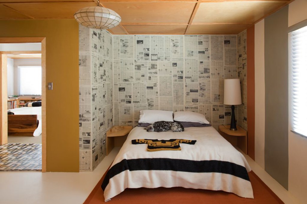
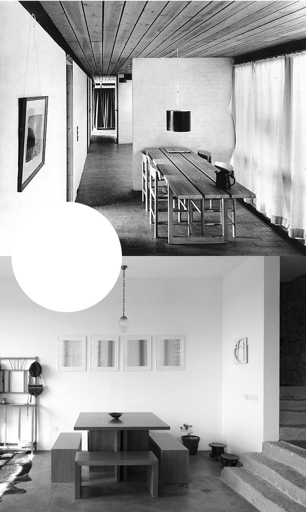
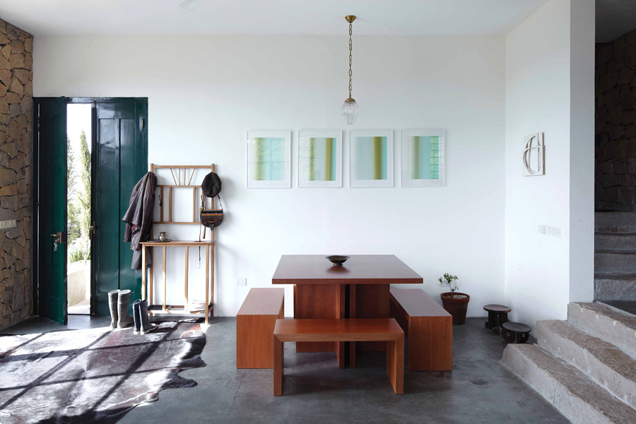
Helen Miller, his wife, over the line one early morning. We had a conversation about the Italian countryside, connection/dis-connecting with the pulse of urban living, their home that was published in World of Interiors 2010, and eventually onto Sam's work + workshop. After many emails back and forth, Helen sent me a work regarding Sam's work that she had written, entitled, "Growing Up with Silver and About the Untitled Mirrors ." It's a beautifully written introduction to Sam's work, and I'm honored to post it on YHBHS in its completition. Together Sam and Helen have created a space to create in, putting forth their ideas into the world, and I'm glad I contacted them.

This weekend in San Francisco, Sam Orlando Miller's work can be seen at SF 20/21 for those in the Bay Area. Sam Orlando Miller is represented by Hedge Gallery, a San Francisco design/art gallery, that will be re:opening at a new location this Fall 2011.

Thank you Sam and Helen for your kindness... - David John


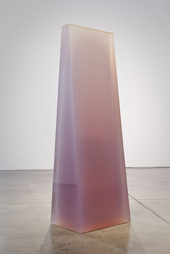
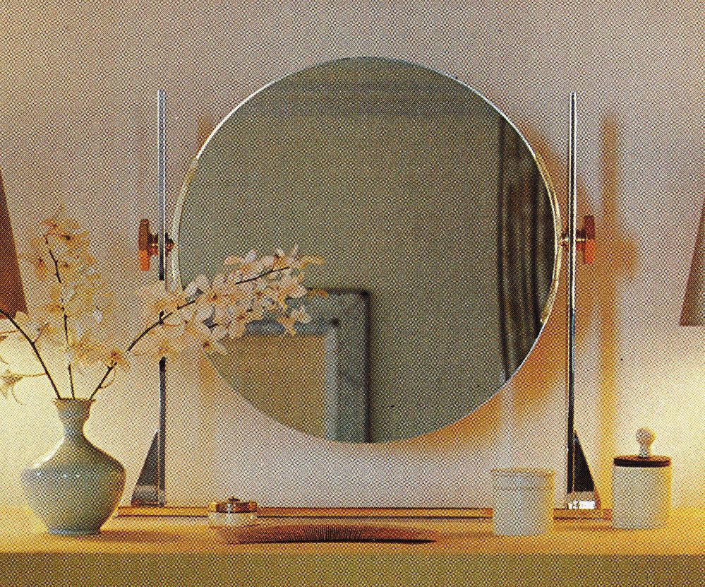
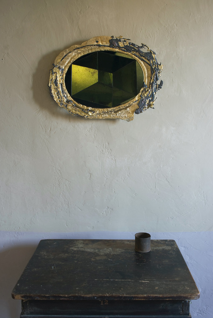
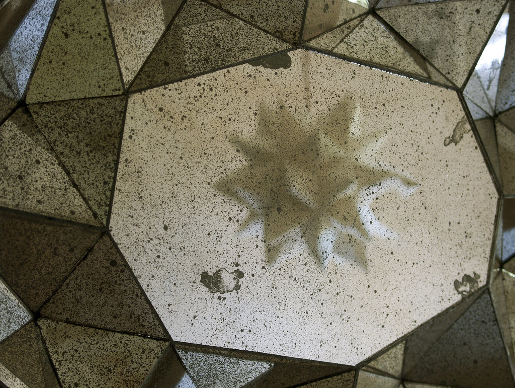
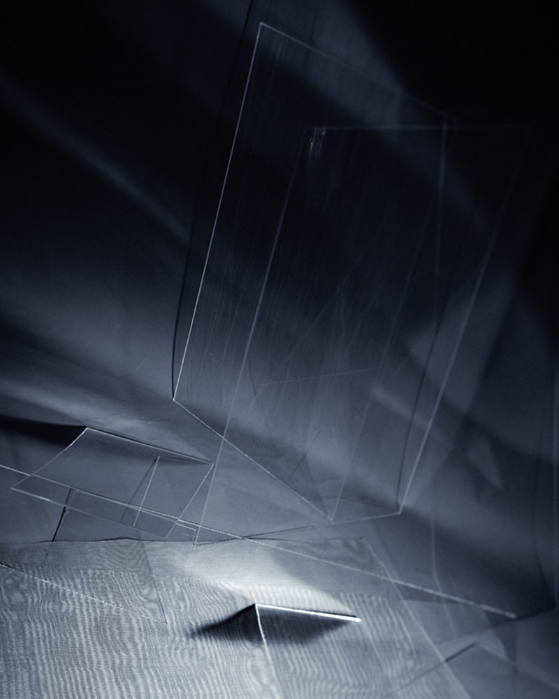
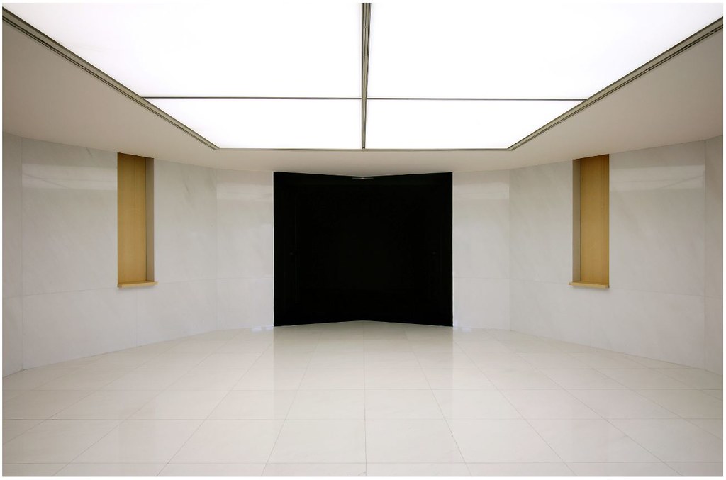
untitled mirror 1 detail (reflected in the mirror is a work from the untitled sculpture series).


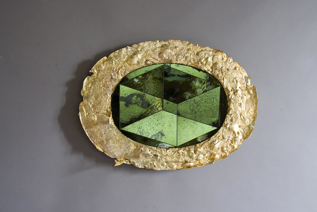
Growing Up with Silver and About the Untitled Mirrors


"Silver has always been part of my life. It is a material I grew up with and so it feels like part of me. When I look at silver so many memories emerge; of my father, his craftsmen, of their workbenches, the dirt of the polishing room, the sparkle of a sugar bowl chased with a pattern of strawberries. Silver takes up a significant part of my memory and most things are in some way connected to it.

As a youth I spent time working alongside skilled English craftsmen. Two in particular worked with glass so this recent collection of untitled mirrors is rooted to the European craftsmen I feel a deep connection with.

I found a piece of mirror one day and I picked it up because I saw that the silver was coming off. It was because it was falling apart that I noticed it. The disintegration made me more aware of the material because I saw it in a state of change. I didn’t think these things at the time I just felt an emotional connection to the old mirror so I put it in the workshop and left it there.

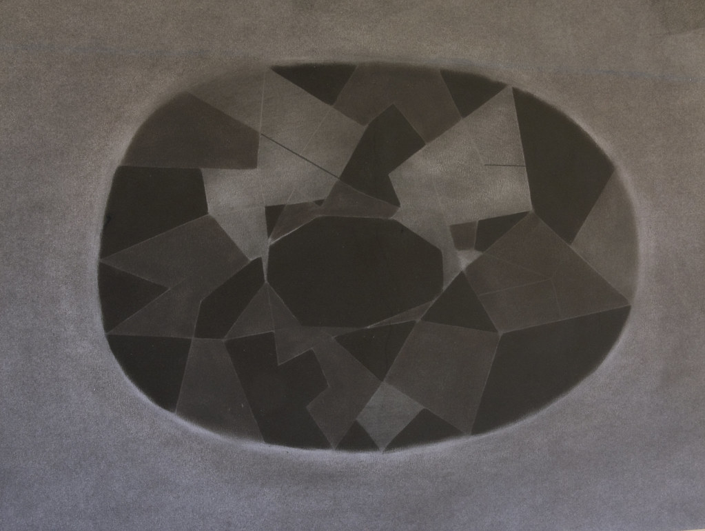
Some time later Helen was photographing a room in our house, which has dark walls. Looking at her pictures it struck me that all the light was being absorbed by the building and by the furniture and little was being reflected back. So I remembered the piece of mirror. And the shape came to mind from some black drawings of a crystal form I had made at that time. They are very dark drawings and within their blackness I felt the possibility of the opposite, of light.

I wanted to see if that crystal shape would work in three dimensions. So I had the form and the material and I put them together. But the main thing in my mind really was to create something the opposite of the drawing, the reverse, that did not absorb light and that gave energy and balance to the room. I wasn’t for a moment thinking about making something you could look at yourself in.


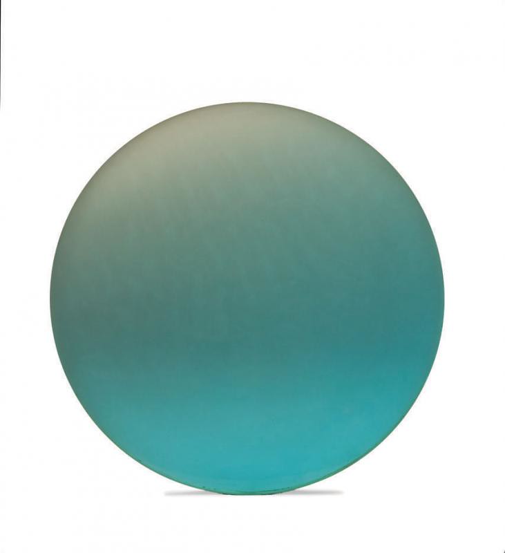
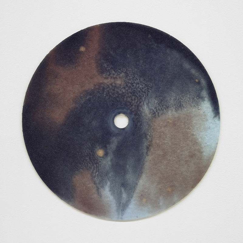
above: untitled drawing 4, below: untitled mirror 7


What is essential to me in these works is that the disintegration of the mirror surface makes you aware of the silver. By finding that first piece of abandoned mirror I identified a material in a particular state that I felt connected to and that I could work with. Most of the materials I work with tend to have such a patina. This can happen naturally or can be created. If the material has to be transformed in order to let it speak then that’s what I do. But I need to understand what has created the surface that draws me towards it. Whether it’s time, misuse or loving care, whatever has happened that makes it compelling, I identify. But sometimes new, unaltered materials can also be an interesting counterpoint. Simply because they have not yet had a life.


In my mind there is no hierarchy of one material over another, be it a diamond or charcoal. Part of growing up with silver made me realize it was just a substance that happens to be wonderful to work with because of it’s physical qualities, not it’s status or worth. The skill of working with silver is the understanding of reflection. When you make an object in silver you need to know how it captures the world around it.

Making the UNTITLED MIRRORS I have been working with ovals and facets over a period of time and a dialogue has developed between me and them, between the reflective and the dark, the shadow and the light, and there is always the chance that when I look into one of my pieces something unexpected might happen."


25 September 2010 Helen Miller
photographs and text courtesy of Helen Miller
Sam Orlando Miller's site here..


-----
You have read this article hedge gallery / helen miller world of interiors / mirror 7 / sam orlando miller / sf 20/21 with the title September 2011. You can bookmark this page URL https://gigibytes.blogspot.com/2011/09/a-non-conversation-with-sam-orlando.html. Thanks!
xiral segard
vs
pierre vadi

"In his installations, objects, and maps Pierre Vadi highlights moments in which reality seems to flee from itself, and everyday life is transformed into a frequently ironic décor with a complacent touch. (here)
aka
"the melody is inside all of us."


lampe gayalux
vs
pierre vadi


image 1:

The Gayalux lamp is both sculptural and light. This ball mineral is anchored on the ground, it seems to levitate with his streak of light passing through it. Concrete leaves architecture for the object, the block is curved like a skin. (here)

Xiral Segard (born 1972) studied Applied Arts at the Olivier de Serres and Duperré. Fascinated by the concept of "work in progress " and the architecture, she is focused on concrete, building material. In 1998, she created his first collection, the series " Wall Of Fame" candlesticks concrete , followed Lamps "Gayalux" in 2003, photophores "Jour de Fêtes" and " Les Morand" bowls concrete reliefs starred in 2005. These collections exposed and marketed to the shop "Bo" (75003 Paris), at Nantes, Le Havre and Genève.


image 2:

Pierre Vadi - Alcaline Earth du 18 décembre 2009 - au 30 janvier 2010, via here...


-----------------------------
You have read this article ironic decor / pierra vadi / xiral segard with the title September 2011. You can bookmark this page URL https://gigibytes.blogspot.com/2011/09/xiral-segard-vs-p-ierre-vadi-in-his.html. Thanks!
Jerry McMillan's torn bags
" It is portal to a world of discovery, as his collection has been to me."


Over the past month, I've been immersed in Richard Dorso's collection that will be up for auction on October 9 at LAMA. Dorso's vast collection spans many decades, countries, and mediums. Like all great collectors, he collected what simply captured his heart and imagination. His collection speaks of not only the art, but of the people he interacted with, friends, art dealers, and artists. Last week while working with his collection for the upcoming YHBHS installation, I came across a sculpture, protected in a plexiglass glass box: inside, a torn paper bag revealing a "door." A portal to a new world of discovery, as his collection has been to me. This work is Untitled (torn bag) from 1971, by Jerry McMillan.

Jerry McMillan is also part of Cherry Martin's restaging of curator Peter Bunnellʼs landmark 1970 exhibition, Photography into Sculpture. "Described in the original wall text as “the first comprehensive survey of photographically formed images used in a sculptural or fully dimensional manner,” Photography into Sculpture brought together a cross-section of artists from across the United States and Canada. The show encapsulated the radical gestures of late 1960's photographic practice, both inside and outside the photo world. " Cherry Martin's programming is some of the best in this city, and this show is another example of their approach to contemporary + historical programming that is so needed, and so rare to find in a private gallery.

It's a rocking time to be in L.A. Make time for Pacific Standard Time events, or you'll be sorry.... - David John


images above:

Left: Lot 84 Jerry McMillian Untitled (Torn Bag) 1971 Mixed Media #52 of 100 11" x 6" x 5"; Box 13" x 8.5" x 7" Estimate $200 - 300 To be offered in the October 9, 2011 Auction of The Estate of Richard Dorso at LAMA

Right: Jerry McMillan Torn Bag 1968 Photo-offset craft paper bag construction with shelf and Plexiglas cover, Cherry Martin Gallery


--------------------
You have read this article cherry and martin / jerry mcmillan / lama auction / pacific standard time / peter loughrey / photography into sculpture / richard dorso / torn paper bag / yhbhs and lama with the title September 2011. You can bookmark this page URL https://gigibytes.blogspot.com/2011/09/jerry-mcmillan-s-torn-bags-it-is-portal.html. Thanks!
Pacific Standard Time!
(Hollywood is a Verb, man)


For the next few months here in Southern California, Pacific Standard Time will be hitting full force! More art + design than one can possible take in, but hey, it's worth a try, right? The events are beginning to unfold, for a full listing, go here.... For those of us that treasure the history of Southern CA and understand the significance and importance of this work, this is an exciting time to be living in Los Angeles.... palm trees, endless boulevards, forgotten light, fallen stars, and shattered dreams...

I'm particularly excited to be taking the press tour of the Getty's exhibitions: Crosscurrents in LA Painting and Sculpture 1950-1970, Greetings from LA: Artists and Publics 1950-1980, and From Start to Finish: De Wain Valentine's Gray Column. And speaking of De Wain Valentine, LAMA's upcoming auction will feature two works by De Wain Valentine, that were part of Richard Dorso's California collection.


"I look at the unfortunate things: misfortunes, underbellies, sadness
. The things that go on not just in a city, but everywhere. The weight of history and all these things can be looked at negatively, but they also can be looked at positively. I see a lot when I drive here. Sometimes I’ll just be driving along and I’ll see a building that just assaults me and insults my intelligence. And the entire thing is so nasty its like having someone spit lemon juice in your face, but there is some effect there that makes me roll on and continue and make something of it. These negative things do work in my favor. They influence me to take motion on things. And that’s where I think my art comes from."

- Ed Ruscha, from an interview in FABRIK magazine, here..


Pacific Standard Time is a collaboration of more than 60 cultural institutions across Southern California coming together for the first time to celebrate the birth of the L.A. art scene. The celebration begins October 2011 and runs to April 2012. The image above on the left is the cover of the exhibition catalog: Pacific Standard Time Los Angeles Art, 1945–1980 Author: Edited by Rebecca Peabody, Andrew Perchuk, Glenn Phillips, and Rani Singh, with Lucy Bradnock.. purchase here..


------------------------
You have read this article ed ruscha interview / hollywood is a verb man / la and cars / pacific standard time with the title September 2011. You can bookmark this page URL https://gigibytes.blogspot.com/2011/09/pacific-standard-time-hollywood-is-verb.html. Thanks!
Autarky
is the quality of being self-sufficient.


images:

left: Joep van Lieshout (1963, Ravenstein) Joep van Lieshout lives and works in Rotterdam. Since the early eighties he produces objects in mainly bright coloured polyester, the material that would become his trademark in subsequent years. In 1995 he founded Atelier Van Lieshout (AVL), undermining the myth of the individual artistic genius. Atelier Van Lieshout has attained international recognition for objects that balance on the boundary between art, architecture and design. These works of art are practical, uncomplicated and substantial. Recurring themes in the work of AVL are autarky, power, politics and the more classical themes of life and death.

right: Table lamp in gray and ochre glazes by Patrick Nordstrom (1870-1929), Royal Copenhagen, Denmark, 1919... BAC Gallery: Founded in 2001 by the Architect Carlos Aparicio, BAC showcases a very unique selection of 20th Century European antiques
Within the walls of a converted warehouse in the SoHo district of Manhattan, BAC presents a spectacular collection that is driven by a great understanding of the period and a desire to display a very special and sophisticated point of view.


......................
You have read this article atelier van lieshout / autakry / bac gallery / nordstrom lamp with the title September 2011. You can bookmark this page URL https://gigibytes.blogspot.com/2011/09/autarky-is-quality-of-being-self.html. Thanks!
the "modern" kitchen table
1957 vs 2011


the "modern" kitchen table
1957 vs 2011

1. Skåde, 1957, by Friis og Moltke, via here.
2. A Modern Country House in Uruguay, a House Built out of Boulders. via NYT here.


--------------------
You have read this article a house built of boulders / the "modern" kitchen table 1957 vs 2011 with the title September 2011. You can bookmark this page URL https://gigibytes.blogspot.com/2011/09/the-modern-kitchen-table-1957-vs-2011.html. Thanks!
Don Bachardy's "Portraits of L.A. Artists"
at Craig Krull, Los Angeles

&
Beatrice Wood: Career Woman—Drawings, Paintings, Vessels, & Objects
at Santa Monica Museum of Art


2 portraits :Ed Ruscha & Frank Gehry,
pencil on paper, 1978


Shows galore! This Saturday, a show I've been looking forward to opens at Craig Krull Gallery in Santa Monica. Part of the Pacific Standard Time events, Don Bachardy's "Portrait of L.A. Artists" includes portraits of Mary Corse, Robert Graham, Ed Ruscha, Chuck Arnoldi, Billy Al Bengston, Vija Clemins, Craig Kauffman, Joe Goode, Tony Berlant, Larry Bell, Guy Dill, and many of Don himself.

Also, Santa Monica Museum is opening a new exhibition of California artist, Beatrice Wood: Career Woman—Drawings, Paintings, Vessels, and Objects. It will offer a comprehensive survey and a new assessment of this emblematic California artist—a scholarly, commemorative evaluation of Wood, whose extraordinary life and career traversed and contributed to the cultural and artistic highlights of the entire 20th century. (Adam Silverman did the design installation for the show!)


---------------
You have read this article beatrice wood / billy al bengston / don bachardy / ed ruscho portrait / frank gegry portrait / los angeles artists / pacific standard time with the title September 2011. You can bookmark this page URL https://gigibytes.blogspot.com/2011/09/don-bachardys-portraits-of-l.html. Thanks!
Jean Prouvé 1901-1984:
"Industrial Beauty"


Jean Prouvé 1901-1984: Industrial Beauty September 1, 2011, Ivorypress Art + Books presents the show Jean Prouvé 1901-1984: Industrial Beauty, dedicated to the outstanding French engineer, artisan and designer Jean Prouvé (Paris, 1901 – Nancy, 1984).

JEAN PROUVÉ 1901-1984, AV Monografías 149, 2011

This AV/Arquitectura Viva monograph accompanies the exhibition Jean Prouvé 1901-1984: ‘Industrial Beauty’, on view at Ivorypress Art + Books from 1 September to 12 November 2011. The publication opens with a summary of the content by one of the curators, Luis Fernández-Galiano, and further consists of three parts, each one containing several essays and interviews:

"The first part – Preambles – presents a full biographical account and analyzes Prouvé´s first professional years in Nancy. The second part – Processes – concentrates on the construction techniques as well as his façades and achievements in sustainable design and industrialized housing. Under the title Practices the publication deals in depth with the phase in Maxéville (known as his mature years) and the time after in which Prouvé conceived masterful buildings, components and was active as professor and as consultant. The publication includes texts by Catherine Prouvé, Peter Sulzer, Ignacio Paricio and Norman Foster among many others."

IVORYPRESS ART+BOOKS SPACE I & SPACE II C/Comandante Zorita 48 - 46 28020 Madrid. Spain. T: +34 91 4490961 F: +34 91 570 98 64 space@ivorypress.com

more images via.designboom


----------------------
You have read this article ivorypress / jean prouve / norman foster with the title September 2011. You can bookmark this page URL https://gigibytes.blogspot.com/2011/09/jean-prouve-1901-1984-industrial-beauty.html. Thanks!
when light (darkness) becomes us....
aka
"challenging and experimenting with elements of transparency, color, light and structure."

- barbara kasten


Ineluctable
, an exhibition of photographs by Barbara Kasten. Barbara Kasten’s newest series of abstract photographs records the consequential traces of light upon large-scale assemblages composed for the camera. Instead of using photography as record or reference, the physical object, which is the transparent Plexiglas plane, becomes immaterial. Light and shadow becomes the subject.

The work in this exhibition also includes works from the 1970s - unique cyanotypes, Polaroid’s, and drawings on photographic paper. Through various photographic processes investigated over the last four decades Kasten continues to show a remarkable consistency of interest in challenging and experimenting with elements of transparency, color, light and structure. As one of the preeminent photographers working today, Kasten continues to affect a recent generation in the exploration of the foundations of photography. Kasten’s own interest in light developed out of the conceptual concerns of painting, sculpture and installation influenced by early exposure to the work of artists Robert Irwin and James Turrell.

Barbara Kasten, Ineluctable, 9 September - 15 October 2011
Tony Wight Gallery 845 West Washington Boulevard, Chicago IL USA 60607


----------------
You have read this article barbara kasten / immaterial light / when light becomes us with the title September 2011. You can bookmark this page URL https://gigibytes.blogspot.com/2011/09/when-light-darkness-becomes-us.html. Thanks!
Arata Isozaki

vs

Aiko Miyawaki


“I have the sense that I have always been looking for how to say something... For me, making shapes is not my final goal, what I have sought is something completely different. How should I express it? I might say something like that which isn’t, the spirit that Oscar Wilde said was hidden behind all things. While there are all sorts of methods and materials, such as tableaux or reliefs or three-dimensional works, to the degree that their focus is on creating a form, you cannot thoroughly, actually grasp this thing that isn’t. That is why more than calling what I make sculpture, it might be better to call them a medium, and when the gaze that falls on them is a mixture of transparent, semi-transparent, reflective or refractive, then something completely different appears.


I am seeking that instant, that moment....


“In the fall of 1962, I spent several hours on a street corner in Paris, watching the sun set, and as it got darker, it had a great effect on me.... I lost all interest in stories which have a beginning, and an end, in bold shapes, bright colors. Then I started to make works that seem to have no beginning, no end.


text by Aiko Miyawaki,

image above: Arata Isozaki, Hotel Silken Puerta America, photo by Rafael Vargas


the search began here... thank you.


---------------


You have read this article Aiko Miyawaki / Arata Isozaki / Arata Isozaki vs Aiko Miyawaki / architecture / design / hotels with the title September 2011. You can bookmark this page URL https://gigibytes.blogspot.com/2011/09/arata-isozaki-vs-aiko-miyawaki-i-have.html. Thanks!
And Zeus said, "No, You better let me Use my lightening, like scissors,

Like I cut the legs off the whales And dinosaurs into lizards."


Then he grabbed up some bolts And he let out a laugh,

Said, "I'll split them right down the middle. Gonna cut them right up in half."


"When the earth was still flat, And the clouds made of fire,

And mountains stretched up to the sky, Sometimes higher,

Folks roamed the earth Like big rolling kegs.

They had two sets of arms. They had two sets of legs.

They had two faces peering, Out of one giant head

So they could watch all around them As they talked; while they read.

And they never knew nothing of love. It was before the origin of love."


sconces by Stilnovo, lyrics from Hedwig and the Angry Inch.


------------------------------


You have read this article hedwig vs stilnovo / stilnovo with the title September 2011. You can bookmark this page URL https://gigibytes.blogspot.com/2011/09/and-zeus-said-no-you-better-let-me-use.html. Thanks!
when structure becomes us (the room)

vs

"we have never been modern" - bruno latour

aka

if a room became a puzzle.


when structure becomes us (the room)

vs

"we have never been modern" - brun0 latour


Perhaps I've spent too many lazy afternoons engaged with Tony Smith's massive Smoke, studying the black angles and smooth surfaces. Whenever I encounter spaces & rooms as above, I consider the pure joy of solving a puzzle of space and time. A state of stacking, and balance! If a room becomes a puzzle. An empty box, waiting to be filled with mass, volume, structure, and a sky to see the stars above. Welcome to the weekend, warriors, pt 458.


images....


1. Room from Elle Decor UK, via insideinside (now in Echo Park!)

2. Embaixada Arquitectura "After Embaixada Arquitectura were commissioned to create a new exhibition space in the Portuguese city of Tomar, the Lisbon-based practice took the existing building back to a shell, then infilled it with a series of angular constructions."

3. K Studio, via here. "we are an architecture practice based in athens, greece.Our contextual approach to individual projects seeks to produce unique architectural experiences."


--------------------------

You have read this article elle decor uk / k studio / smoke tony smith / when structures become us with the title September 2011. You can bookmark this page URL https://gigibytes.blogspot.com/2011/09/when-structure-becomes-us-room-vs-we.html. Thanks!
Related Posts Plugin for WordPress, Blogger...