a room by Shelton, Mindel & Associates
vs.
Robert Ryman's
paradoxically “realist” paintings


"White actually means taking away, eliminating. It’s not the case of painting white paintings. It’s a question of using white pigment. Of course, I use it differently today because the issues have continued to develop. I never thought that there should be a lot of things in a painting that don’t necessarily belong there. After all I didn’t simply make a decoration or paint an accumulation of things in order to see what works well.

My main concern was to develop the structure of the paintings so that it contains the essentials and everything superfluous is eliminated…the composition extends to the wall and becomes a part of the wall… when you take my paintings off the wall, they don’t exist anymore.

The painting needs a wall in order to exist. Otherwise it makes no sense."

- Robert Ryman, taken from here.

Interior space by Shelton, Mindel, and Associates


-----------------
You have read this article robert ryman / shelton mindel interiors / white interiors with the title January 2012. You can bookmark this page URL https://gigibytes.blogspot.com/2012/01/a-room-by-shelton-mindel-associates-vs.html. Thanks!

a conversation with LEADAPRON


I think at root they (my careers) are all attempts to express myself through a discipline and to understand something about what it means to be a sentient human being. - Jonathan Brown

"You see, unfortunately I am an E X P L O R E R." - Lucio Fontana


(all photos by Marco Annunziata and David John)


LEADAPRON is a capsule on Melrose Place that sells rare, signed, out-of-print art and photography books. Select titles, including books on Andree Putman, Pierre Chaveau, Basquiat, Ed Ruscha, Donald Judd, and Lucio Fontana line the shelves. Jonathan Brown, owner, is a collector, and it takes only a moment to realize that this is not your ordinary book store. It's a place that merges design, interiors, and art effortlessly. Plexiglass boxes containing postcards, books, organized in a manner that speaks of space, time, and history are scattered puroposely throughout the open and vaulted rooms. Skylights cast quiet shadows and dance upon the whiteness of the walls and floors. In one collection is rare Ed Ruscha books, while printed works on Lucio Fontana's punctured canvases dominate another tall bookshelf.


I am not interested in the kind of space you are talking about mine is a different dimension. The hole is this dimension. I say dimension because I cannot think what other word to use.

- Lucio Fontana


What is LEADAPRON, and how long has it been around?

Jonathan: LEADAPRON began as Leadapron Productions 15 years ago. I was directing theatre in Manhattan. I came up with the name during my production of the Maids by Jean Genet. A Leadapron is what you wear when you get an xray.

In short, its a protective shield.


What was in this space before Leadapron? Did you have to do any renovations when you moved in?


Rose Tarlow Melrose House. I built a few walls, a front reception booth and shelves to showcase books and artworks, painted it many times, and added track lighting, etc....I changed some small details like switches and the locks, etc, and added a few fixtures throughout. At the time it felt like quite a bit, but I essentially just tried to make the space a blank white canvas so it would disappear and the objects that I placed inside would pop. I still walk around making minor renovations all the time...just refining the space endlessly.


I've seen some amazing shows, such as the recent James Lee Byars show in your gallery space. But, you also show collections of books, such as Donald Judd, Fontana.

Are the works from your personal collection?


Thank you for the compliment. The artists you mentioned are personal favorites. I show what I like. I spent 2 years assembling the Byars works. I suppose you could say that everything in the gallery is my personal collection, but it is for sale as well so I am just a temporary guardian. I keep a few works, but then sell them later only to replace them with something else.


What sort of work did you did before LEADAPRON?

In brief it went like this: Philosophy, architecture, draftsman, boxer, theatre director, writer, behavioral neuroscience, dealer.

Ok, tell me more about all these prior careers.
Is there something that links all of these occupations together you think?

Very good question. I think at root they are all attempts to express myself through a discipline and to understand something about what it means to be a sentient human being. Some are more murky waters to navigate and others might have been too direct or too clear. Some are too mental, others too physical or abstract. A dealer has to embody and encompass all of these disciplines should he be effective. He or she needs to have a perspective, an aesthetic, a sense of design and space, a daring, be able to direct and stage events and most importantly have a sense of what his/her clients want or need and furthermore, they should be able, though charm or ingenuity or force of personality to convey to their clients their ability to both understand and provide.

Where are you from? How long have you been in LA?


I was born in Korea, and then we moved around from Boston to San Francisco to settle in New York. I spent a year living in France as a child, which was wonderful. I mainly grew up in Bronxville, NY, which is a suburb 30 minutes from Manhattan. An idyllic little town with lots of tudor homes and cobblestone streets. Nothing bad ever happened there outside of perhaps the town drunk or a few divorces. If I didn’t grow up there it wouldn’t be a bad place to raise my kids.
At 18 I moved to NYC for 15 years. I’ve been in Los Angeles for the last 10 years.

Why do you think you are interested in objects? what do they mean to you? what is the obsession?


We learn about the world by manipulating objects as a child and I think this extends into adulthood. I enjoy the visual dialogue with objects. They probably give some sense of order or permanence to our lives and add to one’s narrative about their life. I practice letting them go, which is also a healthy disciple. Perhaps they punctuate space and make me aware that I exist, am existing and won’t exist someday....just like art, music and even friends.


In your office, there is an amazing collection of objects and art on your desk. Can you tell me about any of these works?
What sort of works do you collect?

What were you doing in my office??? Just kidding. I've been collecting chairs.


What sort of chairs have you been collecting?


Gio Ponti, Donald Judd, Mario Botta, Gae Aulenti, etc... I just like placing them around the gallery and in my house. They make me happy. There is something about chairs that are more than sculptures (aside from their functionality). They seem half alive, which is just enough to make them endearing.

Any upcoming artists you collect or are very interested in?


Christopher Astley. He works in concrete. I am planning a show of 5 of his sculptures. He's a cross between John Chamberlain, Philip Guston, Chaim Soutine, Francis Bacon and Claes Oldenburg.

What is the attraction to James Lee Byars' work?


It's simplicity, freshness, evanescence, fragility, beauty, intelligence and ethereal-ness. Byars had a great sense of humor and play, he confronted his audience with boldness and courage and developed his own vocabulary while keeping it universal. He is totemic, mystical and truly mysterious. I do believe that Byars was one of the most important artist of the late 20th Century.


Is it difficult to run a book store in the age of the internet?

Not really. The internet helps with sales.

Any favorite galleries/stores in Los Angeles?

I like Earth Bar, Yves Saint Laurent, Prism & OH WOW. Mind and Body all covered.

What can we expect from Leadapron in 2012?

I would say more, but smaller shows. Instead of trying to be bigger and better I would like to get back to basics and create thoughtful, almost salon style shows...and of course we will continue to provide our selection of rare, unique, out of print, signed art, photography, fashion and design books.


LEADAPRON
8445 Melrose Place, Los Angeles CA 90069


----------------------
You have read this article jonathan brown / leadapron / YHBHS interview with the title January 2012. You can bookmark this page URL https://gigibytes.blogspot.com/2012/01/a-conversation-with-leadapron.html. Thanks!

Wendy White on Freunde Von Freunden


I'm thrilled to be contributing to the Berlin based magazine, Freunde von Freunden for their 100th interview, featuring NY artist, Wendy White. FvF "portrays people of diverse creative and cultural backgrounds in their homes or within their daily working environments. " They have featured stunning video interviews with Joseph Dirand, and Karen and Christian Boros. Looking forward to working with FvF on some upcoming stories!

(Read the full interview here.)


"Wendy White took us to her to studio in Chinatown, and kindly gave us a tour around her neighborhood in New York City. It’s really the ideal place to think about her latest work. Glorious rambunctious color drives the works, with collapsing angular fonts being forced off the grid. It’s easy to get lost in the energy in her work. Some canvases sloped onto the floor, others spaciously separated.

Her work is a tale of the modern city, void of logic, overflowing with spray painted emotions. Ed Ruscha captured the Los Angeles notion of light and ease, while Wendy’s work is a reflection of her home on the East Coast in New York, the quickened sensations of life."

- David John


Wendy White is showing with Henning Strassburger at Rosa-Luxemburg-Platz e.V. in Berlin, that opens January 26, 2012.

Interview: Oliver Kann, Frederik Frede
Text: David John
Photography: Fette Sans


--------------------


You have read this article a collage by YHBHS / artist interviews / chinatown new york / david john / fette sans / freunde von freunden / oliver kann / wendy white with the title January 2012. You can bookmark this page URL https://gigibytes.blogspot.com/2012/01/wendy-white-on-freunde-von-freunden.html. Thanks!
Brett Cody Rogers' installation at ALAC

"a booth which draws inspiration from the entryway to Le Corbusier’s Maison Blanche, Villa Jeanneret-Perret in Switzerland – in which dramatic shadows are cast against a jute backdrop."


Brett Cody Rogers' confident abstractions on canvas/ paper have the ability to quietly control the air in a room with their intensity of shape, form, pattern, and color. The 2011 show, Painter's Forms, at the L.A. gallery Pepin Moore, was one of most memorable painting shows of the year. It was in South Willard that I first saw one of Brett Cody Rogers' sculptural works installed from the ceiling. Casting shadows, slowly moving as the air in the room shifted, miniature paintings from strings. To those that looked above, they were rewarded.

This weekend at Art Los Angeles Contemporary, in association with Paddle 8 and Phaidon, Brett Cody Rogers has created "a booth which draws inspiration from the entryway to Le Corbusier’s Maison Blanche, Villa Jeanneret-Perret in Switzerland – in which dramatic shadows are cast against a jute backdrop."

- David John


“It gave me the opportunity to work with ideas that I’ve been researching for my painting practice. It was an interesting thing to design the furniture and the space within my aesthetic as a painter, but not call it an artwork.”

- Brett Cody Rogers


"“…and I thought of our house, all white under the moon and I blessed Ed. that he wanted this whiteness [...] Thank you kindly for your letter that shows me how much you enjoy your home, I understand all the intimacy, the warmth, the spaciousness, the friends who visit, the objects, the music, the reproductions of the human or fantastic statues."

Albert Jeanneret, brother of Le Corbusier, letter to his parents, 19.11.1913


Maison Blanche, photo by Luis Gualtieri 2006, via here


"that both plays on my aesthetic interests and the material forms referenced in my studio practice, as well as modernist tropes in Le Corbusier’s interiors and furniture.

- Brett Cody Rogers

"Architecture is the clever, correct and magnificent
expression of volumes in light. "

-Le Corbusier


-----------


You have read this article acrylic sculpture / brett cody rogers / french modernism / jute as art / le corbusier / mobiles / paddle 8 / phaidon books / when artist make installations with the title January 2012. You can bookmark this page URL https://gigibytes.blogspot.com/2012/01/brett-cody-rogers-installation-at-alac.html. Thanks!
Noé Duchaufour-Lawrance
designer + interior architect


For those at MAISON + OBJET in Paris this week, Noé Duchaufour-Lawrance's design work will be in abundance. Some might know of Noé Duchaufour-Lawrance's work from Galerie BSL in Paris. Noe designed the interiors of this avant-garde showroom in Paris for Director Béatrice Saint-Laurent. After receiving an email, I began looking at some of his recent interior projects only to be transfixed by this interior in the French Alps. A monochrome palate reinforced with the beauty of concrete and wood, an updated version of a ski chalet. Lines that bend and trace the space of the room, a fireplace, a portal of warmth and energy. Transcendental living. - David John


Chalet Beranger: St Martin de Belleville
French Alps, completed 2011

"Far from the geometric construction methods of a traditional chalet, the interior architecture of this family home is a domestic landscape whose forms emerge from the ground like small functional mountains rising from a valley. Resolutely fluid and modern, the result is a set of lines and organic forms composed around a wooden ribbon. A large, main room is set above the whole construction, defining the central point of the chalet where the family comes together around a warm hearth."


"Sketch" London - 2002 : "A Victorian facade in the heart of London which reveals nothing of what goes on inside. Sketch is the place for sensory, human experiences
a voyage in space and time in a listed, 18th century building."


"Designer and interior architect, Noé Duchaufour-Lawrance has defined his own language using natural shapes which are supple, organic, fluid and structured at the same time. A double passion for the material and for the shape embodied by a double faceted course of studies: first of all following a course in Sculpture on Metal (at the Ecole Nationale Supérieure des Arts Appliqués et des Métiers d'Art), then design at the Arts Décoratifs in Paris.

In response to a creatively rich past (his father was a sculptor), Noé Duchaufour-Lawrance very quickly displayed an unusual aesthetic quality, which stands out, beginning with the restaurant Sketch in Soho in 2002 where he served as artistic director, and his interior design was soon acclaimed by the international scene with his organic and urban style. "

some text taken from here...


------------------
You have read this article 1950's interior design / domestic landscape / french alps / maison object / Noé Duchaufour-Lawrance / snow living with the title January 2012. You can bookmark this page URL https://gigibytes.blogspot.com/2012/01/noe-duchaufour-lawrance-designer.html. Thanks!

a conversation with Bec Brittain

...
"The growth of crystals in entirely compelling to me – growth in a non-living thing is absolutely amazing! Moreover, it's fascinating the way each mineral has its specific growth structure which is consistent, yet depending on environmental variables each specimen is unique. "

- Bec Brittain


Bec Brittain's "the SHY Polyhedron light "


Bec Brittain's latest sculptural lighting work "the SHY Polyhedron light " will be part of MAISON- OBJECT in Paris at American Design in Paris, presented by Triode Design, opening this week, January 22nd. For those in Paris for Maison, visit this collection of American Designers, pushing design + objects into the future.

When in conversation with Bec Brittain about her latest work, she told me that "the Polyhedron brings a few ideas to the SHY light system that I hadn't played with before. The lights begin as a burst in the center, as opposed to only forming the perimeter, a burst of brightness." The more I stare into her works, the more I get lost in their subtle, shape-shifting geometry. Pulsating light lines, bringing to mind Fred Sanback's yarn works, Brittain's pieces are elegant-light drawings in the sky, collecting the energy of the room, full of purpose and intent.

Bec Brittain is currently working on an as yet unnamed piece (in-house it's called mirror crystal), which utilizes a 2-way mirror. "It's a polyhedron, which when the lights are off it reflects it's surroundings, but once you turn it on there is an infinity affect and you can see through to the many dots of light." This piece will be debuting that at the Architectural Digest Home Show in New York, March 22-25.

- David John


How did you become interested in LED?


"The quality of light", and why your attraction to working in this source? The interest was actually first with fluorescent light; I became really taken by the idea that we were surrounded by these beautiful white lines, yet they had been relegated to the most banal and industrial applications. I wanted to break them out of that role. After much research, and an initial fluorescent prototype, their technical limitations made themselves quite clear; the LEDs are so nice to work with by comparison – the wiring isn't so complicated.

Right now is such a curious time for lighting technology, there are so many concerns: energy efficiency, quality of light, longevity of design, and many times they are in conflict. My first priority is to try to design things that can be passed on to grandchildren, which requires trying to design for future change. My current solution is to always make sure you can change the light bulb; I hope that this allows not only for burnt-out bulbs to be replaced, but also outdated light bulbs to be updated. A lot of LED lights don't allow for it, and I think in 20 years we're going to have a bunch of light fixtures in the trash. As for light quality, I think it's going to be really interesting how things move forward. LED technology is improving daily in terms of its quality of light. But I also think there's a real possibility of our eyes and our tastes adapting to new kinds of light.

I wonder to myself if we're all going to begin to like different colors because of how they appear under new light....


Why do you call it the Shy Light?

My grandmother is a complete inspiration – she has always had a great eye, and continues to do so past 90. She helped brainstorm about the piece, so I thought it only right to give it her initials, SHY, for Sarah Hitchcock Yerkes.


How did the idea for the LED lamps come about? Can you talk about your process, how you are able to conceptualize, all the way to production?


The SHY light was a nice confluence of the long tubular bulbs lending themselves to make these faceted forms which had been stirring around in my head for a while. For any design there are any number of tools I use, and I just try to find the quickest one for the task at hand. I made a ton of sketch models, using tubes and wire and plasticine, to test the overall shape. The first prototype was made with as many ready-made parts as possible, machining just one custom piece. I have continued to improve it in iterations, refining and making new hardware bit by bit. I suppose I'm a bit impatient and need to see the thing in front of me as soon as I can; I certainly prefer improving iterations of something to trying to get it perfect in the computer before doing anything. You can learn so much in the in-between steps.


Is there are connection between your work and Lindsey Adelman's work? How has she influenced your work, and what has it been like working with her?


It's so hard to say how mine and Lindsey's work are connected; I'm so close to both things, I'm not sure I have the best perspective on the final products and their relationship. What is much clearer to me is the process. When I began working with Lindsey I was trying to decide where to put my focus; I have always been connected to the making of things, but I just hadn't found the right fit in terms of how to try and make a living at it.


The 2 most important things I learned from Lindsey Adelman are:

1. You can be a product designer and not make mass-produced items. Instead you make relatively few pieces, mostly by hand, and they will be appreciated by the client.

2. Relax about something being perfect the first time out.

She continues to change and improve her pieces as certain issues pop up. There's a nice balance between making it the best you can at the time and understanding that you can always make it better. My description of how I made the SHY light in iterations is definitely influenced by this attitude.


You were the Lead Designer at architecture firm WORK AC, and then shifted focus to design luxury door hardware for manufacturer H. Theophile. Currently, you are Design Director at Lindsey Adelman Studio while also building your own practice in product design.

Why have you shifted from architecture to product design?


I began studying product design at Parson's in undergrad, and it was ultimately completely unsatisfying. At the time there was such a focus on mass production and saving resources in the production of the piece (flat-packing to save warehouse space, etc.), but there was no focus placed on the idea that something that will last 150 years will be more environmentally and economically sound than the 20 throw-away tables that you could have instead. I felt very outside what I understood to be the product design world. I left that program, and received a philosophy degree before getting the architecture degree; I used both of those degrees to try to solve this issue I had of wanting to make things but not feeling right about putting more stuff into the world. I tried a bit of architecture, a little furniture design, and some hardware. I think it was partly growing up and having more experience, as well as seeing some other product design practices that I admired, which threw me back into what I had wanted to do when I was 18. I also discovered I really like metal.


3 things we might never guess about you?

Don't we all need a bit of mystery? (yes!)


You speak of a more gradual appreciation of a larger idea. What larger ideas is your work moving towards?


The larger idea is specific to each piece. In the case of SHY, my interest in crystalline structures is really at the heart of it. The growth of crystals in entirely compelling to me – growth in a non-living thing is absolutely amazing! Moreover, it's fascinating the way each mineral has its specific growth structure which is consistent, yet depending on environmental variables each specimen is unique. SHY is constructed similarly, in that the hardware sets certain structural rules, yet it can be put together in a number of different ways.


Bec Brittain
was born in Washington, DC in 1980, Bec Brittain studied industrial design at Parsons, earned a BA in philosophy from New York University, followed by an architecture degree from The Architectural Association in London.

Brittain's work experience has been similarly varied as her education. She was Lead Designer at architecture firm WORK AC then shifted focus to design luxury door hardware for manufacturer H. Theophile. Currently, she is Design Director at Lindsey Adelman Studio while also building her own practice in product design.


Bec Brittain's work is at MATTER in New York.....


-------------
You have read this article a conversation with bec brittain / american designers / bec brittain / triode design with the title January 2012. You can bookmark this page URL https://gigibytes.blogspot.com/2012/01/a-conversation-with-bec-brittain.html. Thanks!

Rose Tarlow

.
“(she) balances emotion and intellect as well as any designer now living … her rooms [combine] sensual pleasures with geometric rigor, and every one of them is simultaneously a lesson in design and a lesson in living.” -

Paul Goldberger on Rose Tarlow


"Buttercup Pendant" : dark rusty distressed iron finish with resin sleeve.


What is perfection, anyhow?


In a recent article I read on Rose Tarlow, a Los Angeles based designer, she mentioned that 20 years ago, an ivy vine meandered through a crack in her home's window. 20 years later, the vine cascades down the walls, a testament to time passing. Stories like this leave a permanent imprint in my mind on "imperfection" and design. For Rose, homes should be imperfect, calm, and strive to be unpretentious.

Stories are told, and as the years pass, her work takes a deeper effect on my own design work. Designers such as Rose Tarlow and Ilse Crawford (to simply name a few) push simplicity, history, and elegance to a new height in their work. Utilizing recognizable forms, allowing the rooms to take on their own life, as if the rooms had always been there, (this is no easy feat friends.)
Masters at work.

- David John


"Blotto Desk"
: French Ash Veneer with six drawers in medium wood stain


I am a solitary person. I like working alone and making my own design decisions.

I have an obsession for buying lovely things, so I occasionally consult on building a collection of antiques and art.”


"Chinese Ceramic Jar Lamp"

- Original Brown Round shouldered, ceramic in original brown finish.


Rose Tarlow
is one of the most influential designers working in America today. She founded her company more than 30 years ago on once-secluded Melrose Place and has built a reputation for the finest furniture, textiles and accessories ever since. Working with local craftsmen who share her impeccable standards for the highest quality, Tarlow knows that creating a truly beautiful room is as much an emotional matter as it is one of color, light and products.

As an internationally-renowned furniture and fabric artisan, interior designer, antiquarian and author, her creations have enchanted the design community. According to New Yorker architecture critic Paul Goldberger, Tarlow “balances emotion and intellect as well as any designer now living … her rooms [combine] sensual pleasures with geometric rigor, and every one of them is simultaneously a lesson in design and a lesson in living.” All the products are offered through the company’s flagship on Melrose Avenue in Los Angeles, and are represented by the finest multi-line designer trade showrooms across the country. " (text taken from here)


visit Rose Tarlow house here..


Read a piece on Rose Tarlow on Style Saloniste here..

Also, in the NY TIMES here...


--------------


You have read this article ceramic lamps / furniture designers / geometrical furniture / LA designers / rose tarlow / what is perfection with the title January 2012. You can bookmark this page URL https://gigibytes.blogspot.com/2012/01/rose-tarlow.html. Thanks!

A conversation with Peter Klick

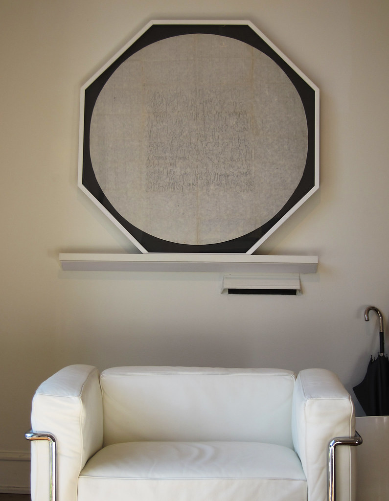
Since basements usually have only a few windows, if any, they are great spaces to design.
As if to design in a shoe box…"

- Peter Klick of Klick Interiors


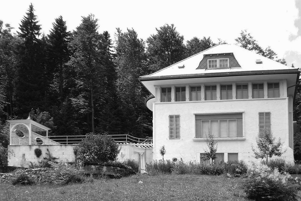
a drawing for the H51 residence in Zurich, by Peter Klick


Decoration can be a state of mind,
an unusual perception, a ritual whisper. - Ettore Sottsass

Why can't we be ourselves like we were yesterday? - New Order


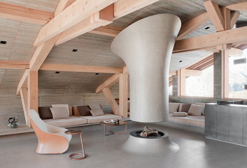
Peter Klick's H51 project in the Zurich suburbs, which started about 34 years ago, and completed in 1990, continues to push design boundaries 35 years later. Recently, we are witnessing a strong resurgence of Postmodernism. Recent exhibitions of PostModernism at the V of A, Style and Subversion 1970-1990, and a new generation of designers discovering the works of Sottsass, Pesce, etc, brings a new light and shadow to projects such as Klick's H51 project. Sottsass' design has gained strength and validation from the auction market in the last years, as his prices have soared to all time highs, as in the recent LAMA Auction last year.

For Klick, he notes Gaetano Pesce, Ettore Sottsass, and Jaime Hayon, a contemporary Spanish designer, as some of his greatest influences. Klick's interiors utilize a complex color palette with confident sculptural forms to tell a distinct narrative of design, that references Italian/ French design, while also telling his own personal story of design.

When I asked Peter Klick to name a few of his favorite designers, he gave me a long list of inspired designers that included: Bram Boo, Maarten Baas, Mario Gamper, Jaime Hayon, Matteo Thun, Ettore Sottsas, Gaetano Pesce, Alessandro Mendini, Gae Aulenti, Arne Quinze, Marten Baas, Patricia Urquiola, Hans Wegner, Paola Lenti, Annet van Egmond, Achille Castiglioni, Michele De Lucchi, Andrea Branzi, Verner Panton, Hella Jongerius, Gam/Fratesi ...


Are you ready to tour H51?


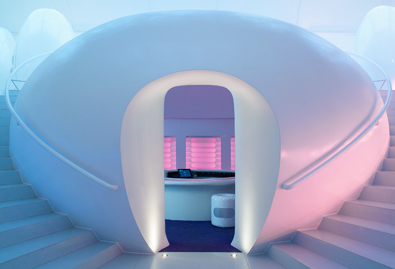
Welcome to H51: The Pink Guest Room

Peter: Oh yes,…it was for a young family with 2 children. They had a nice house in the Zurich suburbs, Switzerland. It had a view to the mountains, and on a clear day you could see the Alps. The house had 3 bedrooms and 3 bathrooms, an indoor pool, a home theater / play room, and a large unused basement. It lacked a proper guestroom, or room for the nanny who would be watching the children.

I already worked on some rooms in the house, so they simply asked me:
Can you do something interesting with this space?

"Sure I can," I replied.

Since basements usually have a few windows, if any, they are great spaces to design. As if to design in a shoe box. But how to design a space for their daughter, a girl in a basement, that she likes, and feels safe.

That was the challenge!

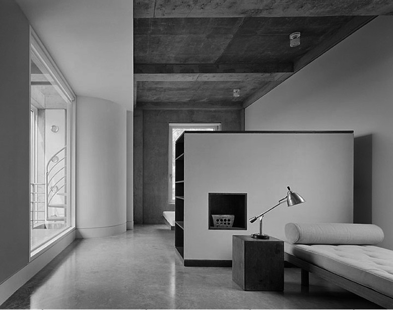
In the basement we did not have a view to the mountains; so the idea was to try to replace it with the forms of the walls, roofs, tables and the back of the bed. Also a roof over the bed feels safe and cozy. From inside, the illuminated, pink, translucent painted Plexiglas columns are holding the roof with is also holding 50watt halogen spots. The colors pink and grey have a low contrast which makes the space feel larger.


Peter: The master bedroom is located behind the kitchen. The remodeling of the kitchen, dining and living area, as well as the master bedroom became a major project because we eliminated some structural walls. The master bathroom is between the Bedroom and Kitchen, with dark blue tiles from floor to ceiling, walk in shower and whirlpool bathtub. The bedroom has a dark blue carpet, a walnut dresser and a large closet with mirrored sliding doors.

Illuminated by Standing lamps from Salvador Dali: Cajones and Black label from BD Barcelona. The family has a lot of guests with sit down dinners, so, the concept was to avoid a large living room area with sofas and TV, and to upgrade the dining room area with a larger table which provided more comfortable seating. The kitchen with a bar for aperitifs, and breakfast for the kids, and in the basement, a home theater with a pool table.


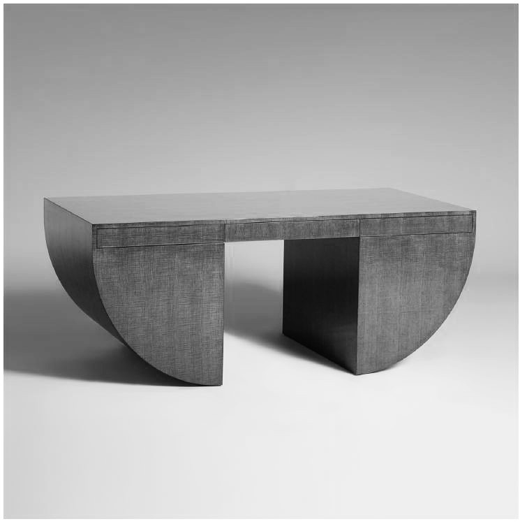
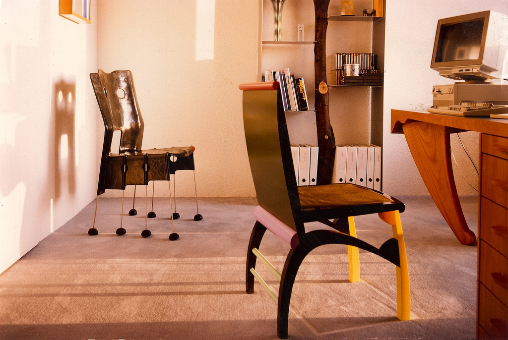
Office: Andrea Branzi's Amnesia shelf from Design Gallery, Milan,
Gaetano Pesce's Green Street Chair for Vitra, Alessndro Mendini's Chair,
and a custom designed desk by Peter Klick


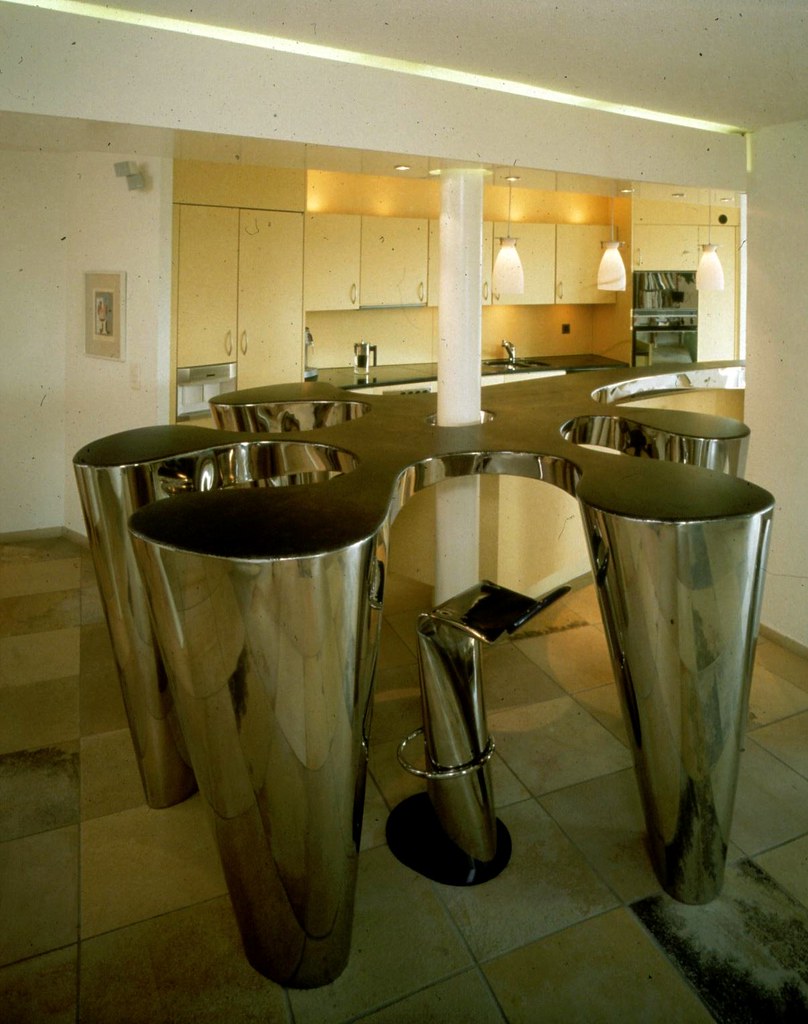
Ron Arad's custom bar for H51


Peter: After completion of the project, they did not like my walnut bar very much. At the time we went to Salone in Milan and discovered the organically shaped bar with bays to sit in from Ron Arad. He did this beautiful bar for the Strato showroom in Milan, so I contacted Ron Arad and asked him if he would design and produce a bar like this for us.

I took the dimensions in Zurich, he designed it in London and Marzorati Ronchetti procured it in Cantu, Italy and they installed it in Zurich.


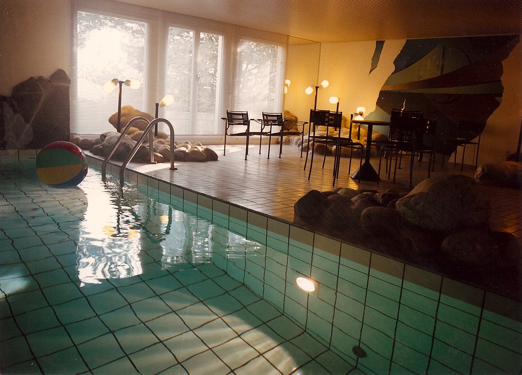
Indoor Pool: "the stones and boulders to give the pool a more outdoor feeling."


"It is important to realize that whatever we do or design has iconographic references, it comes from somewhere; any form is always metaphorical, never totally metaphysical; it is never a 'destiny' but always a fact with some kind of historical reference.

- Ettore Sottsass


Bedroom: Peter Kick custom designed the flowers for the headboard,
curtains and night stand, as well as the table.


Peter Klick received his Bachelor of Science in Classical Furniture and Fine Work Working at the Allgemeine Gewerbeschule in Basel, Switzerland after a four year hands-on apprenticeship. He continued his education at the legendary Staatlichen Akademie der Bildenden Künste in Stuttgart, Germany where he received a Master of Arts in Interior Architecture. For the next five years, Klick worked as an Interior Architect for Venzin AG where he designed, constructed and remodeled more than 200 boutique and retail stores, offices, homes and restaurants in Switzerland. Klick’s extensive experience led him to establish his own firm, Klick Interiors, which launched in 1985.

Since its launch, Klick Interiors has enjoyed a wide range of international projects ranging from an innovative classroom design for a prestigious Catholic School in Chicago to the complete interior redesign and construction of a historic 100 year old villa in Switzerland. Klick Interiors clients have included Interhome, Utoring, Hotlelplan, UBS, Swatch, Seipp and many others.

Now based in Chicago, Illinois, Klick works as a Program Coordinator and instructor of Interior Design at the renowned Harrington College of Design. Passionate about passing along his experience to senior-level Bachelor of Science students in Interior Design, Klick remains very active in the Interior Design industry, and continuously travels throughout the year to the latest Interior Design exhibits, shows, conferences and experimental design studios. Klick Interiors specializes in residential and commercial projects throughout Europe and USA.


Please visit Klick Interiors here


------------------

You have read this article harrington / interior design / peter klick talks with YHBHS / post modern design / post modern interiors / swissmade / zurich design with the title January 2012. You can bookmark this page URL https://gigibytes.blogspot.com/2012/01/a-conversation-with-peter-klick.html. Thanks!
“I like the idea of a floating space,
the idea that these sculptures are almost in a state of free fall,
that they are in a state of weightlessness

- Patrick Hill


Patrick Hill: Curls, Kinks and Waves

Almine Rech Gallery : January 13 - February 23, 2012 : Paris

Curls, Kinks and Waves sets a stage - an abstract scene of fragmented landscapes, wavy horizons, and sensual feminine silhouettes. Precisely engineered, the sculptures are constructed from overlapping panes of glass and pieces of marble that are fixed to a wooden base with brass pins. The flatness of these materials exaggerate the sculptures' facade-like quality while recalling the graphic shapes and imagery of 1980's design.

The marble is stained with a palate similar to artist David Hockney’s pool paintings. Bright blues splash the wavy edges of marble sheets decorated with neon yellow squiggles, sperm, jelly beans - a pattern repeating throughout the show. The works evoke So Cal beaches, pools, O.P., Esprit and all the surface that came with 1980’s opulence.

Hill’s new work moves away from the blacked-out gravitas seen in his 2008 solo exhibition with David Kordansky Gallery in Los Angeles, attending to issues of market, wealth and regionalism through the whimsical and subtly erotic lines and curves of his beachy tombstones. The unreal (or extra-real?) colors buoy these heavy, sinking grave sites letting the sculptures float throughout the gallery space: “I like the idea of a floating space, the idea that these sculptures are almost in a state of free fall, that they are in a state of weightlessness” says Hill. The sculptures, levitating at the command of the artist, are bound and forced to submit again to gravity and time through a subtle fastening system inspired by the clasp on Cartier’s LOVE bracelet.


------------------
You have read this article almine rech paris / david hockney reference / Los Angeles Contemporary Art / marble sculpture / patrick hill / sculpture in LA / the pools of Los Angeles with the title January 2012. You can bookmark this page URL https://gigibytes.blogspot.com/2012/01/i-like-idea-of-floating-space-idea-that.html. Thanks!
a slow gentle excursion
into the still waters.
(sometimes I see)

1930 vs 2012


Sometimes I See: Larcier


1. Jean Mayodon urns, pair France, c. 1930 ceramic, bronze. (here)

"A ceramist with a painter’s mind, highly inspired with hindu arts, he produced a figurative decorated pottery, after antique tradition, characterized by the practice of stanniferous earthenware with "golden fire". He made gigantic works (decorative pannels, sculptures, fountains, fire-places) of perfect quality. He fitted his own ovens and improved his knowledge in chemistry in order to achieve oxide-coloured pieces, interspersed with a gold pattern giving it a precious aspect. He got many official orders and his qualities led him to assume the artistic leadership of the Manufacture of Sèvre in 1941, after having been its artistic counsellor in 1934."
(text from here)

2. New work by Brion Nuda Rosch. These works are the starting point for a trio of exhibitions slated to open this Spring. A two person exhibit in Lisbon, a solo exhibition in Seattle and a solo project in Copenhagen.


------------------
You have read this article brion nuda rosch / jean mayodon / larcier / sometimes I see vocal mix with the title January 2012. You can bookmark this page URL https://gigibytes.blogspot.com/2012/01/a-slow-gentle-excursion-into-still.html. Thanks!

a conversation with Troy Seidman: Caviar 20

...
"During the 70's there was a lot of design activity that clarified some of the tenets of modernism and anticipated minimalism. The 80's were just crazy so much grandeur and ornament. While I wouldn't want to live in an 80's period room that is stuffed with chintz and grandfather clocks and volumes of books, I appreciate the dedication to antiques, detail and style."


Link

What does the name of your store, CAVIAR 20, refer to?

I really thought "Troy Seidman 20th Century" (or something along those lines) was a bit of a mouthful. I love black lacquered furniture and Caviar just seemed evocative of the spirit and aesthetic of what I wanted to present.


How did you first get interested in Design + Art?

Seeing one of Felix Gonzales-Torres' pieces, comprised of a pile of wrapped candy in a corner available to be taken by the viewer, made a big impression on me at the age of 15. I had also been spending some time in Brussels in 2006 and discovered Ado Chale. I think he is the first 20th century furniture designer that I fell in love with.


Félix González-Torres, “Untitled” (USA Today),” 1990.


Why you were affected by Felix Gonzales-Torres' pieces?

FGT's sculpture is so radical because it requires the viewer to shift from passive observer to recipient. Normally the viewer is forbidden from physically engaging with artwork, with FGT (especially the candy sculptures) the viewer bends down, picks up, unwraps and eats (!) All these physical actions that normally have nothing to do with experiencing art. With this in mind, I think the bridge to being interested in both 20th century/contemporary design has a natural proximity.

I love Arik Levy's "Meteor" for example because it is both functional and sculptural. It can sit in a corner and just be a sexy object, or I can sit on it, put books on it, use it as a foot stool etc. If you read the descriptions on Caviar20 you'll notice that one of our favorite terms in "sculptural presence", even when a piece is good at its responsibilities (like being a chair) we want it to be engaging enough visually that it could never be sat in but still cherished.

Ado Chale? What is it that you found yourself attracted to?


I think a lot of men respond to Ado Chale's work because his pieces are like jewelry for a room. Unlike a woman, I don't have the privilege/option of wearing precious stones and gems but I still appreciate the beauty of these natural elements. (Well I could wear jewelry but Liberace is not really my choice of fashion icon or reference point)

Anyway, Ado Chale takes natural elements like lapis, malachite and even peppercorns, and he inlays them into black lacquer and the results are just breathtaking. His work has this great balance between being ornate without being ornamental or glamorous and minimalist.


Who is Caviar 20 working with at the moment?


I'm currently working with 6 contemporary designers; Bev Hisey, Tahir Mahmood, Group-Two Design, Don Howell, Reed Hansuld and Dyland McKinnon. All 6 designers represent an amazing intersection between craftsmanship and innovation. Their aesthetics vary but all of their work is sexy, clever and well-made.


USA, circa 1940, candle sconces


Who are some of the designers you are carrying in Caviar 20?

As for 20th century designers, I carry and seek out Verner Panton, Curtis Jere, Gaetano Pesce, Raymor, Bjorn Wiinblad, Piero Fornasetti, Italian glass/lighting (like Vistosi, Mazzega and Venini). I also love (non-reissued) Knoll.


3 favorite designers you passionately collect?
Or any specific time/era you are drawn to?

I really love the 70's and 80's. During the 70's there was a lot of design activity that clarified some of the tenets of modernism and anticipated minimalism. The 80's were just crazy so much grandeur and ornament. While I wouldn't want to live in an 80's period room that is stuffed with chintz and grandfather clocks and volumes of books, I appreciate the dedication to antiques, detail and style. I really love Vistosi (Italian glass), Rita Letendre (a Canadian abstract artist) and Richard Serra.


Any advice for the new collector, other than "collect what you love..."?


Seek out pieces that are iconic but have unique features/elements. Avoid pieces that have been reissued (or that are in continuous production).


What is IDS11 in Toronto?


Its a cross between a trade show and a contemporary design fair. The most exciting element of IDS is a section called "Studio North" where contemporary designers have small booths or participate in a prototype competition. It is a great way to see what is happening with contemporary design in Canada.


3 things I would never guess about Troy Seidman?


-I wanted to open a laundromat when I lived in Tel Aviv.
-I've run 4 marathons.
-My father is a very serious collector of books on baseball. He has a library of over 5,000 titles. (I love passionate collectors!)


Troy Seidman is the founder of Caviar20. He has worked at Le Musée D’Art Contemporain de Montréal, Todd Merrill Antiques, Galerie Van den Akker, and Sotheby’s. He has participated in fairs including The Armory Show, Le Book, Modernism, Toronto International Art Fair, Palm Beach International Art Fair, Olympia (London), Pavillon des Arts & Design (Paris), and Design Miami.

Troy divides his time between Toronto, Montréal and New York.


visit Caviar 20


------------------
You have read this article a conversation with troy seidman / a topic of collecting / ado chale / caviar 20 / collections / gaetano pesce / modern desing conversation with the title January 2012. You can bookmark this page URL https://gigibytes.blogspot.com/2012/01/a-conversation-with-troy-seidman-caviar.html. Thanks!
Related Posts Plugin for WordPress, Blogger...