all colors will eventually fade into winter.
vs
"Look for comfort now, within these walls
For all these different days yeah, these autumn ways
Will slowly disappear: Will slowly fall apart.
Drifting slowly, drifting clear"


Shades of color/texture for a declared interior.

Seek light and transparency in the California fall.

(above lyrics by neil halstead, first image from world of interiors magazine, 2nd image from cabin fever._


--------------
You have read this article cabine fever / california light / neil halstead / world of interiors magazine with the title November 2011. You can bookmark this page URL http://gigibytes.blogspot.com/2011/11/all-colors-will-eventually-fade-into.html. Thanks!
Lempertz :Contemporary Art
Saturday, 3 December 2011
upcoming auction


Lempertz :Contemporary Art
Saturday, 3 December 2011
upcoming auction

photographs by Candida Hofer

"Lempertz is one of the leading auction houses in Europe and the eldest in family posession. The history of the company reaches back to the beginning of the 19th century. In 1802, Johann Matthias Heberle established the „Antiquargeschäft mit Auktionsanstalt (Antiquarian Book Shop including Auctions)" that held important auctions of rare books and art works. After the death of the founder in 1840, his employee Heinrich Lempertz, at that time 24 years old, took over the company that was than renamed „J. M. Heberle (H. Lempertz)“


---------------

You have read this article lempertz with the title November 2011. You can bookmark this page URL http://gigibytes.blogspot.com/2011/11/lempertz-contemporary-art-saturday-3.html. Thanks!
the rectangle vs the square,
fucking trivial details man.


"There is a black which is old and a black which is fresh.
Lustrous black and dull black, black in sunlight and black in shadow."

"Here and now I would be, I should be But how? I could have been One of these things first I could have been One of these things first." (nick drake)


the rectangle vs the square,
applaud the details man.


1. Rectangular dining table with frame in jacaranda and inset black underpainted glass top. Designed by Joaquim Tenreiro, Brazil, 1949. via R20th

2. "In the last ten years of his life, Reinhardt focused solely on square, black paintings. In his unpublished writings, the artist indicates that these pictures relate aesthetically to monotonal Chinese paintings rather than Western painting's concepts of light and dark. These canvases are intentionally enigmatic, painted to resist interpretation and to represent the beginning of a new way of seeing and thinking about art. In 1961, Reinhardt described them thus:

A square (neutral, shapeless) canvas, five feet wide, five feet high, as high as a man, as wide as a man's outstretched arms (not large, not small, sizeless), trisected (no composition), one horizontal form negating one vertical form (formless, no top, no bottom, directionless), three (more or less) dark (lightless) no–contrasting (colorless) colors, brushwork brushed out to remove brushwork, a matte, flat, free–hand, painted surface (glossless, textureless, non–linear, no hard-edge, no soft edge) which does not reflect its surroundings—a pure, abstract, non–objective, timeless, spaceless, changeless, relationless, disinterested painting—an object that is self–conscious (no unconsciousness) ideal, transcendent, aware of no thing but art (absolutely no anti–art)." (text image taken from here)


................
You have read this article ad reinhardt / one of these things first by nick drake / r20th / the rectangle vs the square / trivial details man with the title November 2011. You can bookmark this page URL http://gigibytes.blogspot.com/2011/11/the-rectangle-vs-square-fucking-trivial.html. Thanks!
LAMA : Los Angeles Modern Auctions

"The
December 11, 2011 Important Modern Art & Design Auction features over 500 lots of exceptional material from a prominent West Coast collection and includes rare examples of modern art and design by iconic 20th century artists."


California desig
n is not a superimposed style, but an answer to present conditions It has developed out of our own preferences for living in a modern way."
- 1951 Greta Grossman


Greta Grossman : Step table
Lot 341: est. $2,000 - $3,000 designed c. 1952
"Walnut frame and lower shelf with Thermoset Plastic upper shelves and black iron legs with round walnut tips."

go see the Auction Preview:
December 1 – 10, 2011 10 a.m. – 6 p.m.


-----------------
You have read this article greta grossman / lama auction with the title November 2011. You can bookmark this page URL http://gigibytes.blogspot.com/2011/11/lama-los-angeles-modern-auctions.html. Thanks!
Design Masters @ Phillips de Pury & Company
December 13, 2011, New York
&
"the fun of the century"
piano magic


Could it be that you drove me into your fleet of hand-melt candy
Could it be that you sent me falling off the roof backwards, gently
Do not let my words depress you - I'm here to uplift you now
(I'm here to uplift you now)
(here)


1. Property of an East Coast Gentleman, Pierre Chareau
Important desk, model no. MB 405, and stool, model no. SN 3, ca. 1927 Rosewood-veneered walnut, painted iron. 36 1/4 × 64 × 40 3/8 in. (92.1 × 162.6 × 102.6 cm.) ESTIMATE $475,000-525,000

2. Scott Burton, Rare pair of chairs, ca. 1988 Stainless steel. From the edition of five (2). Each: 31 1/2 × 21 2/3 × 32 in. (80 × 55 × 81.3 cm.) ESTIMATE $225,000-275,000 PROVENANCE Max Protetch Gallery, New York, 1988; Private collection, New York

3. Piano Magic return to Antenna Studios, Crystal Palace, London on Dec 2nd to play their final show of the year. Again, this will be a special "quiet" set with support from the wonderful Directorsound. This is a no-alcohol, all ages affair that runs strictly from 7.00 - 9.30pm.


-----------------
You have read this article design masters / phillips de pury / scott burton with the title November 2011. You can bookmark this page URL http://gigibytes.blogspot.com/2011/11/design-masters-phillips-de-pury-compan.html. Thanks!
chasing light into "the nothingness."

Uta Barth
: "a mantra that allows us to tune into the subtlest, most ephemeral information that I am trying to chase down."
vs
"Quincy Jones-designed house in Beverly Hills' Trousdale Estates "


1. Uta Barth 27 Oct 2011 - 22 Dec 2011

Tanya Bonakdar Gallery
is pleased to present a remarkable group of new works by Uta Barth. As the artist's ninth solo exhibition with the gallery, this show will bring together two of Barth's latest series of color photographs within the main floor exhibition spaces. This series is installed in the main gallery space as a sequence of diptych and triptych paneled photographs that trace a growing ribbon of light against the curtains of the artist's home. Created over the course of a single afternoon, this project follows a distinct chronology that diverges from the circular nature of her earlier series.

Here, Barth captures glimpses of the ephemeral as it exists between two fixed points in time, beginning with the very first sliver of light that snakes across her textured curtains and culminating in large ribbons that fill the final frame. Despite this sequential ordering, however, these photographs do not invite a linear narrative. Rather, they coalesce to transform observations as simple as a ray of afternoon sunlight into a lyrical description of the passage of time, heightening our awareness of such subtleties and, in turn, the process of looking itself."(here)


2. "The Cox-Arquettes put some work into the place--architect Cory Buckner, who's known for her work on the Jones/Whitney Smith-designed Crestwood Hills tract in Brentwood, did a "Complete house remodel," according to her website. That included: "bedrooms reconfigured with new hall, new kitchen, all new finish materials and outdoor Fireorb fireplace." The house sits on nine-tenths of an acre and has that totally killer swimming pool featured in Architectural Digest back in 1974."
You have read this article chasing light into the nothingness / uta barth with the title November 2011. You can bookmark this page URL http://gigibytes.blogspot.com/2011/11/chasing-light-into-nothing-ness.html. Thanks!

a conversation with IKO IKO, Kristin Dickson

...
"I think you keep making things in search of beauty
and what you want beauty to mean within your work. It's infinite.
"

-Kristin Dickson, of IKO IKO


It was not surprising when Kristin Dickson of IKO IKO told me that they don't think about IKO IKO as a job they go to.
She said "It's more like who we are and what makes us completely happy." Over the years, I've had the pleasure of slowly getting to know Kristin and Shin of IKO IKO.

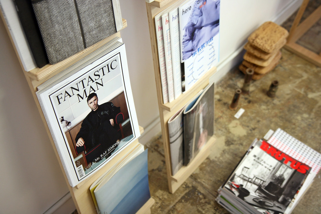
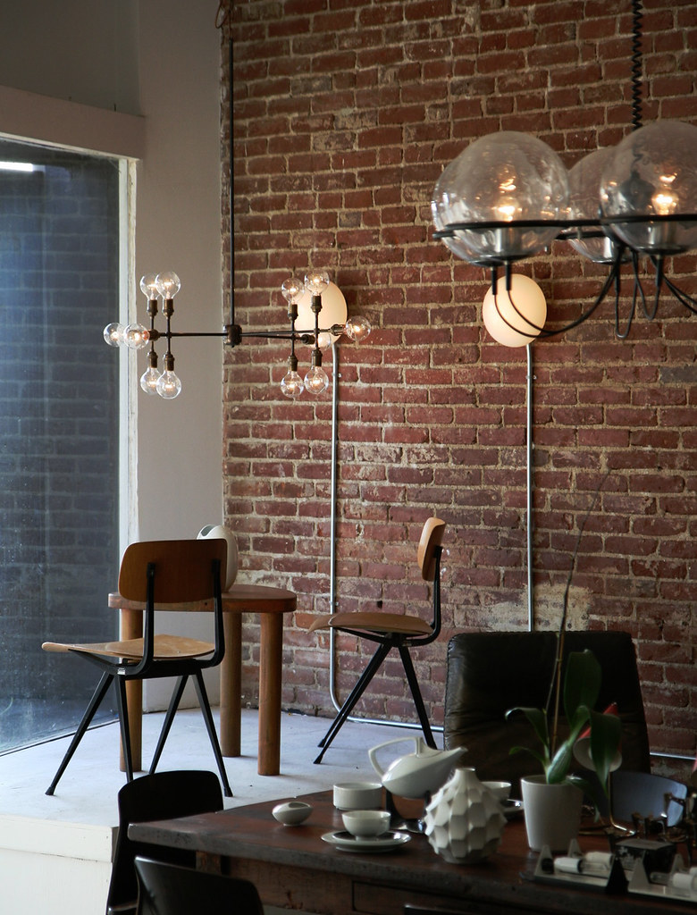
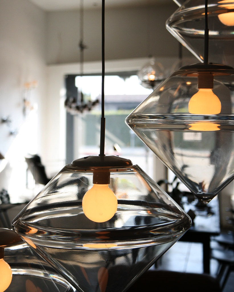
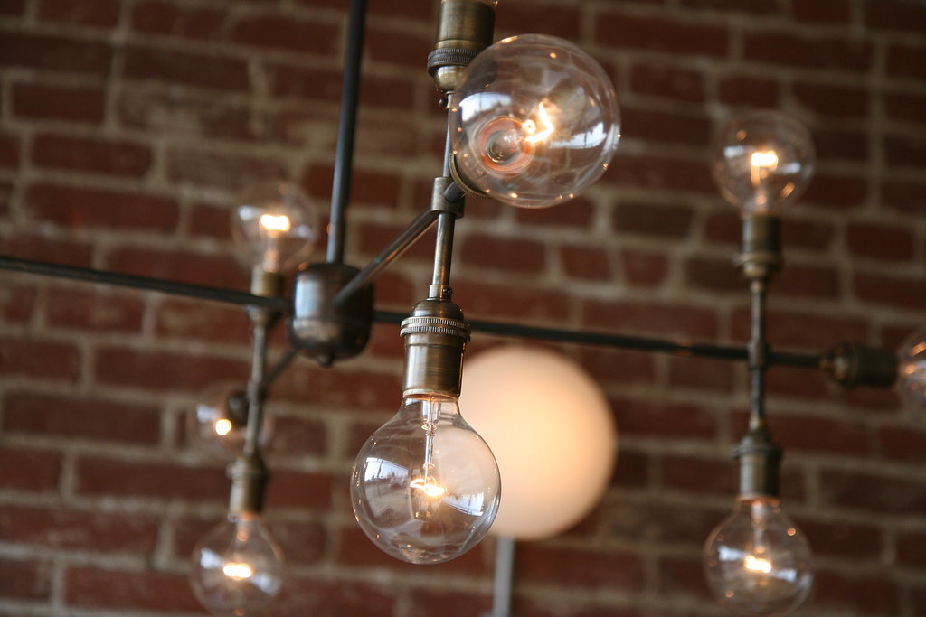
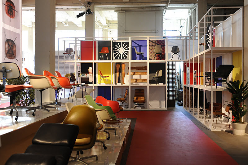
IKO IKO is the perfect place to pick up the latest Apartamento magazine, check out one of their curated shows, or purchase a gift for someone, or yourself. The store carries MerkelWare a line of everyday ceramics by Matt Merkel-Hess, Hannah Keefe's exquisite jewelry, as well as Shin's line of furniture & objects under the name
WAKA WAKA. IKO IKO also hosts Zachary Leener's ongoing ceramic sculptures, which now have been shown at Salon 94 and in the pages of PIN-UP Magazine. Read an interview here with Zachary...

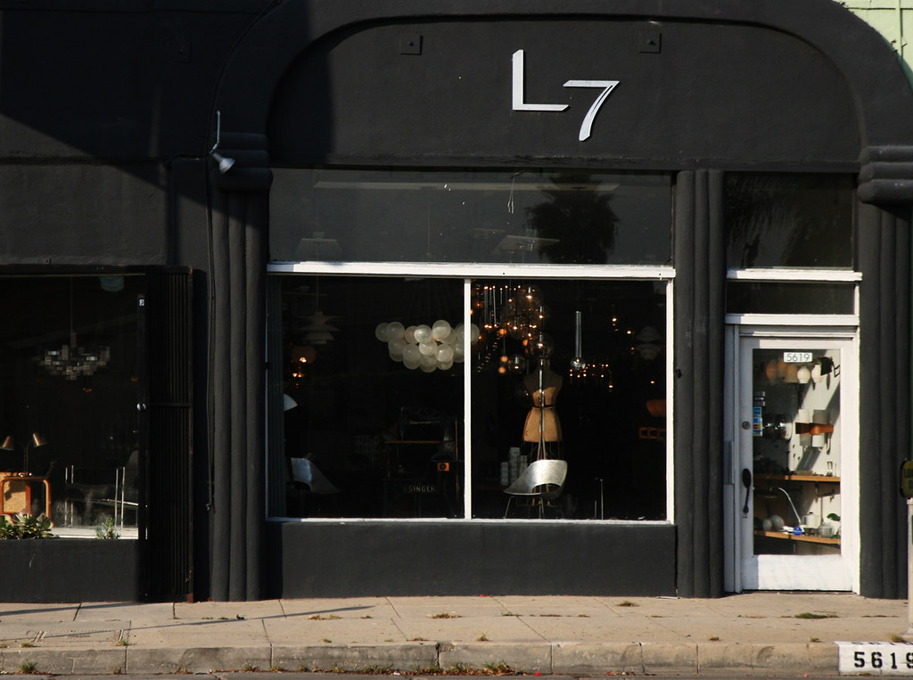
They recently moved to a new location on 931 North Fairfax Avenue, in the heart of Los Angeles. If you have not been to their new store, now is the perfect time! For those not here in LA, shop online with IKO IKO....

Thank you to Kristin and Shin.....
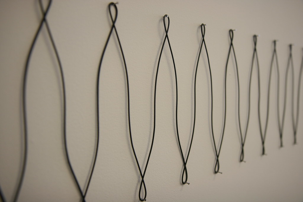
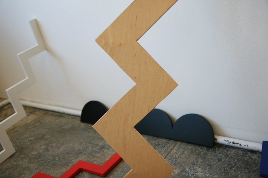
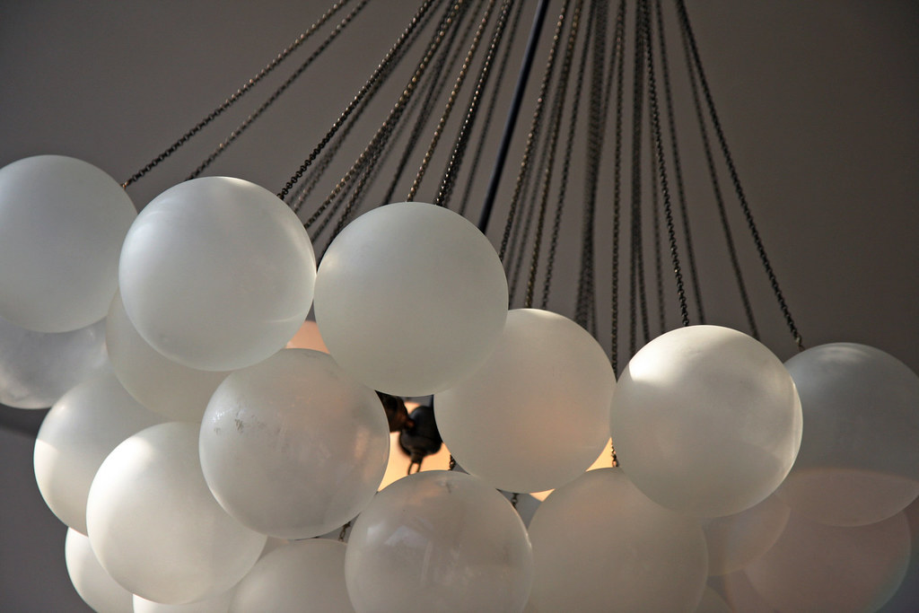
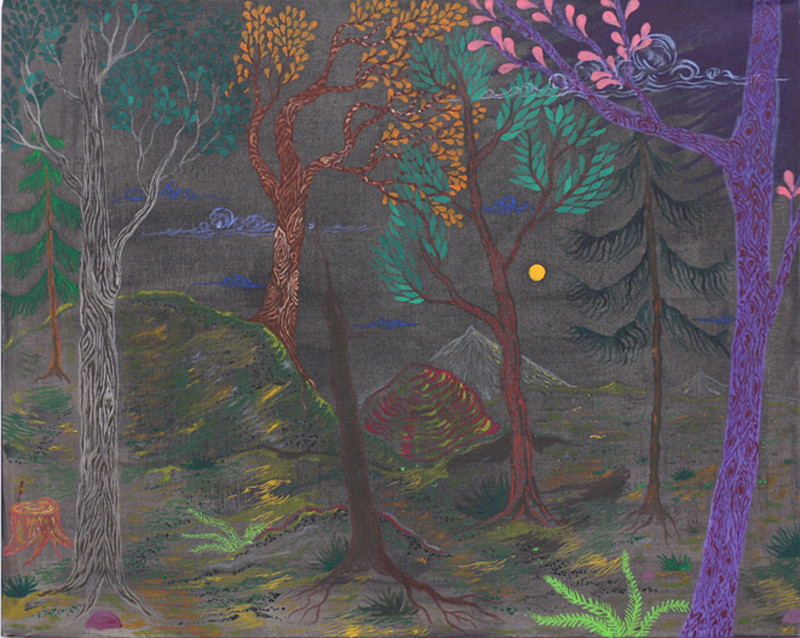


your own, personal, zig zag..
. by waka waka


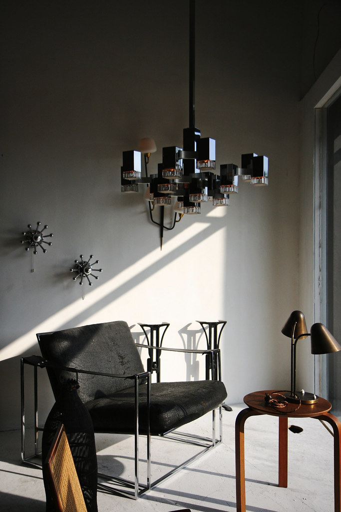
How do you view the "space" of the store?

As for the offerings of IKO IKO I want it to feel like an experience. So there's a balance in "space enhancing" sculpture, utilitarian work and then work that points to various traditions. I think the artists we show and the work Shin and I produce reveal a particular personality--a fascination with process, texture, pattern, humor and the unexpected.

The idea of limited editions and one-offs is also motivating in who we work with and gives a nice platform to what an artist or designer might want to make outside of their everyday practice. We try to make this a very personal space where ideas are moving around and the work is rotating. The arrangement of the space is determined by how these objects can articulate our story but also give a sense of being in a live space where you are interacting with these pieces.


How do you think about space, in your home, or in your store?

I think they both center around personal expression but more like private versus public expression. I think we view our home as a place with things that inspire us--a big library, our own travel finds and personal effects, but arrangements are created with the idea of living with our collection of things and objects. The store is where we want to inspire an audience, so the artists and makers we show at the store excite us and speak a language we feel is important to share with others. The store is our statement of what we find beautiful, intelligent, unusual and curious.


Tell us about the name of the store & how your store has evolved over the last few years.

It's credited as an old creole song with an original 1953 version (entitled Jock-A-Mo) by James "Sugar Boy" Crawford. A few other musicians had a try at it..the Dixie Cups, Cyndi Lauper, the Grateful Dead. In Gambian it means "attention!" or "listen up!" and in Japanese, "lets go!" I like the possibility it insinuates.


You recently moved your store from Echo Park to Fairfax in Hollywood. How is it?

Our Echo Park space felt more like you were window view into our tiny IKO IKO clubhouse (workshop included). Our new location feels like we've evolved to a more open architecture where there are white walls, big windows and a larger landscape for arranging pieces. It feels a bit more public and like were getting the chance to present our ideas to more people.

The space issue is a huge plus because it provides more opportunity to develop and show new pieces to a larger audience. We are lucky to have built relationships with some amazing artists who we continue to collaborate with on pieces specific to the store and to our concept of IKO IKO. What we are trying to do is build outside of the repetition and overlap that retail can be and create strong work and creative connections with the artists and designers we work with.


Anything you fear?

I try not to.


3 things I would never guess about you?

Tater tots
I would love to live in Spain and study lacemaking.
Art Laboe request line... here...


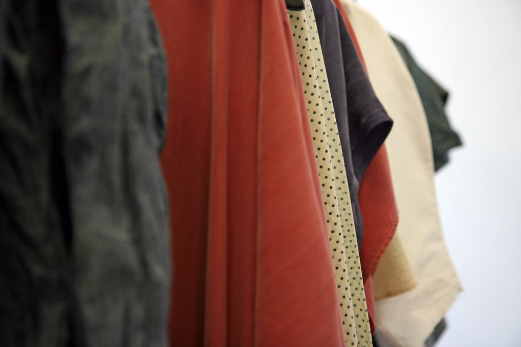
ROWENA SARTIN, Kristin Dickson's clothing line is sold exclusively at IKO IKO. What is your definition of beauty in regards to your clothing line?

I think you keep making things in search of beauty and what you want beauty to mean within your work. It's infinite. I find that working outside of the idea of a fall or spring collection is easiest for me, so it's more of a long stream of an idea with each clothing piece. I think also when I design it's less about accentuating the female form and more about the conversation the clothing can have on your body--how interesting is the shape, the construction, the finishing details. Those elements make a piece a beautiful idea when the balance is right.


Is there a specific time or place in "history" that occupies your mind?

Not completely, but I do think that the 80s were really visually liberating. It was exaggerated, ridiculous, and so obvious and open to interpretation in fashion. I like the geometry of clothing then, with all the over-sized proportions and how that translated to messages about power, movement, gender.


What colors, shapes, and materials are you attracted to these days?

I'm always attracted to texture and how to work variations of it together and how to drape it in a way that might feel unusual. I also like when fabric recalls certain textural effects like crumbled paper or a plastic bag. I think I also relate comfort to texture as well with the silks and washed rayons. I would have 20 colors all at once if possible, but I typically work with navy, black, white, natural and a few other color favorites--salmon, lavender and grey. I also try to have polka dots somewhere in there, too.


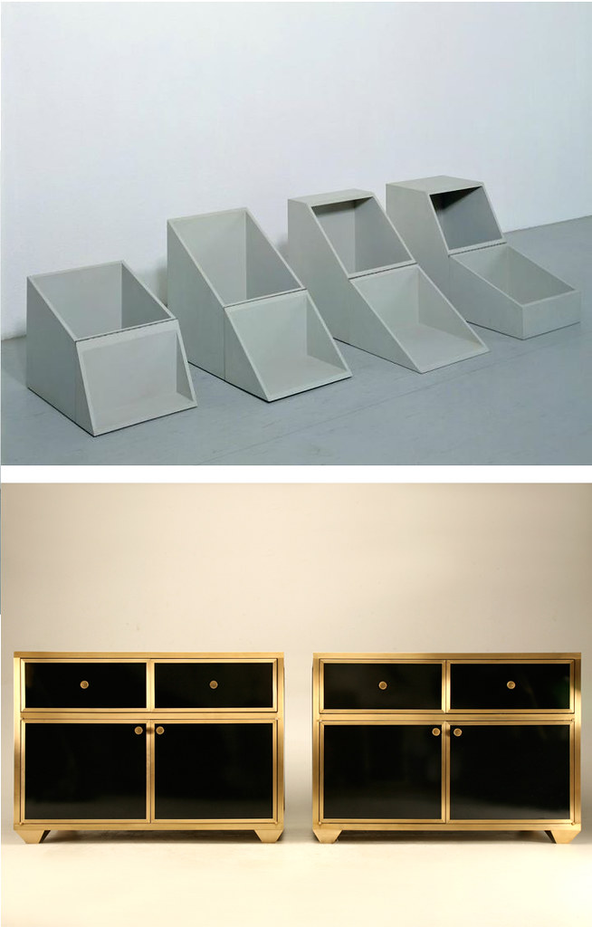
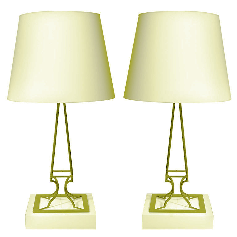
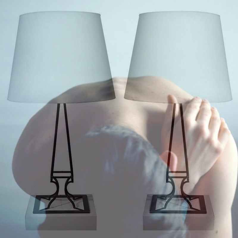
Shins furniture line is called WAKA WAKA. Are your names connected?


We wanted them to sound like family members or at least have a sing-along effect.


How does Shins work influence yours?

He has an incredible identity to his work. Everything he makes maintains a certain character and consistency in design which I think shows his individuality as well as a clear confidence in the process start to finish. I try to be conscious of the distinctions in my designs in the way he effortlessly does.


Is it fair to say your artistic relationship is becoming harder to distinguish?

We feel lucky to work with each other and also share so many similar reference points, inspirations, and creative goals. Its so rewarding to be able to have a creative partnership with your life partner but still have individual perspectives. There's a harmony but also a healthy discord which makes the final pieces work well.


What have you learned from your last few trips to traveling to Japan? Historically or socially? Have these trips altered your ideas of beauty & design?

The idea of respect is so profound from human interactions, to architecture and how people interact with space, honoring seasons, and how art is incorporated in life there--from ceramics to textiles, to plantlife to food. Leaving your comfort zone is much more enlightening when the idea of normal becomes indefinable and where customs and repetitive gestures show you a really everyday beauty.


How does life compare in Japan to Los Angeles?

I think in Los Angeles I'm more aware of the force in how people speak, drive, and interact in general. In Japan there's a marked consideration to certain details and how dutiful people are to those details--trash and recycling (at least 4 different recycling categories), the ceramics you use during each season (even applying it to chopstick rests), interior and exterior architecture (always removing your shoes when entering a home) and the intense presence of nature (flower arrangements both formal and casual in business and homes). Again, its a different application of respect in Japan that I think is really thoughtful.


Thank you to Kristin, for taking the time.
Looking forward to more conversations......

IKO IKO 931 N. FAIRFAX AVE. LOS ANGELES, CA 90046
323.719.1079 : HOURS : TUES-SAT 12-7 // SUN 12-5


photos by Marco Annunziata


--------------------
You have read this article a conversation with IKO IKO / kristin dickson with the title November 2011. You can bookmark this page URL http://gigibytes.blogspot.com/2011/11/a-conversation-with-iko-iko-kristin.html. Thanks!
YHBHS store visit with Gallery L7

"authentic 20th Century European lighting, furniture & objects."


Sven Neumann, owner of Gallery L7
5619 melrose ave, los angeles, ca 90038


What does your store specialize in?

We specialize in collecting important and/or exciting authentic 20th Century European lighting, furniture & objects. All items are handpicked, most of them are found during our frequent trips back to the German homeland, others we acquire through several European dealers that we work with.


Any specific items at the moment you are in love with?

Obsessed with Kaiser Idell lamps as well as kandem lights (both are German Bauhaus-aera lighting manufacturers) love Gaetano Sciolari cubic chandeliers for their exquisite composition. The “grasshopper” lounge chair by Preben Fabricius & Jørgen Kastholm.


photography courtesy of Marco Annunziata


Favorite architects / lighting designers?

Alvar Aalto, Charlotte Perriand, and Serge Mouille


What did you do before L7?


For the past 7 years I worked for Frank Gehry as a 3D Coordinator & Job Captain on medium to large scale projects. Before that I had engagements with Greg Lynn, Graft Lab & Imaginary Forces as a project architect.


2 new works by APPARATUS, a lighting studio in New York.


Visit Gallery L7 on 1st dibs here....
all images courtesy of Marco Annunziata


-----------
You have read this article gallery l7 / yhbhs store visit with the title November 2011. You can bookmark this page URL http://gigibytes.blogspot.com/2011/11/yhbhs-store-visit-with-gallery-l7.html. Thanks!
when paintings become a building.
when a building becomes a painting's memory.


Matthew Marks Gallery
,
1062 North Orange Grove, Los Angeles, opening January 19, 2012

"This 3000 square foot gallery for Chelsea gallery owner Matthew Marks, with a facade embellished with an Ellsworth Kelly sculpture, will open in January of 2012."

"ZELLNERPLUS is an award winning architectural design firm located in Culver City, California. ZELLNERPLUS has designed public and private art galleries, residences, institutional facilities and corporate work spaces in Los Angeles, San Francisco and New York. ZELLNERPLUS has been recognized in publications such as Art and Auction, Architectural Record, Domus, IDChina, The Architects Newspaper, Harper's Bazaar, The Los Angeles Times and The New York Times for its ability to deliver uniquely tailored spaces for art, living and working. ZELLNERPLUS was named by Domus Russia and the organizational committee of the ARCHIP International architectural committee as the laureate and winner of the ARCHIP-2009 Innovations award."


-----------------
You have read this article matthew marks moves to la / when a painting becomes a building / zellnerplus with the title November 2011. You can bookmark this page URL http://gigibytes.blogspot.com/2011/11/when-paintings-become-building.html. Thanks!
new works by Ricky Swallow
@ Marc Foxx, opens tonight

"The narratives that these new works create ask for quiet reflection on what might be considered the small pleasures of life, as they are made in proximity to our daily rituals in the moments where object-hood is more than just function or form, but rather an intimate relationship and exchange with ourselves."


Binder With Magnifying Glass 2011 Patinated Bronze.


Ricky Swallow
ʼs practice has always addressed materiality and transformation, as seen with his previous woodcarvings and their processes of reduction. This new area of Swallowʼs practice involves addition, improvisation and construction. The subtle evidence of the cardboard and tape used to construct the original model is quietly at play on the tactile surfaces of the works. The artistʼs careful and specific use of color in the patinas references utilitarianism, modernism and the rudimentary design palettes of Native American Art. The color of the patinas seem effortless, but are, in fact, a very intricate process, which is in contrast to a classical, more traditional approach to treating bronze. References can also be seen in this collection from Mid-Century modernist art, design, architecture and ceramics.

Variations on the form of the French curve appear throughout the show as an adaptive and playful motif, which echoes the nature of the cardboard tubing material from which each work was created. The use of the top hat, in “Blowing Hats”, 2011 and “Hat Clock/Open Study”, 2011 has been adapted to signify both playful dynamism as well as formal contemplation.


Ricky Swallow, at Marc Foxx
November 19 - December 22, 2011

all text courtesy of Marc Foxx


----------------------
You have read this article bronze / native art becomes bronze / ricky swallow with the title November 2011. You can bookmark this page URL http://gigibytes.blogspot.com/2011/11/new-works-b-y-ricky-swallow-marc-foxx.html. Thanks!
Old Plank Road : Chicago

"The fuel to feed this fire is most often found in the English Midlands, Italian Countryside or the charming South of France. Dozens of European trips have yielded thousands of treasures brought back to America in shipping containers and suitcases (when necessary)."


"Unique margarine store counter from England with a stone top and marble surround. Ideal as a kitchen accent piece or utilized as a small island or desk, this is fantastic... "


Old Plank Road has been importing and restoring European antiques and vintage furniture since 1992. In January 2011 they moved to their new location in a beautiful restored vintage building in Chicago with 31,000 square feet of space - a fitting backdrop for our spectacular inventory. (more here)


-------------
You have read this article chicago shopping / margarine store counter / old plank road with the title November 2011. You can bookmark this page URL http://gigibytes.blogspot.com/2011/11/old-plank-road-chicago-fuel-to-feed.html. Thanks!
"I like to think of my work as a threshold between
in and out, object and space, heavy and light."

- Peter Shelton


Peter Shelton: eyehand
Selected sculpture from 1975 - 2011 at L.A. Louver, Los Angeles
19 November - 30 December 2011


"A lot of my early work started off nominally geometric and constructed, but I would sneak in a reference to the body without depicting the body, which was a way of creating a kind of subversive connection. Desire, memory, humor, even wistfulness are powerful psychic qualities that I do not avoid. I wanted to enter the work directly and have its narrative understood as much in the body as the mind."

"I like to think of my work as a threshold between in and out, object and space, heavy and light. You can see a preoccupation with the piercing of a membrane as a theme in flattop, 1975, with its overhead plane extended endlessly by mobility of it wheels. holecan, 1980 is an anthropometric planetarium of perforations. And recently blackslot, 2008-10 pushes its elusive objectified inner out to its edges where its containing skin defuses into an indefinite surface bleeding off into space.

-- Peter Shelton


Born in 1951, Peter Shelton was a pre-medical student at Pomona College, studying sociology, anthropology and theatre, before he switched to major in fine art. Shelton went on to earn a trade certificate in welding from the Hobart School of Welding Technology in his hometown of Troy, Ohio, in 1974, and a MFA from the University of California Los Angeles in 1979.

more here....
You have read this article art / art as objects / eyehand / peter shelton / pst time with the title November 2011. You can bookmark this page URL http://gigibytes.blogspot.com/2011/11/i-like-to-think-of-my-work-as-threshold.html. Thanks!
new works by Abel Auer

"They are dream worlds, parallel worlds,

contrary to the artist’s own urban living environment."


Abel Auer: In the future
till 10 December 2010 at Sies + Hoke

"The American philosopher David K. Lewis says that everything we can think of inherently contains the possibility of existence. Abel Auer goes one step further. He constitutes a possible world not only on the intellectual level, he shows it to the viewer in his paintings. The question of whether this world is parallel, alternative or contrary to ours remains unanswered. The unshakable duration of this reality is based on his use of unreal colors, bizarre shapes and distorted perspectives, culminating in the borders of arabesque crochets.

..

Sentimentalism and nostalgia are manifest in his paintings, the longing and the substitute for a lost nature
. At once they are personal and reaching to an universal level of human understanding. The figures creeping through fantastic landscapes are reminiscent of heroic characters in the works of Poe, Kafka, Baudelaire or Ensor’s paintings. The strange other-worldliness and unity of the self-contained, hermetic world is drawing the viewer into the narrative, testing his or her sensitivity. 
Abel Auer’s images are an exploration of 19th Century landscape painting... They are dream worlds, parallel worlds, contrary to the artist’s own urban living environment."


all text taken from here..


--------------------
You have read this article abel auer / artists / new painting / sies + hoke with the title November 2011. You can bookmark this page URL http://gigibytes.blogspot.com/2011/11/new-works-by-abel-auer-they-are-dream.html. Thanks!
"from where you just arrived"
vs
"a square with returns eventually returns to a corner."


"When we are honest – that’s my saying – if we are honest then we will reveal ourselves. But we do not have to make an effort to be individualistic, different from others. You see that is the nonsense of the last 15, 20 years, the two decades, of the great famous American decades of Abstract Expressionism.

What is wrong there is that everyone wants to be different from the already different ones.
And then they ended up all alike. And we are tired of that. And the youngsters feel that now. And they don’t continue, you see. They see this will not last."

- Josef Albers.... 1968, Archives of American Art, Smithsonian Institution


"from where you just arrived"
vs
"a square with returns eventually returns to a corner."


1. Andree Putman, from the book "Complete Works." Paris 1992. "The bathroom, containing a bathtub, square sink composed as a single block, and recessed soap holder is covered entirely in gray ceramic 5 x 5 tiles. Along the walls runs a rhythmic frieze of glass squares gilded with white gold. Hidden in niches behnd a beveld mirror are storage spaces. An illuminated groove is recessed in the false ceiling, under a pane of sandblasted glass. The pendant lamps are covered in shades made of parchment, similar to Chinese lanterns.... (here)

2. Manuel Canovas, Paris, textiles... see the entire collection here... perfect for sofa upholstery, faded squares of light.

3. Laura Owens. at Pepin Moore... "From Where You Just Arrived".... A brilliant show of paintings in Chinatown. This smaller work by Laura Owens captivated me with its pink and blue grids, and has stuck in my mind throughout the weekend. Other works by Jonas Wood and Ruby Neri, and lots of impressive smaller works at Pepin Moore....

"Organized by Ryan Schneider in New York and Jonas Wood in Los Angeles. Schneider and Wood draw comparisons between the painting scenes in their respective cities by including the work of artists in their immediate circles of friends and contemporaries. The exhibition, inclusive of works by nine artists from each city, exposes the dialog between these two centers of contemporary American painting. "


----------------------
You have read this article andree putman / bathroom design / josef albers interview / laura owens / manuel canovas / textiles and paintings / the sqaure tile / the square in art / tiled bathrooms with the title November 2011. You can bookmark this page URL http://gigibytes.blogspot.com/2011/11/from-where-you-just-arrived-vs-square.html. Thanks!

Apartamento #08

....
"there are always a few days during a Los Angeles winter,
when the sky seems to open up, and all the water falls out."


"The afternoon I handed the keys to the new homeowners, there was a certain sadness I felt as I stood on the back porch, gazing off into the dense foliage, as the rain began to fall. In California, I’ve always welcomed the rain, as the sun is often in abundance. But there are always a few days during a Los Angeles winter, when the sky seems to open up, and all the water falls out."

- "The Backyard" by David John, in APARTAMENTO #08


Thank you Apartamento for asking me to be part of the latest edition. From the looks of the cover, this is going to be another mind-melting edition. Faye Toogood, Rafael Cardenas, Michael Stipe, Marcelo Krasilcic, Nathalie Du Pasquier, Patrick Parrish, and tons more....
You have read this article an everyday life interiors magazine / apartamento / la winter with the title November 2011. You can bookmark this page URL http://gigibytes.blogspot.com/2011/11/apartamento-08.html. Thanks!
"Time is transparent.
We move through it unwittingly,

conditioned by its constancy."


Sam Falls, Untitled (West Hollywood, CA. Green)
2011 hand-dyed green cotton and metal grommets


M+B is now showing works curated by Sam Falls & Matt Moravec. TIME AND MATERIAL will be on view from November 4 to December 22. Participating artists include Sam Falls, Jacob Kassay, N. Dash, Kyle Thurman and Joe Zorrilla.

"Time is transparent. We move through it unwittingly, conditioned by its constancy.

It's passage is recorded on everything: obtaining, detaining, reflecting and detecting the subtle morbid dance of existence and material."


Jacob Kassay, Untitled 2011 sand, jute


The work in this exhibition embraces the inevitable. The wrists acknowledge the object's empirical place in linear time. A place which is at no moment more complete, and at the end of which, awaits an unavoidable fate: that of its devolvement. Despite this material dissolution, the concept persists through time's weathering wash. The life of the object is to exist as we do, between two bookends, gathered up and let out."


---------------------
You have read this article dusty time capsule / jacob kassay / mb art / sam falls / sand and jute with the title November 2011. You can bookmark this page URL http://gigibytes.blogspot.com/2011/11/time-is-transparent.html. Thanks!


Tonight's event is full! Hope you reserved a spot for de Lab's latest design excursion! Tonight, Daniel Ostroff curator & editor is giving us a guided tour. Directly after, we will be getting boozed up across the street, at street, feverishly getting drunk on cocktails. Not a bad way to spend a Tuesday night! Cheers.

"de LaB (dee-lab) unites Los Angeles creatives in efforts to improve and engage the city with events that are one part education, one part inspiration, and one part libation."

"Our next de LaB ducks into the showroom of legendary furniture dealer JF Chen for their latest show, Collecting Eames. The show features 425 products designed by Charles and Ray Eames, making it the largest and most diverse gathering of Eames objects in the U.S. In addition to the pieces of furniture for which the duo was best known, the show also includes rare posters, toys, and graphics, and extremely unique pieces like an Eames-designed tube radio.
Our tour will be guided by curator and editor of
EamesDesigns Daniel Ostroff, who will point out some of the gems in this fascinating collection, and talk about the book which is being published about the show."

read more here..

941 North Highland Avenue
Los Angeles, CA 90038 USA
You have read this article collecting eames / delab with the title November 2011. You can bookmark this page URL http://gigibytes.blogspot.com/2011/11/tonights-event-is-full-hope-you.html. Thanks!

a conversation with Christopher Farr

....
"A slow and deliberate process that allowed for an honest and inimitable collection that speaks entirely of their integrity throughout the stages of selection, translation and manufacturing."


"The question as ever is one of excellence and quality as opposed to medocrity and plagiarism these forces battle it out and occasionally you see something breathtaking."


748 N. La Cienega Boulevard Los Angeles...

Last week, I spent the afternoon absorbed in the works of
Christopher Farr's Omega Group Collection. Tucked away down a small walkway is Christopher Farr's showroom, two floors of color, historical stories, fabrics samples, and inspiration in every room. Christopher Farr's work inspires so many designers for obvious reasons: pure beauty and a commitment to historical and contemporary artistic discoveries.

He has collaborated with design icons such as Ilse Crawford, John Pawson, Allegra Hicks, Gunta Stolz, and Gary Hume, to name only a few. I'm honored to have had this conversation with him, and hope that the future will lead to more conversations with him about his various styles of workings, and mediums.


Thank you Christopher, Christina, and Joe..... - David John


a detail shot of one of the rugs....


Christopher Farr selects a series of existing designs by the Omega Group, and brings them back to life in a series of 5 exceptional rug creations, based on the designs of Roger Fry, Vanessa Bell, Duncan Grant and other key members of the Omega Workshop and Bloomsbury collective from 1912-1919.

Christopher Farr has chosen to work with some of the most beautiful and challenging of the Omega designs. This is testimony to the Omega artists’ design abilities in that they were able to create works of art that also function perfectly as rugs."

"The Omega Workshop were
a laboratory of design ideas, creating a range of objects for the home, from rugs and linens to ceramics, furniture and clothing ­ all boldly coloured with dynamic abstract patterns."


upstairs at the showroom...
until Nov 19, 2011


Who are the OMEGA Workshop, and why is their work relevant today?


Christopher Farr: The Omega Workshop was an experiment conducted by the founder Roger Fry. An important aspect was practical in that it enabled the well educated but cash poor artists to earn a living with as little compromise and as much enjoyment as possible. Omega is relevant today in terms of it's spirit and spontaneity as opposed to the contrived cleverness of so much of the output of today's art and design practitioners.


Did you grow up in London? Do you feel that British Design is different from American Design?

Farr: Yes I'm a Londoner by birth and have lived there most of my life. I relate to European design more as I know it better.The difference for me is that product design is celebrated much more in Europe, in the US it seems that interior designers are lauded and to a lesser extent architects. If you go back to the fifties and sixties I would say American designers and architects were easily as influential and perhaps more famous than their European counter parts.


How you are able to translate images to rugs? What are the obstacles and difficulties that arise?

Farr: The success of making historic designs is dependent on our understanding of the essence of the art you're working with. The process is basically a series of questions and sampling till it feels close to the spirit of the artist. I try to imagine myself in dialogue with the artist. It's a slow and painstaking business but deeply satisfying.


You have an ability to control, energize, and define color. Would you call yourself a colorist? Any artists who use color you look to as inspiration?

I find any self definition limiting so no I'm not a colorist as such. I try to stay as open as possible when I'm drawing as if I'm a kid playing with a cardboard box. As for artists well the usual suspects... Joseph Albers, Mark Rothko, Pierre Bonnard, Henri Matisse Sonia Delaunay .....


the studio wall of color! colors fading & communicating.....


You've had a history of incredible collaborations. What does collaborating mean to you? Any specific one that you are especially proud?

Collaborating means to surrender ones slavery to ego in order to listen and understand another artists process. I'm proud of all the collaborations, and if I had to pick standouts it would be Kate Blee of the living artists and Gunta Stolzl of the dead ones.


In your art studio, what do you find yourself creating? What mediums seduce you?


Black ink drawings by the hundred and painting both acrylic and oil. I also play with tape.


How has the rug business changed in time from when you began?


The contemporary rug business has moved from almost zero when I started in 1984 to a status of dominance - you only have to look at the editorial and advertising then and now to see how dramatic it has been. The question as ever is one of excellence and quality as opposed to medocrity and plagiarism these forces battle it out and occasionally you see something breathtaking.


samples of Christopher Farr cloth....


Christopher Farr has been at the spearhead of contemporary rug design for over twenty years. Together with his business partner Matthew Bourne, they were the catalyst that revolutionised contemporary rug design. Starting with a small shop in a leafy area of north London, a stone's throw from Primrose Hill, this one time painter, trained at the Slade School, wrought a vision that combined the art of the times with a different form. From cool minimalism to bold neo-expressionism influenced by the artists Ryman, Albers and Martin, his medium was no longer oil on canvas, but wool and dye, spun and woven by hand into objects that were more than mere floor coverings. They were themselves works of art.


---

-----------------------------


--------------------
You have read this article a conversation with christopher farr / christopher farr with the title November 2011. You can bookmark this page URL http://gigibytes.blogspot.com/2011/11/a-conversation-with-christopher-farr.html. Thanks!
"The pitchfork needs earth or it isn't really a pitchfork. It only, it needs something else in order to be activated, and my, the light-bulb needs electricity, it needs a socket to go into, you know. "

Michael Craig-Martin
vs
Old Plank Road


Michael Craig Martin, 1960's
vs
Old Plank Road


"Well I've, I've always considered that the, all of the image, the images that I use have to do with some play between presence and absence.

I mean all of the objects, because each object is seen individually, it always needs another object in order to be completed. The pitchfork needs earth or it isn't really a pitchfork. It only, it needs something else in order to be activated, and my, the light-bulb needs electricity, it needs a socket to go into, you know. All the different things need something, and the other thing that's, that's present and also absent in all of them is human presence, they are all the most human of objects.

No one looks at these things without thinking of their own life, without thinking of these things mean something to absolutely everybody."

- Michael Craig-Martin, interview here...


second image via here...

Antiques on Old Plank Road, Inc.
1750 N. Springfield Avenue


--------------------------
You have read this article art as objects / the activation of objects with the title November 2011. You can bookmark this page URL http://gigibytes.blogspot.com/2011/11/the-pitchfork-needs-earth-or-it-isnt.html. Thanks!
"I'm shape-shifting from place to place,
bending time, curving space"
(here)

Jean Michael Frank
vs
Jochen Weber


Have you ever wanted to believe something so much,
that you actually believed it?


"A cousin of Anna Frank, author of the celebrated “diary”, Jean-Michael Frank was born into a well-to-do Parisian family. Before working as an interior designer, he travelled at length around the world, an experience which profoundly influenced his work. Frank practiced his trade as an interior designer with enormous success. A relatively new concept for the time, interior design distinguished itself from both architecture and industrial design. Among Frank's patrons were some of the most renowned personages of his age, from poet René Crevel to artists such as Giacometti, Dalì, Bérard, Paul Eluard, Louis Aragon and Nelson Rockefeller.

In 1939 he was forced to leave Paris to avoid Nazi persecution, taking refuge first in Argentina and then in the USA, where he died tragically, committing suicide as his brother had already done in Paris. His style – defined as “poor luxurious” or simply “Frank style” – was highly successful during the 1930s and ’40s, and still today remains a benchmark for contemporary interior design. His furniture are elegant and rigorous, sophisticated in its use of materials yet simple in its classic, refined lines." (here)


sculpture by Jochen Weber, via here.....
2 lamps by Jean Michael Frank, BAC Gallery.


------------------
You have read this article when a lamp becomes a photographed / when a lamp becomes a song with the title November 2011. You can bookmark this page URL http://gigibytes.blogspot.com/2011/11/im-shape-shifting-from-place-to-place.html. Thanks!
new work:
Michael Rey @ Young Art gallery
till Nov 20, 2011


big gay heart
, 2011

primer, wood, steel 53 x 12.25 x 120 inches


Young Art Gallery, one of LA's defining galleries at the moment, continues to show some of the most interesting sculptures in a tiny gallery space tucked away on a small street in Chinatown. Michael Rey's latest works should be fully encountered.


Michael Rey’s shaped wall works and sculptures issue from an encounter between high modernism and traces of ’80s goth culture—a collision of nostalgias that mutually undermine each other. Rather than hold up modernism as a patriarchal presence against which to mount a heavy handed Oedipal attack, Rey treats it as a source of some of the diverse free-floating signifiers from his childhood, made meaningful associatively rather than through art historical reference. Eschewing any heroic anti-heroism, the artist opts for a playful reinvention of lost objects he knows to be culturally phantasmic. Although Rey’s objects can be (partially) read as exercises in de-sublimation, they are best understood as libidinal configurations always in the process of metamorphosis and which refuse any singular fixed meaning.

The 8 monochromatic wall works are panels entirely surfaced in oil-based plasticine clay. The peculiarity of this material is that it remains forever malleable even after its oil paint finish has dried. The resulting surfaces are epidermal in their fragility and suggestive of these works’ metaphoric permeability to their surroundings and to the viewer’s gaze, a permeability enhanced by the orifices that pierce their surface planes. The plastic quality of the clay, with its infinite capacity to accept impressions, hints at corporeal vulnerability while simultaneously evoking fetishistic display.


Young Art: 418 Bamboo Lane, Unit B
Los Angeles CA 90012


-----------------

You have read this article micahel rey / young art gallery with the title November 2011. You can bookmark this page URL http://gigibytes.blogspot.com/2011/11/new-work-michael-rey-young-art-gallery.html. Thanks!
Related Posts Plugin for WordPress, Blogger...