LAMA & YHBHS

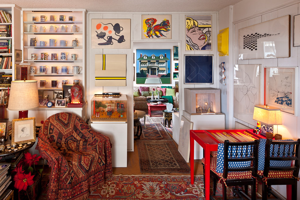
“Well, I’ll confess something. I like happy art.

And you’ll notice most of the art is happy.” - Richard Dorso


image: Richard Dorso's Los Angeles home.

Photography © Grant Mudford.


YHBHS & LAMA! For the next month, I'll be sharing lots of images, related interviews, & events regarding an interior space I have created for LAMA's next auction. The YHBHS exhibition space will be open to the public beginning September 19, until the day of the auction, October 9, 2011. The space is getting close to being installed, painted, wallpapered with KREME papers, furniture selected, & all soon to be photographed! Please check it out in person if you are in Los Angeles.


When Peter Loughrey, Director of LAMA, first showed me the photographs of Richard Dorso's L.A. home, I was immediately transported by his collection & the story his residence told about the forms and colors of 60s California art. I'm creating a temporary open space inspired by the geometrical, hard-edged works from Dorso's collection by Baldessari, McCracken, Ruscha, Arnoldi, and many other early California artists. Lots more to share in the next weeks. - David John


"Los Angeles Modern Auctions (LAMA) and You Have Been Here Sometime (YHBHS) will partner together to produce a special interior showcase for LAMA’s Pacific Standard Time exhibit Collecting in Los Angeles 1945 – 1980. This 3 week exhibit explores the collecting practices of Richard Dorso, a native Californian, who at age 101 left behind a unique art collection spanning much of the 20th century. The exhibit will conclude with an auction of the entire collection on October 9, 2011."


Auction: October 9, 2011; 12pm Noon (PST) Pacific Standard Time Exhibition

Preview: September 19 – October 8, 2011. Open daily 10am – 6pm Auction, Exhibit.

Preview Location: 16145 Hart St. Van Nuys, CA 91406


Visit LAMA here.

Keep informed on events on the LAMA Blog!


-------------------

You have read this article california artists / john mccracken / lama / los angeles modern auctions / richard dorso / yhbhs and lama with the title August 2011. You can bookmark this page URL http://gigibytes.blogspot.com/2011/08/lama-yhbhs.html. Thanks!
"RISK lies at the core of crafts,

risk of failure always accompanies new discovery, new beauty."


new works by David Taylor


Last year, YHBHS had the pleasure of interviewing David Taylor about his work & his design philosophy. He talked about his philosophy as a simple connection to a larger feeling of "if it feels good do it." Something about his words resonated on a deep level, echoing and finding meaning in my own work. It points to a moment when there is clarity in our thoughts, and the decision to move ahead with instinct, as opposed to doubt.


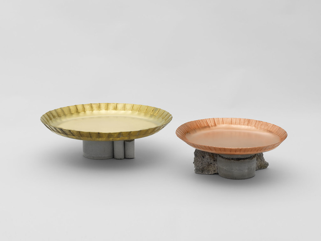
David Taylor's new work will be up in Stockholm this September, and his latest works are a continuation of his personal explorations into form + materials + humor.
- David John


"In his forthcoming exhibition Walk the Walk at Konsthantverkarna in Stockholm, David Taylor presents a cohesive body of work developed by whim and impulse at the workbench. By following a notion, working by ear and improvising with unexpected materials without fuss and undue analysis Taylor gives us an insight into the importance of intuitive knowledge, that “gut feeling” which is often more relevant than we can appreciate.


Walk the Walk is a tightly knit family of objects where Taylor’s signature style has been broadened with materials and techniques rarely seen in his work. Concrete meets silver the precise and timeless encounter the modern and impermanent. This latest edition from Taylor’s workshop is made with a clarity of intention and a conviction in execution, that leaves not doubt the author can not only talk the talk, but knows a thing or two about walking the walk."


- Petter Eklund


Go to David Taylor's site

Read the YHBHS interview with David Taylor

Visit Konsthantverkarna


----------------------


You have read this article concrete and silver / david taylor / impermanence / Konsthantverkarna / modern works / stockholm design / walk the walk with the title August 2011. You can bookmark this page URL http://gigibytes.blogspot.com/2011/08/risk-lies-at-core-of-crafts-risk-of.html. Thanks!
It Happened at Pomona: Art at the Edge of Los Angeles 1969–1973 "demonstrates the ways in which several groups of artists who were associated with Pomona College between 1969 and 1973 engaged with the art of their time in Southern California and contributed to a transformative moment for art history both in Los Angeles and internationally."


YHBHS is gearing up for Pacific Standard Time exhibitions, that are about to explode in about 60 different venues all over Los Angeles. Anyone excited about California design, Post War Art + Sculpture + Design should have plenty to keep their minds & eyes occupied in the upcoming months. First stop, will be Pomona to check out the latest exhibition, It Happened at Pomona, Part 1: Hal Glicksman at Pomona August 30–November 6, 2011....


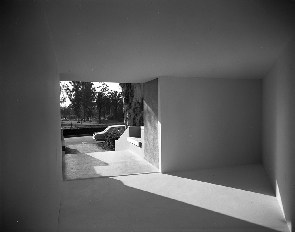
"The highlight of this exhibition will be the creation of a new work by Michael Asher in response to his landmark 1970 installation at Pomona College, and the re-creations of seminal installations by Lloyd Hamrol and Tom Eatheron. Asher’s 1970 architectural intervention dramatically altered two of the museum’s adjacent galleries (the South and West Galleries), transforming them into two triangular spaces joined by a narrow opening that severely restricted the flow of light into one space while keeping the other space permanently open to the street outside.


"Like many artists of his generation, Michael Asher took his lead from Minimalism’s theatricality, which was designed to enhance viewers’ perceptual awareness of their role within the exhibition space. Yet where many of Asher’s peers responded by expanding their practice into the more temporal realms of film and performance, Asher focused on the temporal as a condition of the spatial, which aligned his work more specifically with architecture. Overall, Asher’s entire oeuvre has investigated how viewers encounter specific sites, primarily spaces dedicated to the presentation of visual art. As a result, Asher’s work is typically associated with the Conceptual art practice of Institutional Critique". (text taken from here)


read more here...


image above, Michael Asher, installation, 1970. Viewing out of gallery toward street from small triangular area, Pomona College Museum of Art. Photograph courtesy of the Frank J. Thomas Archives.


-----------------


You have read this article It Happened at Pomona: Art at the Edge of Los Angeles / los angeles 1970 / michael asher / pacific standard time with the title August 2011. You can bookmark this page URL http://gigibytes.blogspot.com/2011/08/it-happened-at-pomona-art-at-edge-of.html. Thanks!
"I started Matthew Hilton, the company,

because I wanted somewhere I would have complete creative control.


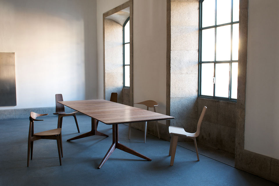
"The company was launched in September 2007 and very soon after, made it's first Licence agreement for manufacturing and distribution of the products with De La Espada. The pieces shown here are the first of a growing number of high-quality products which will be made in relatively small quantities, using hand-skills based manufacturing. I will be regularly adding new products using different techniques and materials.


Matthew Hilton
was born in Hastings in 1957. He graduated with a degree in Furniture Design from Kingston Polytechnic in 1979 when he started to design and manufacture a range of objects using low-tech casting techniques. These were picked up by Paul Smith and Joseph Pour La Maison and sold in their London showrooms. From 1980 to '84 Matthew worked as an industrial designer for the product design company Capa, London. During this time he also designed sets for the renowned fashion designer Koji Tatsuno's company Cultureshock.


more here...


--------------------------

You have read this article contemporary furniture / elements of a room / furniture design / matthew hilton / wood furniture with the title August 2011. You can bookmark this page URL http://gigibytes.blogspot.com/2011/08/i-started-matthew-hilton-company.html. Thanks!
portrait of the quiet sitting room. pt 57

...

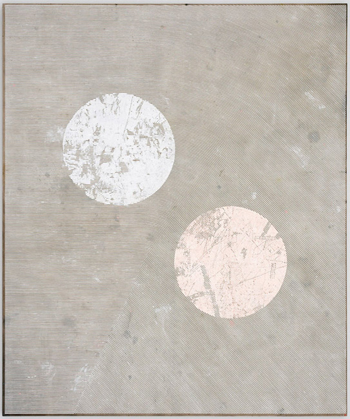
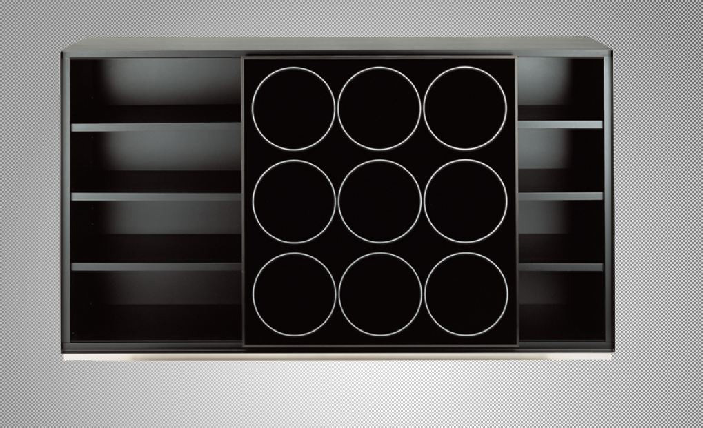
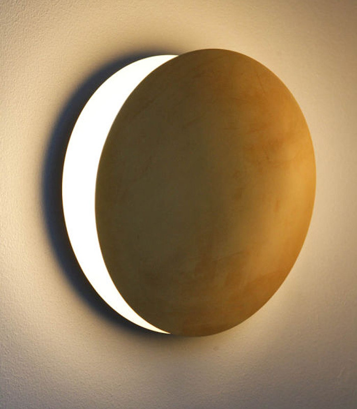
two circles, nine circles, & one circle.

aka

a painting, a cabinet, and a sconce.


"Luminous circles evoke eyes, as they are transformed into gray and brown scale color wheels, oceanic whirls, pentagons, and stars." via here


Portrait of the quiet sitting room. pt 57

...

two circles, nine circles, & one circle.

aka

a painting, a cabinet, and a sconce.


images:

1. Garth Weiser, c/o Casey Kaplan Gallery

2. Carlo Colombo, 2004, Zanotta Italia

3. Rewire Custom Sconce, Los Angeles. a lunar perfection.


----------------------------


You have read this article garth weiser / light / light becomes us / luminous circles / portrait of a sitting room / sconce / when furniture becomes the future / zanotta italia with the title August 2011. You can bookmark this page URL http://gigibytes.blogspot.com/2011/08/portrait-of-quiet-sitting-room.html. Thanks!

P O S T M O D E R N I S M

"Postmodernism was more like a broken mirror, a reflecting surface made of many fragments. "

vs

"Excuse me child, I am trying
to see all the colors and wonder your brightness can be. Return to nothingness and joy just might be right. "


Postmodernism: Style and Subversion 1970-1990

London: V&A from 24 September 2011-8 January 2012.

I was born in 1974, which means in 1984, I was 10 years old.

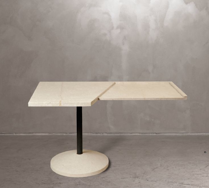
1984... New Order has just released Power Lies and Corruption, Ronald Reagan is President, Derek Jarman releases Imagining October, The Apple Macintosh is introduced, Molly Ringwald in Sixteen Candles premieres, Madonna releases "Borderline, Ettore Sottsass designs the Mimosa Table, Andy Warhol paints a portrait of Michael Jackson, Keith Haring gains more and more fame, and by the end of 1984, there had been 7,699 AIDS cases and 3,665 AIDS deaths in the USA.

A time of extreme movement and rebellion, this was my Y O U T H. Let's Dance! - David John


i-D, no 28. The Art Issue, August 1985. Styled by William Faulkner, design by Terry Jones, photograph by Nick Knight, featuring Lizzy Tear.


London: V&A from 24 September 2011-8 January 2012.

"Of all movements in art and design history, postmodernism is perhaps the most controversial. This era defies definition... Postmodernism was an unstable mix of the theatrical and theoretical. It was visually thrilling, a multifaceted style that ranged from the colorful to the ruinous, the ludicrous to the luxurious."

What they all had in common was a drastic departure from modernism’s utopian visions, which had been based on clarity and simplicity. The modernists wanted to open a window onto a new world. Postmodernism, by contrast, was more like a broken mirror, a reflecting surface made of many fragments. Its key principles were complexity and contradiction. It was meant to resist authority, yet over the course of two decades, from about 1970 to 1990, it became enmeshed in the very circuits of money and influence that it had initially sought to dismantle.

Postmodernism shattered established ideas about STYLE. It brought a radical freedom to art and design, through gestures that were often funny, sometimes confrontational and occasionally absurd. Most of all, postmodernism brought a new self-awareness about style itself."


"I feel so extraordinary Something's got a hold on me

I get this feeling
I'm in motion
A sudden sense of liberty

I don't care 'cause I'm not there And I don't care if I'm here tomorrow."

(both lyrics by Hot Chip & New Order...)


You have read this article madonna / postmodernism / style and subversion / v of a museum london / what is a postmodernists with the title August 2011. You can bookmark this page URL http://gigibytes.blogspot.com/2011/08/p-o-s-t-m-o-d-e-r-n-i-s-m.html. Thanks!
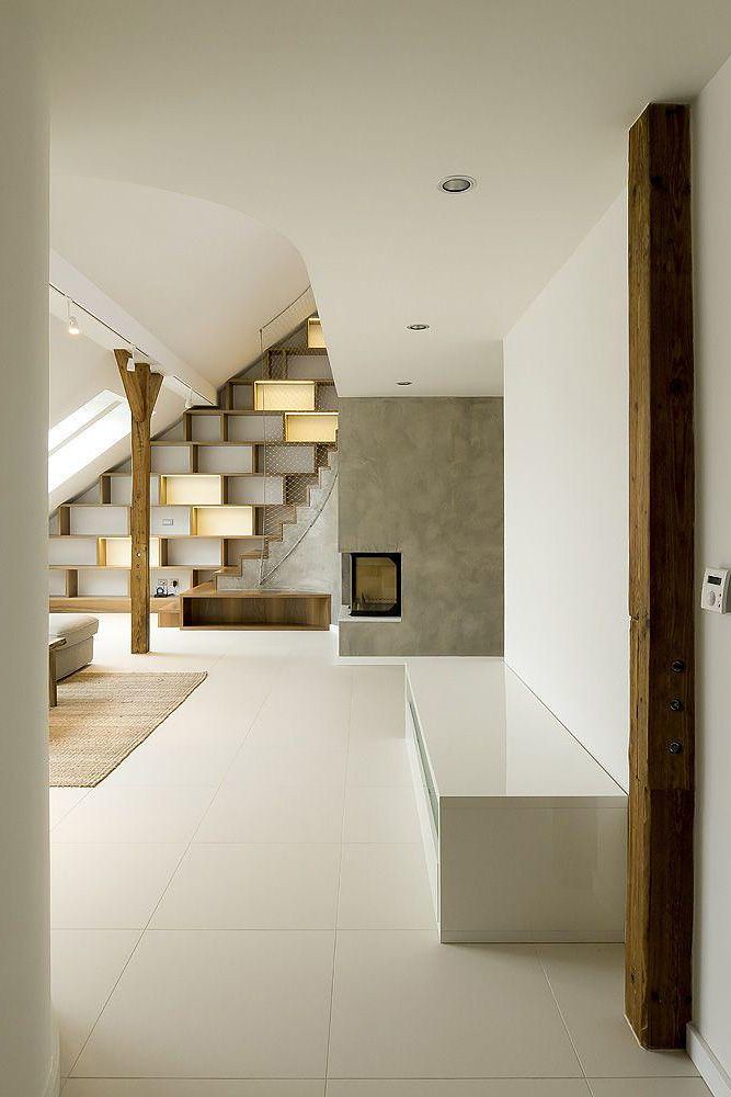
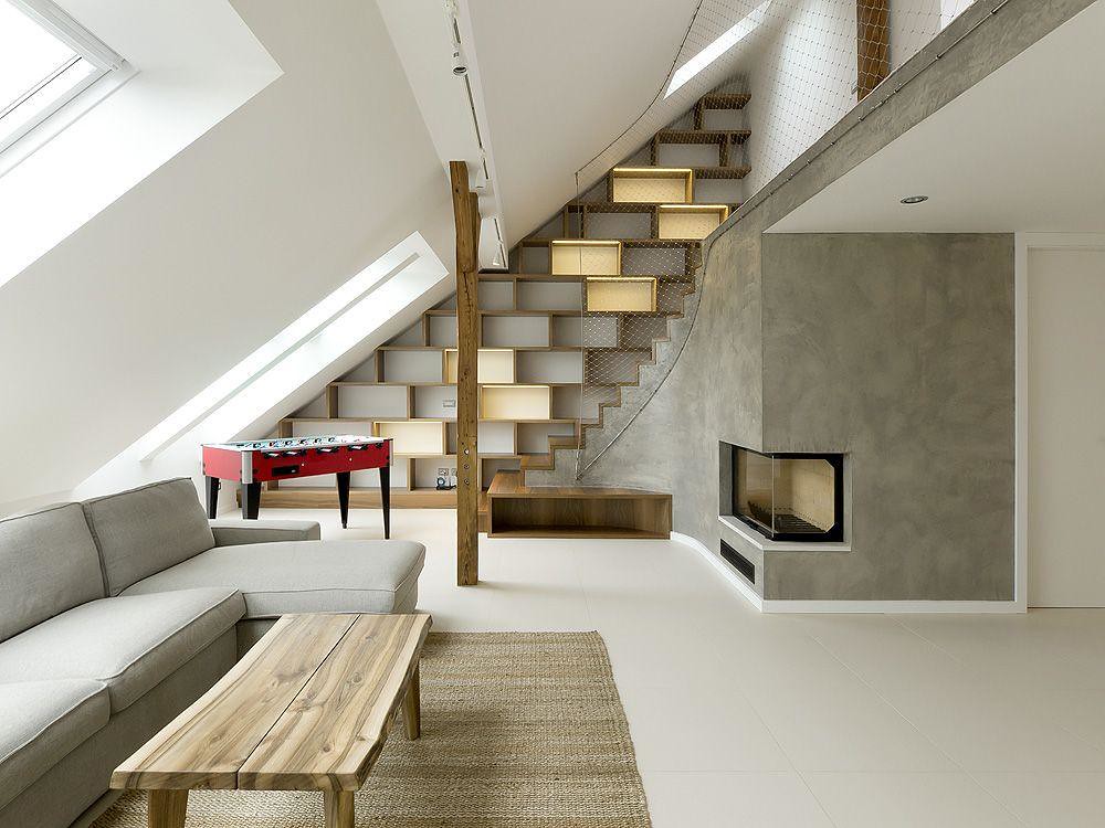
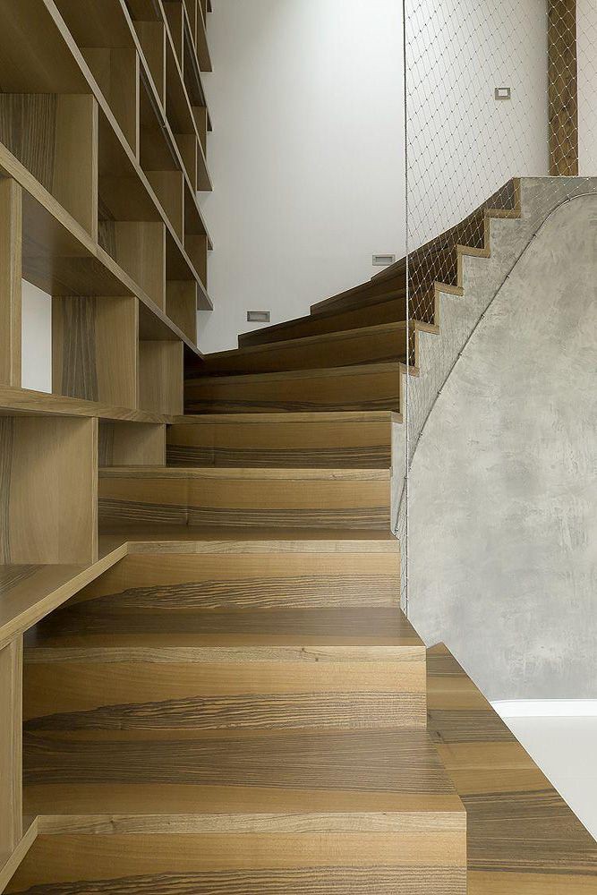
"Even the staircase with integrated fireplace and library climbs up in rounded corner.

The railing is made out of thin stainless steel net, so it is safe but even smooth and transparent.
"


A1 Architects, The Rounded Loft


Dezeen posted "The Rounded Loft" by A1 Architects, a firm based in the Czech Republic. Their portfolio showcases some magical projects completed and still in process by these youthful designers. I admit, I'm completely absorbed in their approach, and their results. (take a look at the Black Teahouse in Česká Lípa!) The Rounded Loft utilizes a seemingly awkward space, rounding the edges, and opening up into lightness, almost a sense of floating above the city. Spare material selections push their aesthetic to the new level. A stainless steel net for a staircase railing, yes!


Ladies and gentleman, we are now floating in space & it feels brilliant,bright, and beautiful....


The issue of "boundless“ space became the main motif of our work. The private spaces such as bedrooms are of course separated, but the rest of common activities rooms are connected within one fluent space. It starts at the entrance hall with dressing wardrobes and slightly continues towards living space and kitchen with large dining table, the space is also opened to upper gallery which is meant for guests. To reach specific fluency of space we decided to round off some of the interior corners, which finally give the space its unique smooth character. Due to these softened corners one moves and feel simply free and the boundaries of walls somehow disappears. Even the staircase with integrated fireplace and library climbs up in rounded corner. The railing is made out of thin stainless steel net, so it is safe but even smooth and transparent.


Next to the main continuous living space there are three bedrooms and one study room, and some storage spaces integrated mostly as built in furniture. The issue of materials was another important part of the project. Their main attributes are touchable-ness and pure naturalness. We chose carefully many of them together with clients at stone workshop and joinery. Most of wooden furniture were tailor made pieces. Beige large format tiles are used on all attic floors to support the feeling of continuity. We exposed as much of the wooden bearing structure as we could. The kitchen counter is made out of black granite stone which is next to bright marble on the wall behind. There is used walnut wood for the dining table and ash veneer for the light above. The living space is connected with the kitchen by raw grey plaster.."


"And we, in our work, look for the MAGIC of these little things in ordinary things around us and in things that inspire us…"

First independent projects of A1 Architects date to the year 2003. Two years later a studio and a creative workshop are formed in Prague. Today this studio is built on the works of architects Lenka Křemenová and David Maštálka who initially studied together at the Academy of Arts, Architecture and Design in Prague. In 2006 Marta Maštálková, the graphic designer, joined the group.

Interdisciplinary communication and searching for unique solutions are the main characteristics of our studio. All of our projects are solved in a complex way, starting with the whole concept and moving on to the interior details and design of utility objects.


You have read this article a1 architects / the rounded loft with the title August 2011. You can bookmark this page URL http://gigibytes.blogspot.com/2011/08/even-staircase-with-integrated.html. Thanks!

Structures & Style 2011

...

"We don’t really define our work as artistic practice. I think that might limit our ambitions to have a very diverse practice involved with many scales and types of projects. It just so happens that we’ve been doing a lot of fashion-related projects lately but we have a lot broader ambitions to work on more public and cultural projects."


Leong Leong
(here)


model of 3.1 Phillip Lim
in LA. LEONG LEONG


Saturday, August 27, 2011 from 11 AM - 3 PM.


I've been invited to attend an event this Saturday that I'm extremely thrilled to attend. "Now in its third year, the tour has previously showcased noteworthy hotels and restaurants throughout the City. This year's tour will feature the City's most inspired fashion retailers, many of which are housed in stunning and unique spaces. " Perhaps I'll see you there? Leong & Leong melted my mind with some of their work awhile back, so this will be a joy to hear all about their LA project.. For anyone interested in pattern, textures, and the ever morphing relationship between fashion and interior design, this is the place to be.... Thanks Structures & Style for organizing these events here in Los Angeles... - David John


August 27, 2011.... Structures & Style is an exclusive guided walking and shuttle tour, providing participants with a behind the scenes peek at the latest design and architecture concepts in the City of West HollywoodAlberta Ferretti, 3.1 Phillip Lim, H.L.N.R., Church Boutique, & Roseark.... Presentations by store representative and tour guide include such topics as: techniques on retail display designs, storefront's relationship to the street in urban design, the strategy of design for the customer's journey throughout the interior space, and the interplay between pattern and texture...

Link

All of the ticket proceeds go to the West Hollywood Community Housing Corporation. Tickets are regularly $185, Structure & Style rate is $110.(go here) All proceeds from the tour go to the West Hollywood Community Housing Corporation, a non-profit organization committed to developing safe, decent and affordable housing for people with limited income, including those with special needs, with the goal of enhancing community diversity and supporting economic diversity. WHCH go here......take a look at the map here...


LEONG LEONG
is an award winning New York-based design office practicing in the fields of Architecture, Culture and Urbanism. LEONG LEONG's internationally recognized work is directed by Dominic and Chris Leong. The two founded their firm with the belief that the practice of Architecture gains relevance through a constant dialogue with other disciplines, cultures, thinkers and makers to offer thoughtful and innovative design solutions. Their concept-based approach to design is coupled with a deep interest in methods of production that challenge norms and reveal new territories. LEONG LEONG's body of work includes the completion of projects in New York, Seoul, Hong Kong, Los Angeles, and Napa Valley, California...


---------------------


You have read this article leong leong / structures style / weho with the title August 2011. You can bookmark this page URL http://gigibytes.blogspot.com/2011/08/structures-style-2011.html. Thanks!
a late summer afternoon

at IKO IKO

931 North Fairfax Avenue, LA (new space)


As the sun was slipping into the sea,

the circles began to appear everywhere, and every how, and every when.


Congrats to Kristin and Shin on the new space for IKO IKO!
Yesterday, afternoon drifted into dusk, at their new space on Fairfax, while I was taking in their new location + new works. Their new space continues their seamless voyage into artist + high craft driven objects.


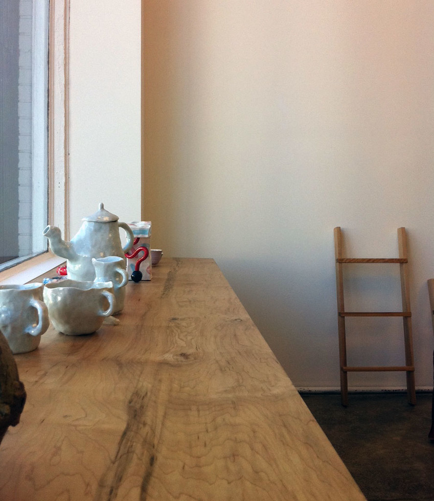
IKO IKO is the creative home of Kristin Dickson and Shin Okuda's ongoing projects, Rowena Sartin (common structures of clothing design.) + Waka Waka (furniture + sculptural investigations). In addition, the minimally + gorgeously designed space is curated with objects, books, textiles, ceramics from their travels abroad + local meetings. Shin introduced me to his new Waka Waka ladder works (!!!) and told me about some exciting collaborations he is working on....


Stay tuned... YHBHS will be posting an INTERVIEW w/ Kristin Dickson this coming month...


In the meantime, check out an interview
YHBHS did with Shin Okuda of WAKA WAKA last year... Also, read about Iko Iko in the T Magazine blog here..., and read IKO IKO's card catalog entry here..


--------------

----------


You have read this article iko iko fairfax / kristin dickson / shin okuda / waka waka with the title August 2011. You can bookmark this page URL http://gigibytes.blogspot.com/2011/08/a-late-summer-afternoon-at-iko-iko-931.html. Thanks!

volume + void

..

“I started to get involved with people who were creating their own worlds. I realized I wanted to do that, and I hoped people would like it.” - Faye Toogood

vs

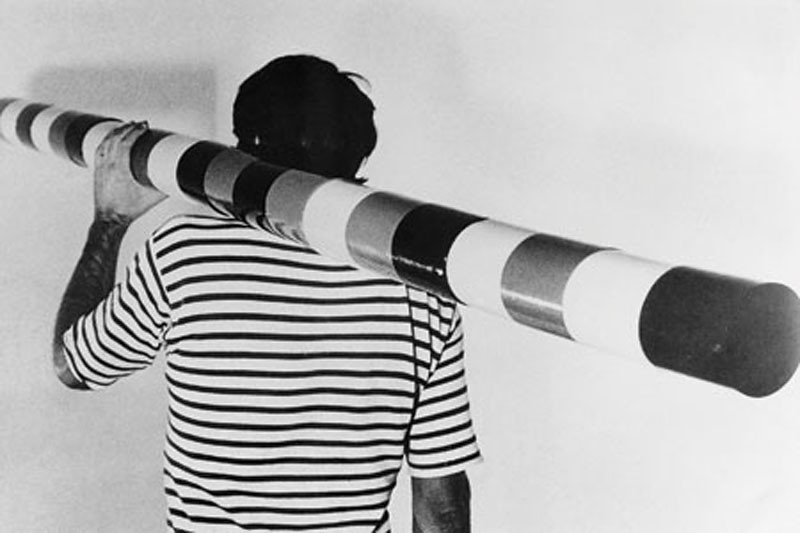
Andre Cadere worked to a system of numerical order that he had developed himself, containing errors as a secret code. Cadere developed his Barres de Bois as mobile works of art in 1970, something that he could take everywhere with him and use at any time, anywhere.


Faye Toogood of Studio Toogood...

(element table in resin, from Assemblage 2) table with VOID.


"Toogood’s knack for sourcing materials and her compulsion to group unlike things derives from a love of research that harks back to her art history studies at Bristol University, and her stint at World of Interiors; when she was 22, the leading British interior design magazine hired her as an intern. “I didn’t even know what a stylist was,” she recalls, but she certainly learned. In her 10 years there, she rose to the position of senior stylist before opening her own studio in 2008, to branch out beyond creating dreamy sets that lasted no more than a few days.


Studio Toogood has since designed interiors, both temporary and permanent, for various creative brands. For a display at Comme des Garcons’ flagship store in Tokyo, she took the fashion label’s deconstructed plaid – a defining pattern in its 2010 men’s collection – and recreated it on stacks of white cubes with coloured electrical tape. At The Rug Company’s New York store, she covered the walls with archival images of English houses, then painted them with graffiti. The plan was to eventually turn the murals into tapestries."

(via here, Azure magazine), (dezeen screen with Faye Toogood), (past YHBHS post on Studio Toogood)...


Andre Cadere
referred to his wood bars as “peinture sans fin” – “unlimited painting” – which redefined the boundaries of the medium and broke with traditional ways of seeing. The form of the rod does not prescribe a privileged point of view – it has no front nor back, no bottom nor top – but offers itself to multiple presentations instead: The bars can be laid out on the floor, fixed to the wall or can lean against it; they can also, theoretically, be moved from one place to another. (via here)


James Hyde said Andres Cadere is "probably the most important artist of the 1970s whom you've never heard of." When he died at 45, he left behind about 180 segmented wooden "barres."


--------------------

You have read this article andre cadere / faye toogood / resin table / studio toogood with the title August 2011. You can bookmark this page URL http://gigibytes.blogspot.com/2011/08/volume-void.html. Thanks!
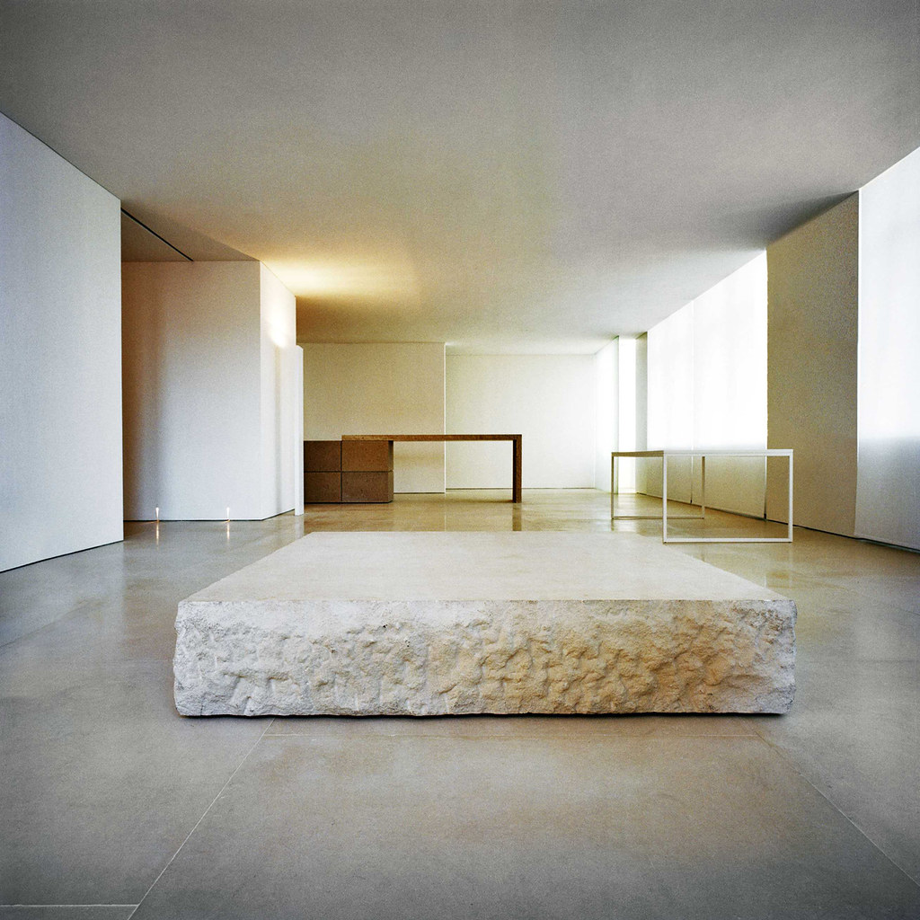
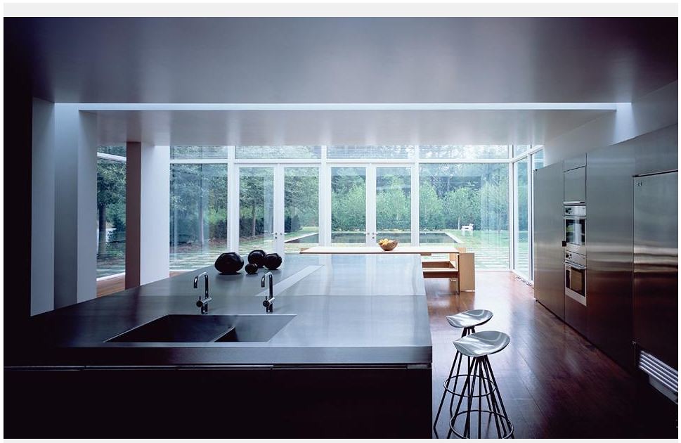
‘What counts in Andrea Pallladio’s work is the importance of space as VOID."

- Claudio Silvestrin


Claudio Silvestrin Architects


+

Dow Jones Architects

+

a volcano


claudio silvestrin architects

+

dow jones architects

+

a volcano


"‘I’m a lone wolf’, Claudio Silvestrin says of himself. By that he means that he does not hang out on the architecture scene. He is not a networker, a golf player or a talker at public or academic events. All that he describes as the ‘blah, blah, blah’ of architecture. Silvestrin’s architecture is often described as austere, and the term could well be applied to the man himself....

Discussing architecture with Silvestrin is not straightforward. He prefers to let his work speak for itself, partly because he is not keen on the way architects constantly promote themselves, but mostly because the intended effect of his work is emotional rather than theoretical or social. It means that he has been somewhat shunned by the academic crowd, though is embraced by those in fashion, art and music."

please read more here...


-------------------------------


You have read this article dow jones architects / john pawson / kayne west / london architecture / minimalist designs / silvestrin with the title August 2011. You can bookmark this page URL http://gigibytes.blogspot.com/2011/08/what-counts-in-andrea-pallladios-work.html. Thanks!
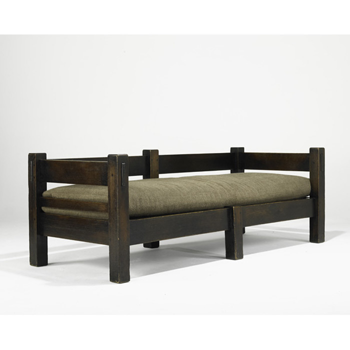
gustav stickley

vs

rose tarlow


gustav stickley

vs

rose tarlow


------------------------


You have read this article with the title August 2011. You can bookmark this page URL http://gigibytes.blogspot.com/2011/08/blog-post.html. Thanks!
There's a guy inside me

Biding his time

Standing in line and waiting for me to fall

For me to fall , Self-preservation threatens us all


Believe it or not, Jean Michael Frank found the flavor of daily life essential to every house. The result of pursuing “perfect taste” was to end up with soulless rooms....


“I wish one could more often see artists collaborating in arranging houses... the result would be, at the very least, something of our time, and alive.”


- Jean Michel Frank, 1895-1941, more here..


lyrics by Malcom Middleton, "choir", images, of a Beatles fan in pure ecstasy..

what brings people to cry when they see their hero? self defeat? pure adoration?

a favorite lamp by Jean Michel Frank


-------------------------


You have read this article jean michel frank / minimalist designs / when a lamp screams in ecstasy with the title August 2011. You can bookmark this page URL http://gigibytes.blogspot.com/2011/08/theres-guy-inside-me-biding-his-time.html. Thanks!
"This city is a point upon a map of fog."

vs.

"there's more liberty in an interior to invent a narrative..."


the upstairs bar...


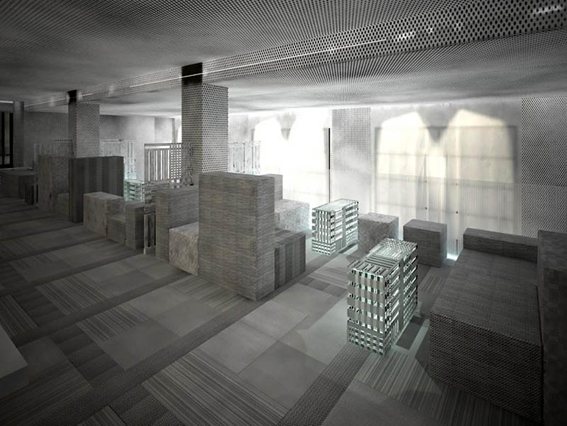
For the W San Francisco, the hotel tapped the genius of starchitect Stanley Saitowitz of Natoma Architects to redesign the first 2 floors...


Stanley Saitowitz
went for a darker look at San Francisco, a night portrait of the city using dark grays and purples for the color scheme. His vision as an architect is so clearly evident in his work as an interior designer — the décor projects the sensation of being outside rather than in. Playing on Bierce's "map," the floor emulates the grid of the city, the furniture extruding from it as its buildings would.


Playing on the "fog," the dark color scheme gets lighter and cloudier as one ascends the the hotel, the fog becoming "densest" at the top, much as it would be standing atop San Francisco's Twin Peaks. Guests can faintly make out the traces of city monuments on the walls. It's truly reminiscent of San Francisco at night, the time when Saitowitz says "cities are most magical and fun." As for the differing roles between architect and designer, "there's more liberty in an interior to invent a narrative," said Saitowitz, whose past interiors have been famously high-concept. "It's more circumscribed. You're asked to make a statement or create a kind of world in an interior."


read entire article here...and more images... (Via Art Info)

all text by Janelle Zara


--------------------------


You have read this article hotel design / interior design / Stanley Saitowitz of Natoma Architects / w hotel sf with the title August 2011. You can bookmark this page URL http://gigibytes.blogspot.com/2011/08/this-city-is-point-upon-map-of-fog.html. Thanks!

"I think we need more thinkers and less architects. "

...

Kelly Waters
interviews Dan Friedlander of LIMN

about Memphis Design Group for YHBHS


"I think we need more thinkers and less architects. In the end I think it is within the individual, their curiosity and what they do with it. Ettore came to our opening all those years ago and he hadn’t been to the West Coast as of yet and he was fascinated by his ride from the airport to the city, the landscape of California and the freeways, he was always OBSERVING, always CURIOUS."


The pressure of COMMERCIALISM and the ability to break through and make it is even greater than it was ten, twenty, thirty years ago.


Kelly Waters
, in addition to being a designer, writes the most amazing design blog called Halycon Days


"David John of YHBHS asked me to be a part of this discussion on Ettore Sotsass and Memphis Design group, and while I have always admired Ettore Sotsass, I did not think I was the right gal for this piece. I have always been one of those individuals that have never really understood what Memphis was all about. While working at LIMN Furniture and still in school, I would round the corner and come across the Carlton or the Beverly cabinet and just stare in dismay as it talked to me from a different time in a different language. This was after all the late nineties. Everything was slick and minimal, the city was filled with dot com madness, and the pages of Wallpaper are what I lusted after!


Things have changed tremendously since then of course, but I never did try to revisit what Ettore Sotsass and Memphis group were trying to share with me. I did remember Dan Friedlander, founder of LIMN Furniture, having an affinity with the Memphis pieces and that perhaps he could shed some light on what I failed to see all those years ago."


- Kelly W.
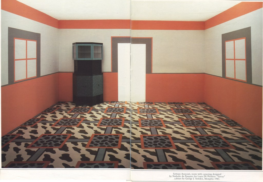
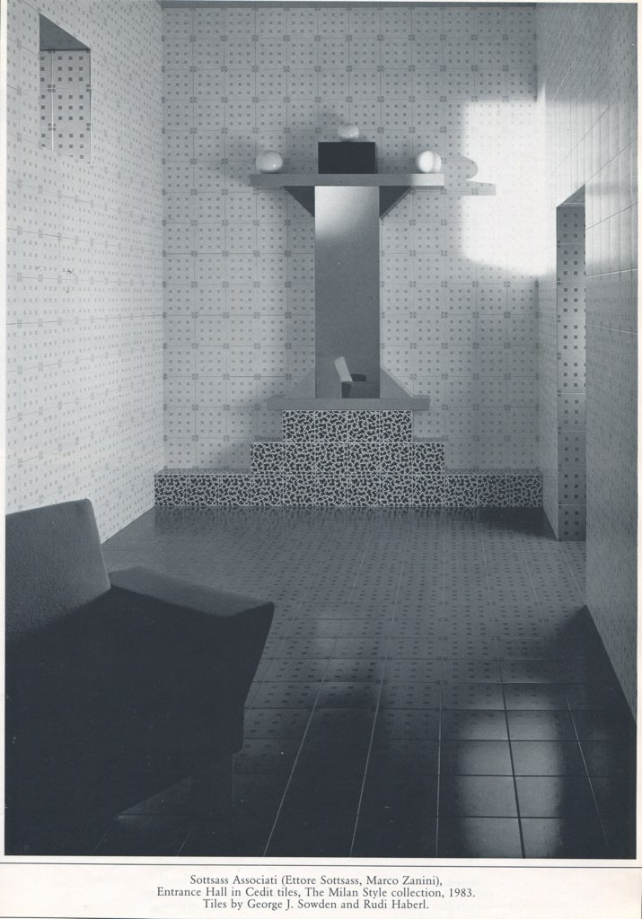


an interview between Kelly Waters and Dan Friedlander.


KW: Although I grew up in the eighties my formal education and knowledge of design was a return to modern and modernism with the introduction of deconstructivists like Zaha Hadid and Daniel Libeskind being debated and fêted. It was clear that design that spoke with such an extravagant language such as postmodernism was viewed with disdain from my professors. It wasn’t timeless so therefore it was worth a mention but not praise. How would you describe Ettore Sotsass and Memphis Design Group to someone who didn’t experience it first hand.


DF: That’s because they didn’t get it., sure Memphis isn’t as important now but when they happened upon the scene it changed everything. They were the first to introduce furniture as art. And before then every architect was putting two Wasilly chairs in the living room. That’s it, nothing else. It was boring. Sotsass and Memphis changed the landscape of design.


KW: I understand you were the first or one of the first to bring Memphis to the States is that true and how did you know about Ettore and Memphis?


DF: We opened Limn in 1981, right around the same time people began talking about Memphis, it was just a happy coincidence. They were our first show. They made us. I found out about them from a couple of friends I went to architecture school with at Berkeley, they were in Italy and brought back a Domus and said you have to check these guys out. It was the second show of Memphis Design in the states,(who was the first I couldn’t make it out on the tape) we had a warehouse down by the ballpark and we filled it as if it were one massive gallery and it wasn’t just Memphis but local artists and furniture designers that were doing similar things in the bay area. It was meant to show that our local talent was just as avant garde and pushing the envelope as Ettore and his collaborators.


KW: Is there a designer today that you see following in Sotsass’ footsteps or seems to be directly inspired by him? And How?


DF: That is really difficult to answer since things are so different now. Ettore and Memphis Group didn’t make these pieces to make any money, he was running his architecture firm and this was just something he did on the side to play and have fun. No one in today’s world does anything without first considering the market. The pressure of COMMERCIALISM and the ability to break through and make it is even greater than it was ten, twenty, thirty years ago. For example take someone like Patricia Urqiola, she’s incredibly talented and is one of the lucky few to break through but her designs are always thought through with a manufacturer in mind and their ability to sell. This is not to insult her or her work in anyway it’s just how things are done. So no, I’m not seeing anyone unless it is an unknown artist that I’m not aware of.


KW:
Are there any pieces you have kept from the Memphis Collection?


DF: I have kept a few remnants through the years for myself.


KW: Are there any other pieces that Sotsass designed outside of the Memphis collection that specifically spoke to you or grabbed your attention and why?


DF: Yes, his glass pieces. He was working with glass throughout his career. They were extraordinary pieces, some blown, some blown and then cast.


KW: Ettore was trained as an architect, as were you, as was I. Do you think there is something about that training that offers its students so many different paths and directions in life?


DF: I have thought a lot about this since I started out as an art major and transferred to architecture hoping it would give me some tools to apply to my art, I meant to transfer back but never did. The architecture schools have such different curriculum these days. When I graduated Berkeley they created thinkers and Cal-Poly created individuals that could enter an architecture office right out of school.


I think we need more thinkers and less architects.
In the end I think it is within the individual, their curiosity and what they do with it. Ettore came to our opening all those years ago and he hadn’t been to the West Coast as of yet and he was fascinated by his ride from the airport to the city, the landscape of California and the freeways, he was always observing, always curious.
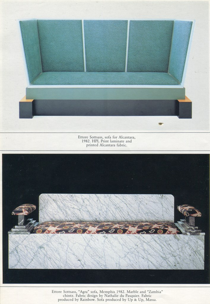
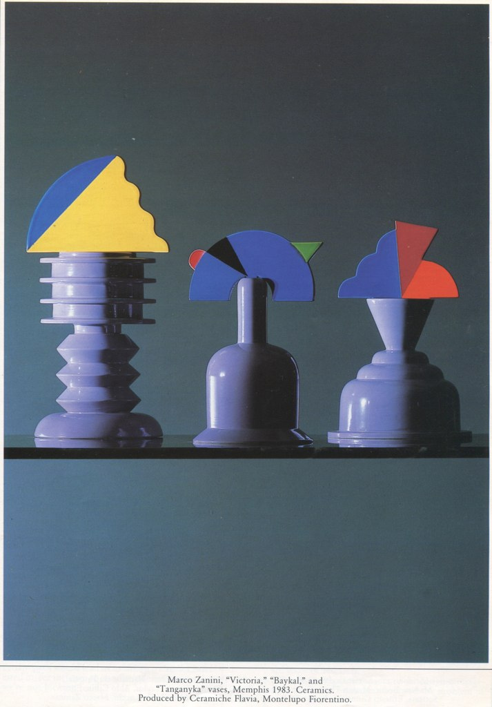


(th
ank you dan and kelly)


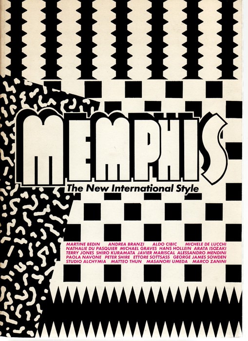
images sourced from the book

Memphis: Research, Experiences, Failures and Successes of New Design

by Barbara Radice (buy it here...)


repost from May 2011....


-----------------------


You have read this article ettoettore sottsass / guest post by Kelly Waters with the title August 2011. You can bookmark this page URL http://gigibytes.blogspot.com/2011/08/think-we-need-more-thinkers-and-less.html. Thanks!
YHBHS voyage

into sound, space, + light


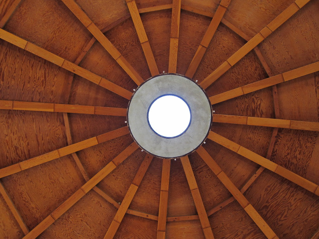
"The Integratron is an acoustically perfect tabernacle + energy machine sited on a powerful geomagnetic vortex in the magical Mojave Desert..."


YHBHS
is traveling to the Integratron this weekend to gaze at the Perseid Meteor Shower Star Party... An annual benefit for the Mojave Desert Land Trust sponsored by Joshua Tree National Park Association. I've got a booking for the Sound Bath at 9 a.m and a schedule of events planned for this desert getaway. Any opportunity I have to drive into the desert sun, I'm game! Also coming up in October, High Desert Test Sites weekend.....


"HDTS returns this fall for a weekend of new experimental art, architecture, and design projects sited in the Southern California high desert. Curators the McCarthy Family, Robert Stone, and Brooks Hudson Thomas have invited an exciting group of emerging and established artists, architects, and designers to create new works for HDTS 2011.
"


What is the Sound Bath?

"The Sound Bath is a 30-minute sonic healing session that you can experience while resting comfortably in the Integratron's highly resonant, multi-wave sound chamber. We play a series of quartz crystal singing bowls live, each one keyed to the energy centers or chakras of the body, where sound is nutrition for the nervous system.


Imagine lying on comfy mats in the center of this relaxing and resonant high-energy field, while having your body bathed in exquisite sound for 30 minutes. The results are waves of peace, heightened awareness, and relaxation of the mind and body. "


"George Van Tassel, creator of the Integratron, was a legendary figure, an aeronautical engineer and test pilot who worked for Lockheed, Douglas Aircraft and alongside Howard Hughes at Hughes Aviation . He was also one of the leaders in the UFO movement who held annual "Spacecraft Conventions" at Giant Rock for 25 years. Van Tassel said UFO channelings and ideas from scientists such as Nikola Tesla led to the unique architecture of the Integratron. He spent 18 years constructing the building."


images sourced from flicker...


----------------------------


You have read this article joshua tree / sound bath / the integratron / YHBHS voyage with the title August 2011. You can bookmark this page URL http://gigibytes.blogspot.com/2011/08/yhbhs-voyage-into-sound-space-light.html. Thanks!


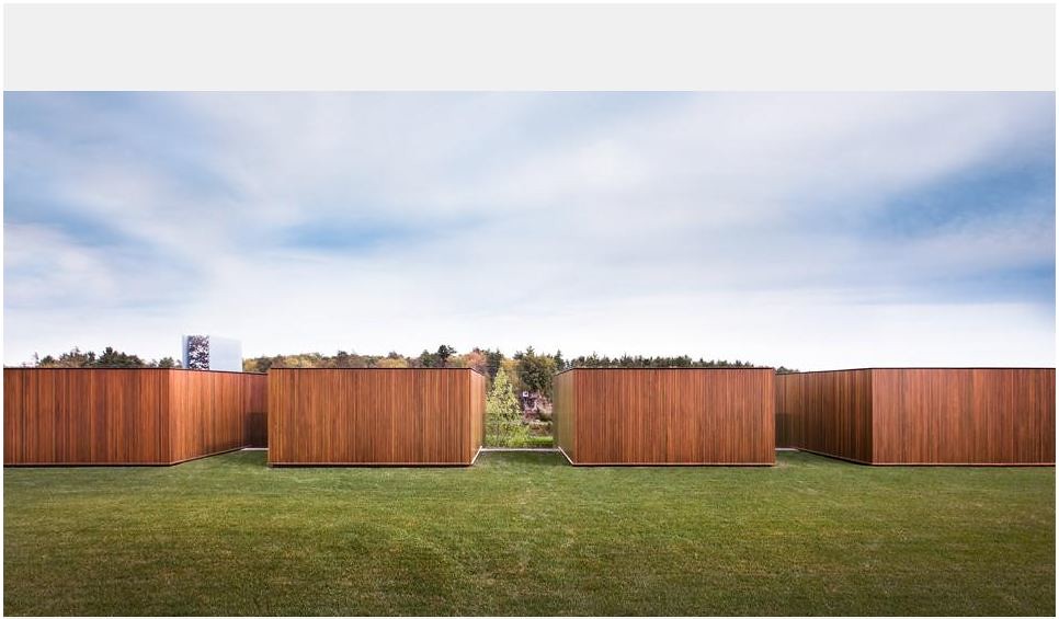
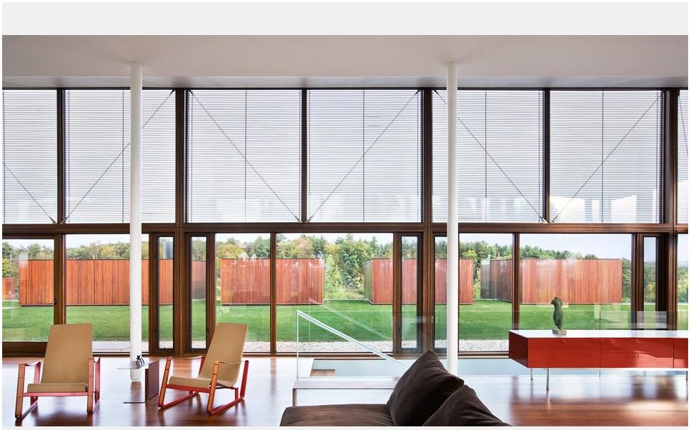
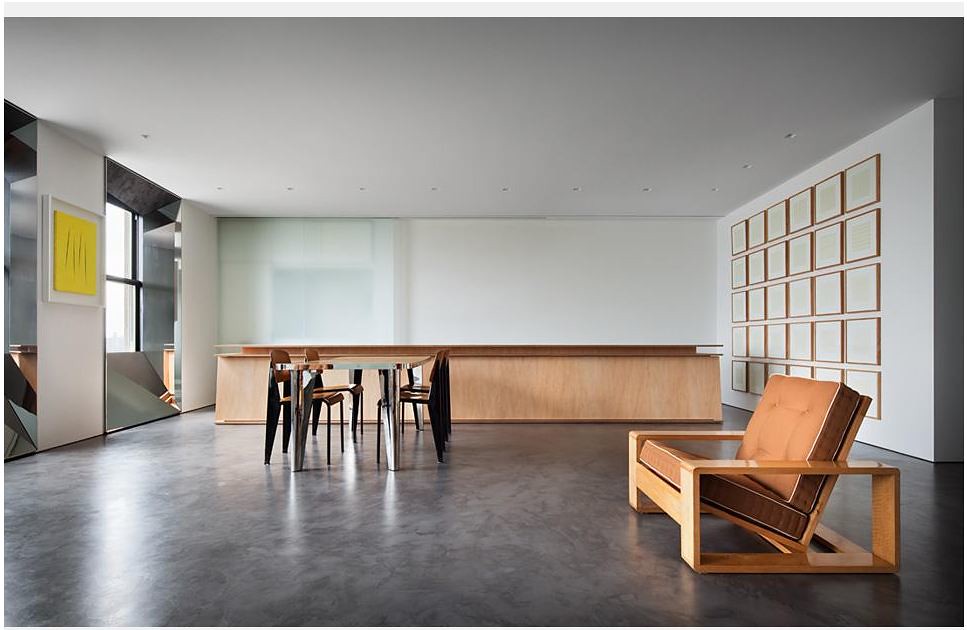
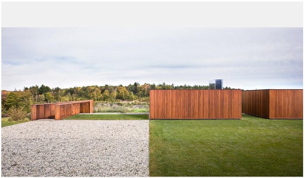
"We consciously aimed for simplicity - in planning, use of light and air, building organization and circulation - because it is our expereicne that simplicity leads to economy, efficiency, and improved performance."


- Thomas Phifer and Partners


"We really seek to open buildings up again…to nature and to the sun, to the sound of the wind; to bring back that sense of nature which is part of architecture.” via ArchDaily interview here


"Thomas Phifer and Partners is recognized for its distinct transformation of modernism. The essence of timeless buildings—simplicity—is achieved through thoughtful responses to the natural environment, study of the human ecology of the site, and a search for appropriate modes of construction, which dictate the forms, spaces, and appearance of buildings. The firm believes that every structure should occupy a harmonious place within its surroundings by balancing human needs and environmental imperatives. This book explores all of Phifer’s major commissions, including Salt Point House in New York, Salt Lake City Courthouse, and his most recent achievement, the North Carolina Museum of Art in Raleigh, which opens in April 2010. "


above images are selected from Thomas Phifer and Partners site here...


-------------------------------


You have read this article american modernism / architecture / homes / the box / thomas phifer and partners with the title August 2011. You can bookmark this page URL http://gigibytes.blogspot.com/2011/08/we-consciously-aimed-for-simplicity-in.html. Thanks!
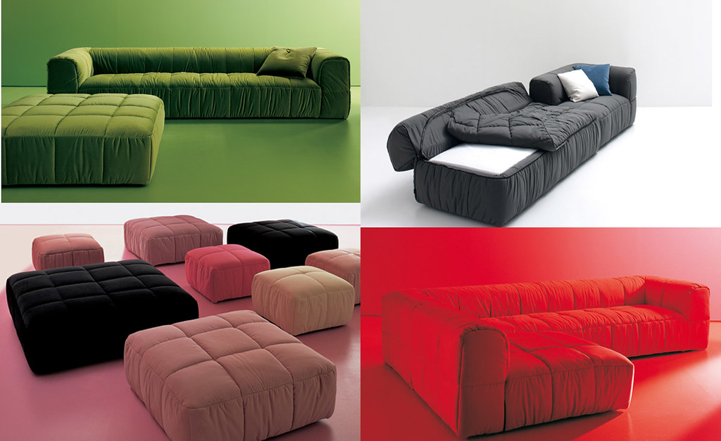
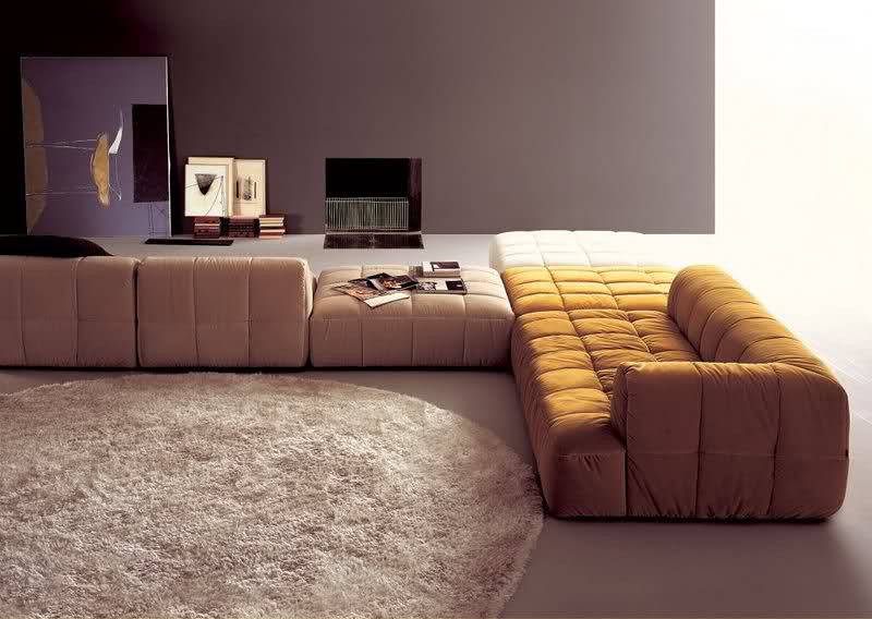
Cini Boeri

"strips"


"Soon after, Boeri created another masterpiece with the Strips sofa, which could be described as either a lounge made from sections of sleeping bags or a bed-sized puffer jacket!"


"Born in Milan in 1924, Cini Boeri graduated from Milan Polytechnic in 1951 and began a long period of cooperation with Marco Zanuso, founder of Italian furniture firm Arflex. She set up her own studio in 1963, concentrating on civil architecture and industrial design. In 1967, Bobo Divano was released by Arflex and became the first mono-block seat in polyurethane foam with no internal structure. The Serpentone, designed in 1971, was another revolutionary sofa made from thin sections of polyurethane articulated around a flexible central core, allowing for free-flowing shapes of unlimited length.

Soon after, Boeri created another masterpiece with the Strips sofa, which could be described as either a lounge made from sections of sleeping bags or a bed-sized puffer jacket!

The sofa’s impact would prove to be lasting – she eventually won a prestigious Compasso d’Oro industrial design award for it in 1979, and Patricia Urquiola recently stated that her critically acclaimed B&B Italia ‘Tufty-Time’ sofa was her homage to Boeri’s Strips sofa.


all text taken from here....


You have read this article 0's furniture / 70's furniture / cini boeri / elements of a room / strips with the title August 2011. You can bookmark this page URL http://gigibytes.blogspot.com/2011/08/cini-boeri-strips-soon-after-boeri.html. Thanks!
I don’t think of myself as a Post-Modernist (or minimalist).


"I find the metaphors of the machine that Modernism embodies, along with the geometric abstraction of formal composition, to be alienating and sometimes even disorienting, as opposed to a more classical approach that considers metaphors of man and the landscape and a more figurative formal tradition."
- Michael Graves


All artists should simply use the materials that are appropriate to their ends. It’s a false issue to say this is ‘industrial’ and this is ‘art’ material" - Carl Andre.


Ah Michael Graves' residential projects make my mind do flips & circles. From early to late, there is something about his work that breaks so many rules, but often times, quietly. I've been staring at these images for a long time now, pinned onto a cork board. Today, they aligned themselves into a coherent thought (that is still up for debate). Here's to patience! Here's to sculpture! Here's to houses that look like sculpture! - David John


"My father’s family were bricklayers and carpenters and shipbuilders, and so my earliest experiences are not of art, but of the materials and those are the materials that I continue to use. I never did anything that required the art supply store as I’ve always used industrial materials.

All artists should simply use the materials that are appropriate to their ends. It’s a false issue to say this is ‘industrial’ and this is ‘art’ material"


- Carl Andre.


the minimalists' nightmare

vs

the postmodernist's painter delight


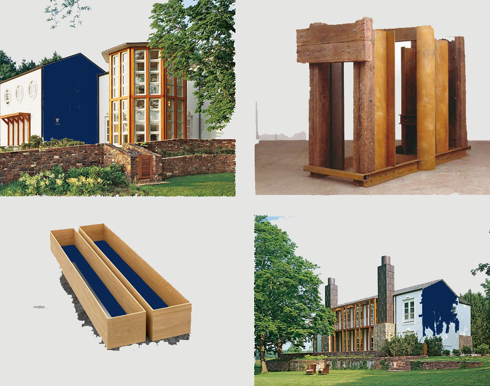
images: top left, clockwise. (all images have been altered, perhaps ruined.)

1. Michael Graves, AD (altered)

2. Carl Andre, wall painted behind. altered

3. Becky Beasely. liquid turned blue. altered

4. Michael Graves, AD altered


I would have to say that my architecture evolved in part as a reaction to aspects of Modernism. I find the metaphors of the machine that Modernism embodies, along with the geometric abstraction of formal composition, to be alienating and sometimes even disorienting, as opposed to a more classical approach that considers metaphors of man and the landscape and a more figurative formal tradition. That is not to say that my work is historicist or classical stylistically, which is part of what the Post-Modern movement argued. I don’t think of myself as a Post-Modernist. The Modernists tried to wipe the slate clean and the Post-Modernists tried to look back to formal motifs recognized from historical architecture. Instead, I think that modern composition is part of a cultural continuum that goes back thousands of years and therefore I tend to see both Modernism and the traditional language of architecture as part of the palette we use to compose our buildings.
-


Michael Graves, please read interview here...


------------


You have read this article carl andre / michael graves / what is a postmodernists with the title August 2011. You can bookmark this page URL http://gigibytes.blogspot.com/2011/08/i-dont-think-of-myself-as-post.html. Thanks!
the forever & infinite

seduction (of the black line).


“Memory is everything.”


the forever & infinite

seduction (of the black line).


“Memory is everything.”


images:

1. Brabrand, 1963, by Friis og Moltke 2

2. desk by Franco Albini


"We believe in human contact and social empathy. Dedication and joy of work are values that are deeply rooted in our company’s traditions and in our desire to renew Danish architecture in light of these traditions and with originality, beauty and functionality. We as professionals are challenged in such a way today that you are often tempted to create new and sensational solutions. FRIIS & MOLTKE is motivated to go in a different direction.


We do this by conducting internal discussions amongst ourselves, and by engaging in dialogue with our clients. They must benefit fully from our company’s experience, capacity and professionalism. Our architectural vision involves a close interplay between details and the whole, integrated buildings with a coherent idiom. This is where we find our inspiration and our joy in creating architecture."


------


You have read this article franco albini / friis og moltke / when architecture becomes a table with the title August 2011. You can bookmark this page URL http://gigibytes.blogspot.com/2011/08/the-forever-infinite-seduction-of-black.html. Thanks!

YHBHS interview with Jon Pylypchuk + Paul + Wendy

...

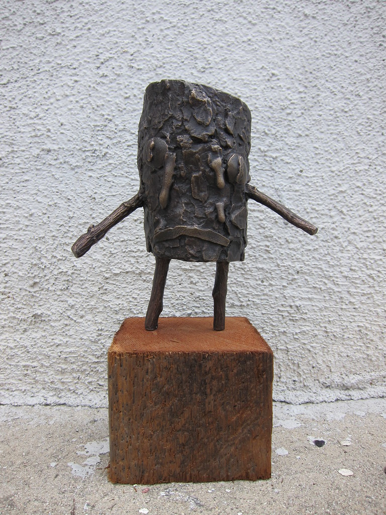
"I was sitting around with my friend Andrew and he was urging me to think of something for the facade of the New Museum in New York. I had these logs sitting around and I had been drinking booze too often. I was thinking about how stupid it is to drink so much, and sort of thought that I was like this drunk log."


- Jon Pylypchuk


Small Log By Jon Pylypchuk Bronze sculpture mounted on wooden base

8.5 x 5.5 x 3.5 inches Edition of 10, 1 Artist Proof Numbered and signed by the artist


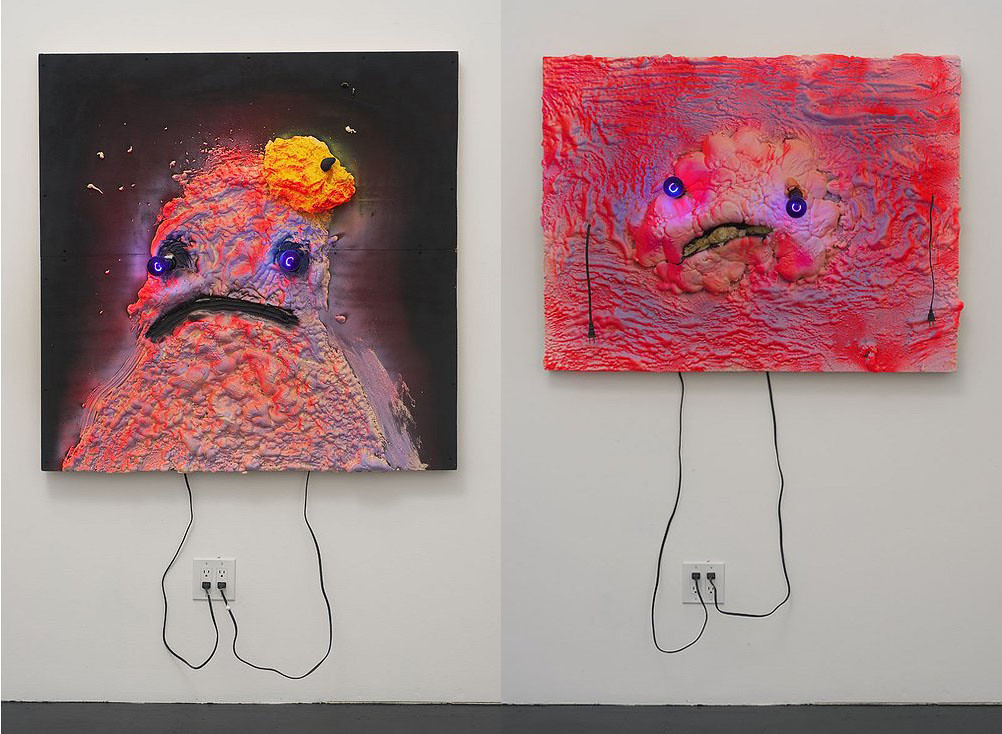
Paul + Wendy run an inspiring online store of artist editions and projects. Jon Pylypchuk's work has delighted me for years, from his early paintings, to his recent wall sculptures with bulging eyes made out of purple light bulbs. To see Jon's work, is to almost take a huge sigh, to whisper to yourself, "it's gonna be alright, man." The worlds he has created, and the emotions he puts forth in his work are unlike any other artist I've come across. When Paul + Wendy told me that their latest edition was the "bronze log man" I immediately smiled. What an amazing combination to come together.


Two weeks later, I was in Jon's studio near downtown L.A., about a quarter mile from my house, chatting with Jon about his latest collaboration with Paul + Wendy, and some of his new work. I wish I had taken photos of his studio, as it mesmerized me. My eyes darting back and forth while in conversation with Jon, scraps and piles of wood, metal, everywhere, and a drum set. We chatted about his family history, casting metals, art-making, and light bulbs:)


It's pretty awesome that YHBHS has continually connected me with such passionate folks such as Paul + Wendy + Jon. I'm completely honored to post this interview on an artist that makes me smile and light up (inside).


Please visit PAUL + WENDY's site here....


Can you tell me how Paul + Wendy Projects originated?


Paul + Wendy : In the early 2000's we started getting interested in art and collecting. Through this we became good friends with several artists. After a while we knew that we wanted to become more involved but were unsure what direction to take. We briefly considered opening a web based gallery and doing art fairs but neither of us really wanted to be art dealers and shortly after most of the world's economy slid into a recession. Our friend, artist Michael Dumontier suggested that we start to publish editions. This seemed like a good way to be involved and to work on projects with artists who we knew or whose work we liked.


At the time Nieves in Switzerland had a big impact on us. They were working with a lot of great artist publishing inexpensive zines that anyone could afford. Locally Art Metropole was an influence as well as Roger Bywater's Bywater Brothers who have published editions by artist like Dave Shrigley, Jonathan Monk as well as our friend, Derek Sullivan. Our first edition was the 'Poster Making' serigraph by The Royal Art Lodge whose members at the time were Michael Dumontier, Neil Farber and Marcel Dzama. It was pretty successful and encouraged us to continue. So far we've published 5 prints, 4 books and a postcard. We'll have a new serigraph by Kay Rosen and a print by Daniel Eatock available soon along with the bronze by Jon Pylypchuk which is our first venture into multiples. buy it here:)


I remember seeing Jon's drip painting at LACMA years ago. The painting must have been 8 feet long, 6 feet tall, and it left a huge impression on me. His last show at China Art Objects included his new works that use light bulbs as an element.


It's as if these characters came to life, emotions at the forefront, glowing tall! Almost as if they walked right out of the gallery, down the city's dirty sidewalks....


How did you come to work with him?


Paul + Wendy: We had always loved Jon’s work and had met him a few times through Michael and Neil. He is an artist whose work we would love to be able to collect but it's now out of our price range. This is where publishing editions is great - we get to own a piece of Jon's work. We approached him about doing an edition with us. Initially, we talked about doing a book of his sculptures from The War series. We all liked the idea but it didn't seem to be moving along very quickly. Jon had already completed that project and wasn't super excited about revisiting it. So we started to talk about completely new ideas. We had seen a bronze sculpture of a cat at his house in Winnipeg one time while he was still living there and had loved it. We said that we would love to do a small version of something like that and Jon liked the idea. After that things came together very quickly, Jon made the log man and then worked with a foundry in Oxnard to produce them.


two works by Jon Pylypchuk,

from China Art Objects, Los Angeles


A Conversation with Jon Pylypchuk
:


Who is the Bronze Log man?


Jon: I was sitting around with my friend Andrew and he was urging me to think of something for the facade of the New Museum in New York. I had these logs sitting around and I had been drinking booze too often. I was thinking about how stupid it is to drink so much, and sort of thought that I was like this drunk log.


I made a much larger one with the intention that if the project got green lighted that I would make a bunch of drunk logs walking around the Bowery. I liked the idea and thought that it would make a nice edition. When I got the logs back from the foundry I intended to make them holding a little airplane bottle of Jack Daniel's but it looked better without it.


Many of your recent projects, you are working with casting, in bronze, aluminum, etc. Can you talk about this shift in materials?


I did a show at China Art Objects in 2008 that had 2 bronze pieces in it and I liked how it transformed the materials that I was using. We were living in Winnipeg at the time and I would commute to Los Angeles to work, and my studio practice suffered as i wasn't working as much as I used to. I struggled with what I was doing because I didn't spend enough time in the studio.


When I did go, I made stuff for shows or art fairs and didn't spend the time just dicking around experimenting. I had a meeting with my gallerist Friedrich Petzel and he said that I couldn't keep fucking the same thing to death. It was the push that I needed to implement the change I had felt I needed for a long time. Revisiting cast objects made me feel like I picked up where I left off a couple of years ago.


I read in a previous article about your preoccupation with death & failure. Are you or your characters you create still in this frame of mind, or have they evolved over the 10 year span
?


I was born an only child to elderly parents. My mother was the second youngest of 5 or 6 kids so from a young age I experienced people dying a lot. I was the only altar boy for the Ukrainian service in a church of old people so I worked a lot of funerals. I realized how much it had affected me when I was in my 20's. My parents always reminded me that they would die at some point and that I needed to be ready.


Well then my parents actually died and I guess like when the kids go off to college, and parents don't know what to do with themselves, the parents go off to heaven or wherever, and you walk around not knowing what to do with yourself. The work has evolved accordingly. I don't have the drive to work through that anymore, although there is still a lingering anxiety.


PAUL + WENDY PROJECTS


thanks Paul, Wendy, and Jon!


------


------------


You have read this article china art objects / Jon Pylypchuk / paul + wendy / winnipeg with the title August 2011. You can bookmark this page URL http://gigibytes.blogspot.com/2011/08/yhbhs-interview-with-jon-pylypchuk-paul.html. Thanks!
Related Posts Plugin for WordPress, Blogger...