we will never fade.
we can never disappear.
we can ever fade bright.
we will forever brightly disappear.
(catch the light while you can my dearest friends.)


Peter Hujar Three Lives: Peter Hujar, Paul Thek, & David Wojnarowicz
October 22 - December 23, 2011 @ Matthew Marks, NY
523 W 24 Street, New York, NY 10011


The exhibition, at 523 West 24th Street, includes 30 photographs made between 1958 and 1985. Focusing on some of Hujar’s most intimate photographs: self-portraits and portraits of his lovers and fellow artists Paul Thek (1933-1988) and David Wojnarowicz (1954-1992), the exhibition includes many works that will be shown for the first time.

Hujar was a leading figure in New York’s downtown cultural scene in the 1970s and 80s. His life was defined by his friendships with other artists, writers, and musicians, and few people were closer to him than Paul Thek and David Wojnarowicz. The portraits he made of them attest to the intimate, complex, and productive nature of their relationships. All three artists were to die of AIDS within a few years of one another, and the highly emotional portraits he made of them are always beautiful, although rarely in a conventional way.

Thek and Hujar met in 1956 at the outset of their careers, and shared a relationship that was both romantic and intensely productive. They visited the catacombs in Palermo, Italy, together in 1963. The trip helped inspire Thek’s best-known sculptures, the Technological Reliquaries. Hujar’s photographs of the catacombs make up half the images for his seminal 1976 publication, Portraits in Life and Death, the only book of his work produced during his lifetime.


"Dont need a mountain for a wall
See the big old moon spin around the world
Somehow it makes me feel so small"
("question of faith")


Hujar met David Wojnarowicz in 1980 and immediately became a source of profound influence and inspiration for the younger artist. They collaborated on numerous works and remained friends until Hujar’s death in 1987.

A selection of Hujar’s photographs and Wojnarowicz’s video A Fire in My Belly, which includes footage of Hujar, will be on view at the Brooklyn Museum this fall in the exhibition Hide/Seek: Difference and Desire in American Portraiture.


---------------------
You have read this article matthew marks / peter hujar / question of faith with the title October 2011. You can bookmark this page URL http://gigibytes.blogspot.com/2011/10/we-will-never-fade.html. Thanks!
"Consider the momentous event in architecture
when the wall parted
and the column became."


-Louis Kahn


ghetto, 2010


Ric Warren: "I believe that urban structures have effects beyond their basic functions and I try to explore the symbolic meanings of these materials and forms. In addition to investigating conditions of contemporary urbanism, I am interested in the historical and hypothetical changes of our human habitat (physically, politically, culturally, socially and environmentally) as well as the everyday maintenance and progress of our built surroundings.


City Limits: Revanchism and the Redevelopment of Spatial Separation
(Shields 1-7), 2011


"Spaces that are visually concealed or made physically inaccessible intrigue me and I try to explore these concerns within my work. Often exploring themes of exclusion, I am interested in structures that effect to conceal, edit, remove, obstruct, imprison, or deny access. I am also interested in distorting functionality by exploiting of the formal tradition of sculpture to occupy space rather than create it. Similar to my intentionally flawed ‘faux architectural’ drawings, my structures and models attempt to mimic the language of architecture, or intervene with it, to create structures that hold space but do not offer it."


--------------------------
You have read this article architecture and space / ric warren / when art becomes architecture with the title October 2011. You can bookmark this page URL http://gigibytes.blogspot.com/2011/10/consider-momentous-event-in.html. Thanks!
"I have always aimed for simplicity.
For me simplicity is searching for the most simple means to achieve the most essential functions."

- Juliaan Lampens


Take a trip to the mountain, take a moment to breathe and to enjoy books. A book that I received last week
, "Belgian Architects and Their Houses" published by Luster is an absorbing exploration of architect's private homes.
Enjoy the weekend with a book. - David John


"Our own house in Eke was built in 1960, it was an experiment in my new style. It shocked a lot of people because it didn't conform to the idea of a normal house with a number of rooms with walls and doors, linked by corridors. For me a house is an open concept where everything is joined up with everything else..."

"I have always aimed for simplicity. For me simplicity is searching for the most simple means to achieve the most essential functions. The function should dictate the beauty of the form, and not the other way around."

-Juliaan Lampens


"The interior decoration blends into the architecture, and the architecture blends into the environment. This vision of architecture is linked to a way of life where people are close to nature, nature teaches us to appreciate the beauty of the weathered, the imperfect, and the asymmetrical. The patina is the result of a process of becoming, a principle that is strongly present in vernacular architecture."

-Eddy Francois and Caroline Dewolf


-------------------
You have read this article 2 candles in a home / belgian architects / belgian homes / eddy francois and caroline dewolf / juliaan laampen / nature and architecture / the architect's home with the title October 2011. You can bookmark this page URL http://gigibytes.blogspot.com/2011/10/i-have-always-aimed-for-simplicity.html. Thanks!

a conversation with Uglycute

....
"We were thinking a lot about the Austrian-Hungarian empire from the 19th century.
A random railway station somewhere in the middle of Europe. "


Bar Central, Stockholm 2011: designed Uglycute

Uglycute. How did a name like that come about?

Uglycute is from the beginning a direct translation of a Swedish expression describing a person or an object that is not necessarily beautiful but fascinating. This has for us developed into a method for us where we try to look for beauty in unexpected places. To dare to open the wrong door in your head in order to surprise yourself. To avoid your own good taste that's blocking the way. As a designer you are always running the risk of getting stuck in old familiar patterns and ideas about beauty and we tend to forget that beauty is a concept in constant movement. Our job is to define new beauty otherwise there is no point with the profession.


Talk about concept, the food they serve, and did that influence any of your decisions in designing this restaurant?

They serve food from central Europe. Think Hungaria, Bavaria and the northern part of the balkans. We were thinking a lot about the Austrian-Hungarian empire from the 19th century. A random railway station somewhere in the middle of Europe. There is also a Tintin cartoon that takes place in a fictive Central European country called Slavonia.
We where looking to find the same feeling of an imaginary lost period.


How long did this project take to complete from the original concept?

2.5 months


How do you go about selecting materials for a project?

We often start with the material when we design. We try out different combinations to get the right feel to it. We have worked a lot with masonite in the past. It is an old Swedish patent from the 30's that was high tech back then but now is regarded as a "cheap" material. The idea of letting it clash with a more exclusive material like brass was interesting to us as designers.


The floor design and materials?


The floor in the bar section is green and white terrazzo from Italy layed in a zigzag pattern. The inspiration for this came from the Chrysler building, that opened the same year as the building the restaurant is in was built. The antiquarian approach was another important design idea along with the Central European one. We wanted it to look as the floor had always been there, that it felt natural for a building from that time. In the dining room we kept an existing oak floor that we discovered during the renovation. And the material of brass. I'm obsessed with brass at the moment in design, mixed with the masonite board.


Designed by Lars Stensö : Staple is a stool. The name reveals that it’s stackable. Staple is a beautiful alternative to the folding extra chairs and it goes perfect with the Shaker table.


Who designed the bar stools? How did this collaboration come about?

The chairs and stools are designed by Lasse Stensö, an old professor to us at the design academy. We have been fans of his work for a long time. His work has never been in production though, and therefore a bit secret. Now his son, who is a friend of us, started this new company (Woodstockholm) and are producing some of his stuff. So it all seemed like the perfect match. We have done a lot of collaborating in the past. In this particular case we where able to change the material and color to Lasses furniture so that it matched the overall design concept.


What is the design community like in Stockholm?

That's a big difficult question. I would say that the talk of the town at the moment is the royalty system. New producers are emerging and designers are starting to take control of the production themselves as a result of the lousy royalty system where designers only get 5-7 percent. That only works if you sell big quantities but no one can compete with IKEA, who doesn't pay royalties to the designers by the way. They pay you once in the beginning, otherwise the designer would become a millionaire. The question is how to survive on a small production? Then you need a bigger share of the pie than 5-7 percent.

Future projects?

We are discussing a new restaurant with a client. Waiting for building permission for a public sauna in a recreational area outside Stockholm. We are also designing a new shop in London for Cheap Monday. Planning for our first separate exhibition in Sweden opening in february next year together with a book on our first ten years.


When did Uglycute as a design practice begin, and why?

We started out ten years ago with a small fanzine called Katsenjammer, German slang for hangover, that we handed out to friends. We did this as a reaction to a design climate in Sweden that we experienced as too quiet. Nobody was really talking about what they were doing and why. We thought that its better to say something, even if it's not so articulate, than to say nothing at all.

There where four of us from the beginning, me who was studying to become an architect, Andreas who was studying to become an interior architect, Jonas and Marcus who where studying to become artists. After a while we got our first exhibition in an arts and craft gallery called Agatha and the name Uglycute came about.


Uglycute
:Kvarngatan 14: 118 47 Stockholm, Sweden
(Photos by Idha Lindhag)


--------------------
You have read this article bar central 2011 / cafe design / railway station / restaurant design / stockholm design / ugly cute / woodstockholm with the title October 2011. You can bookmark this page URL http://gigibytes.blogspot.com/2011/10/a-conversation-with-uglycute.html. Thanks!
"Seems as if we're circling
for very different reasons
But one day the Eagle has to land"


Rose Tarlow
vs
Georges Jouve

"a simple desire for the forms to tell the story."

"Georges Jouve is known as one of the most important ceramists of the 20th century. He succeeded in modernizing the art of pottery by developing unique techniques motivated by his individual style of sensual and sometimes ironic creations that illustrate a subtle combination of rigor, savoir-faire and imagination.

Jouve graduated from the prestigious Ecole Boulle where he received both theoretical instruction in Art History in addition to his technical studies as a sculptor. During World War II, Jouve was captured by the Germans, escaped from a camp and took refuge at his step parents home in a potters village in the South of France called Dieulefit. During that period, Jouve learnt from the local potter's traditions. He created decorative objects modeled in clay and inspired by the religious figurines that were common in that region. In 1944, Jouve opened his studio in Paris and was invited by Jacques Adnet to participate in the exhibitions of the Compagnie des Arts Francais. He subsequently participated annually in numerous 'Salons' in France and internationally: Salon des Artistes decorateurs in Paris, Association Francaise d'Action Artistique in Rio de Janeiro, and Vienna, Toronto, Rome and Cairo." (text from here)


Go to
Rose Tarlow

"I have always had an aversion
to the concepts of in style and out of style."


lyrics from here.
You have read this article 1930's lamps / ceramic lamps / elements of a room / georges jouve / interiors forever / melrose design interiors / no sense of style / rose tarlow with the title October 2011. You can bookmark this page URL http://gigibytes.blogspot.com/2011/10/seems-as-if-were-circling-for-very.html. Thanks!

Larry Bell

.
"Larry Bell expanded the two-dimensional illusion
of a geometric form into actual space..."


Larry Bell : Early Work: October 22-November 26, 2011
Frank Lloyd Gallery, Santa Monica


"Most of my associates thought I was crazy to go to such ends just to work, but I was on a path that I felt needed total control of the media of working with light and its interface with the surface of the glass. By this time, I was aware that my media had no more to do with the interface than it did with the glass material. Glass had three qualities that were interesting to me, it transmitted, reflected, and absorbed light at the same time.

- Larry Bell


"Larry Bell's innovative sculptural work is integral to the development of the clean, clear look of Los Angeles art. Significantly, several series of paintings preceded the artist's well-known cubes and environments of the later 1960s. These early works, from the years 1959 to 1963, show a progression from paintings influenced by Abstract Expressionism, to early shaped canvases, to Bell's incorporation of geometric form within paintings."


Larry Bell's inquiry was driven by his sense that the image should relate directly to the plane of the canvas.
In these early works, Bell focused on visual perception and his questions led him to eliminate distractions such as gesture and tactile layering of paint. That focus on planes and the reduction of gesture meant that the image could suggest volume. In a work from 1961, Untitled, Bell introduces the illusion of a sculptural volume as well as the use of mirrored glass. Other pieces included in the exhibit employ glass, wood and paint and demonstrate the artist's interest in the medium of reflected light.


As Michele De Angelus has summarized, "…Bell expanded the two-dimensional illusion of a geometric form into actual space: his canvases became thick panels with the addition of clear and opaque, black and white glass and mirrors."


(text taken from here)


Link


"Frank Lloyd Gallery, established in 1996, represents contemporary painting, sculpture and ceramics. Primarily emphasizing major West Coast artists that emerged since 1950, the gallery also presents ceramic sculpture in the context of the contemporary art world. The recently expanded exhibition program featured a show titled Sculpture from the Sixties, which included major works by Robert Irwin, Craig Kauffman, Larry Bell, as well as Ken Price, John Mason and Peter Voulkos."


-----------------------
You have read this article glass sculpture / larry bell / sculpture / west coast art / when canvas becomes art with the title October 2011. You can bookmark this page URL http://gigibytes.blogspot.com/2011/10/larry-bell.html. Thanks!
"Atop the crags and cliffs the air is thin
So we'll find a mountain path on down the hill
Meet me where the snowmelts flows
It is there, my dear, where we'll begin again"


"I've a friend who lives out by the rivers mouth
He knows the fiddle's cry is an old sound
A lonesome bow, the creaks and moans of empty houses"

image 1: Valleaceron Chapel by Sancho Madridejos Architects.

image 2: The work of Selldorf Architects is known for its clarity of distribution, elegant proportions, deliberate rendering of light, and integrity of structure. This monograph, the first published on the firm, concentrates on twenty major projects from institutional, commercial, high-end retail, residential, and art-related spaces


words by alela diane


---------------
You have read this article house of the future / seldorf architects with the title October 2011. You can bookmark this page URL http://gigibytes.blogspot.com/2011/10/atop-crags-and-cliffs-air-is-thin-so.html. Thanks!

Richard Serra

....
"If you’re not able to translate information into meaningful activity, then you’re paralyzed by it, but if you can translate whatever the information is into terms that relate to everyday living, then it’s all useful."


- Richard Serra, on the prop pieces


"After I built the prop pieces in the late ’60s, I decided to open up the continuum of space. I wanted to remove the work from the limitations of the object, or the definition of the specific object, as articulated by Donald Judd and Minimalism, which remained predicated on a gestalt reading. Having decided that, I then had to find a way of doing it. I built a piece for Jasper Johns, about 1970, with a small plate that I was using as a template to splash against. I placed the plate in the corner and realized that it was freestanding."

"When I first started working with the prop pieces in the late 60s, you looked at the piece and couldn't enter into it. I got very discouraged that you couldn't because I wanted a more active participation with what that space would be like. Once the pieces started to take on a larger scale and started to manifest themselves in open space and started to divide rooms where you could actually walk into given areas, then it opened up the progression of the work. Once the sculpture left its object quality and took the quality of environmental participation in terms of a context, then I think it really opened up. ..."


On this piece I wanted to make and hold a contained space that had an aperture to the sky.
And I wanted to be able to foreshorten that aperture so that one had the feeling of an enclosed space that opened to the sky over a great distance. I wanted a certain speed in which you could read that distance. That's unlike architecture. Architecture never encloses itself like that even if you are in an atrium. It's never quite that fast or predicated on a viewpoint to the sky in that way. Gothic cathedrals don't do that either. I didn't know whether the 2 ½' square would hold the light of the space. That was something I felt was very fulfilling about this piece."

- Richard Serra


"I don’t get off on steel. It’s just a material I use to control and define space, something I’ve been around my entire life. I believe that the selection of material has to do with one’s sensibility: how you know the world has to do with how you sense yourself in relation to material. Steel is a material that I’ve learned to use. I started handling it at a very early age, and I thought I could use it in a way that I couldn’t use other materials—or let’s say I didn’t have a feeling for using other materials. I worked with rubber, with lead, but steel ended up being the material of my choice. It’s strange. When I see things written about me such as “man-of-steel,” that’s not how I see myself in relation to the material.

I think of steel as something that’s useful in terms of defining space, but I don’t think of myself as being particularly enamored with it as a material in and of itself. For me, it’s a means to an end. I happen to understand its potential and I have a direct connection to it. "


- Richard Serra


-------------------
You have read this article ricahrd serra / the prop pieces with the title October 2011. You can bookmark this page URL http://gigibytes.blogspot.com/2011/10/richard-serra.html. Thanks!

Faye Toogood

...
"In all of my work I’ve tried to link the conceptual to the visual, although it’s much harder with the objects and furniture because they have to work, whereas a photograph only needs to evoke an emotion and a space an experience."


"Bubble drifting, Into a place

Where planets shift
and,
The moon's erased,
Its features lift in the glare"
(here)


Delicate Interference: Assemblag
e 3 There is something about the latest works from Faye Toogood that premiered at Phillips de Pury that remind me of space. Not deep space, the space you might get lost in forever, but perhaps a grounded, softer space, one where you can live, coexist with the stars, and planets, taking notes about the shifts of shadows off the moon.

There are few designers working today, crossing lines, and combining elements with such ease as Faye Toogood. Her work simply knows no limits, appearing effortless, as if she is simply making objects for a world only she is aware of. This latest series is evidence of her desire to produce works of timelessness, something every object maker dreams of.


- David John


watercolour drawing of cage for birds 2011


excerpt from interview....

What would you say is the thread that unites all three of your professional identities—the stylist, the interior designer, the object designer?

Not adhering to the rules when it comes to the process of design. In all of my work I’ve tried to link the conceptual to the visual, although it’s much harder with the objects and furniture because they have to work, whereas a photograph only needs to evoke an emotion and a space an experience. I’m also trying to challenge the perception of materials and constructions and our emotional connection with the objects we choose live with. Not in a worthy way that will change the world, but just in a way that allows people to look at things differently..."

"Well styling is about reinvention, and about picking up on what’s going on. If you’re a particularly good stylist, you pick up on it before anyone else does. While I hope that my objects and furniture aren’t fashionable or trend-based, I do think they appeal to people for the same reasons my styling does—it’s intuitive, it captures the attitude of its time, and it’s coming from someone who is obsessed with observing the world around us. I think those are the qualities that give my work relevance and longevity. I’m much more interested in longevity now that I’m designing three-dimensional spaces and objects. After working on magazines and the transient image, one ambition I had for the pieces is that they have permanence; they shouldn’t be something you tire of. Perhaps their heaviness also helps imply that, as they’re not easy to move and thus won’t be easy to get rid of."


Alter Piece 2011
steel, patinated sandcast bronze, iridescent glass


Studio Toogood designs, directs and executes interiors and environments from concept through to creation. Offering a full creative direction and interior design service, the Studio’s projects range from the two-dimensional page to the three-dimensional space, and from the real to the conceptual. Under the creative direction of London-based designer, Faye Toogood, the Studio collaborates with clients who seek alternative ways of developing their brand or their interior. Its distinctive approach disregards convention in favour of something altogether more brave, joyous and impulsive.


-------------------------------
You have read this article faye toogood / philips de pury / sight unseen / studio toogood with the title October 2011. You can bookmark this page URL http://gigibytes.blogspot.com/2011/10/faye-toogood.html. Thanks!

Geenen + Hoon

....
"Geenen + Hoon
begin with complementary starting points; both are heavily influenced by the architecture of Antoni Gaudi for example. However, they have almost opposite ways of working, employing different techniques to arrive at superficially alike conclusions. "


GEENEN + HOON @ The Aram Gallery
17th September – 5th November 2011

Aram, London's experimental design + art gallery's latest show continues to blur the borders of function & form, referencing Gaudi's triumphant churches in Barcelona... Two designers discovering the point of intersection in their process, tension, and desire for further understanding of form and materials. Their works appear to twist with the shadows, bending with subtle complexities. For those in London, see this show before it disappears or collapses.


The exhibition uses Geenen + Hoon’s works to show how 2 designers interpret similar influences. It presents a succinct step by step journey from initial sketch to full size piece, so as to highlight crossovers in their methods. This methodical approach to the presentation of their work intends to demystify how these designers design, and, it allows for explanations of the materials and processes they use at each stage of their development.


Studio Geenen
proposes design solutions for current issues, based on its research of developments in technology and science and their effects on society. In 2009 we designed the Gaudi Stool as a graduation project. An extremely lightweight piece of furniture it was designed using the same methods as were developed by Spanish architect Antonio Gaudi to engineer the strongest shape for his churches.

As an architect, Il Hoon has developed and carried out experiments following this technique as architectural investigations. The resulting structures and forms are not mere copies resembling those found in nature, instead their process replicates natures’ methods. The resulting structures are lightweight, structurally optimized and extremely efficient. To make these organic forms a fabric stretching technique was developed, a single piece of fabric is stretched into a three-dimensional form. The resulting shapes are not pre-set but allowed to develop into the final shapes.


ARAM Gallery..
110 Drury Lane. Covent Garden London WC2B 5SG


--------
You have read this article Geenen + Hoon / th aram gallery with the title October 2011. You can bookmark this page URL http://gigibytes.blogspot.com/2011/10/geenen-hoon.html. Thanks!
Green Light Corridor, 1970.

"Bruce Nauman enforces the contrast between the perceptual and physical experience of space in his sculptures and installations."


Bruce Nauman
defies the traditional notion that an artist should have one signature style and a visually unified oeuvre. Since the mid-1960s the artist has created an open-ended body of work that includes fiberglass sculptures, abstract body casts, performances, films, neon wall reliefs, interactive environments, videos, and motorized carousels displaying cast-aluminum animal carcasses. If anything links such diverse endeavors, it is Nauman’s insistence that aesthetic experience supersedes the actual object in importance. Perception itself—the viewer’s encounter with his or her body and mind in relation to the art object—can be interpreted as the subject matter of Nauman’s work. Using puns, claustrophobic passageways with surveillance cameras, and videotaped recitations of bad jokes, he has created situations that are physically or intellectually disorienting, forcing viewers to confront their own experiential thresholds.

Looking at the brilliant color emanating from Green Light Corridor (1970) prompts quite a different phenomenological experience than does maneuvering through its narrow confines. Lighted Performance Box (1969) provokes another experiential situation. As a rectangular column, it resembles the quintessential unitary Minimalist sculpture, yet the square of light cast on the ceiling from the lamp encased inside alters one’s reading of the piece: the sense of a hidden, unattainable space, one that can only be experienced vicariously, is evoked. Thus, the performance alluded to in the title is only a private, conceptual act, initiated when viewers attempt to mentally project their own bodies into this implied interior place. "

-Nancy Spector

(all text and images taken from here) Guggenheim


----------------------
You have read this article bruce nauman / green light corridor 1970 / light art / space as art with the title October 2011. You can bookmark this page URL http://gigibytes.blogspot.com/2011/10/green-light-corridor-1970.html. Thanks!
"Taste and style are words I hate.
I care about poetry, humanity and quality."

-Ivan Terestchenko


I recently had the pleasure of interviewing Ivan Teresthchenko about his work for YATZER. Please read the entire interview here. Thank you Ivan and Yatzer. - David John


Ivan Terestchenko
has received international recognition documenting the private homes of fashion and high profile designers for magazines worldwide including The World of Interiors, Casa Vogue Italy, & Elle Decor Italia. His recent work has included Raf Simons' Antwerp home, Frida Giannini's office in Rome and the home of Franca Sozzani, editor in chief of Vogue Italy, in Marrakech, to name but a few. When not working on high profile stories for publications, Ivan photographs surfers and their daily lives in a surfer's hut on the beach, and other expeditions on his well read site. Ivan travels extensively, has sailed twice across the Atlantic Ocean, and is an accomplished painter and sculptor. When he told me his ''dream is to have a surf lodge with a bar somewhere by the sea,'' I was not surprised in the least. Whether photographing, or sculpting in ceramics, Ivan's handwork is always present. There is undoubtedly a subtle sense of ''a storyteller'' in his art that captures and holds my imagination.


"Interior magazines are generally the result of a marketing process which will go on and on, until we get sick of it, about a concept they think is successful, and decorators or designers will bend their work to get a chance to be published. I have never followed this mantra. Taste and style are words I hate. I care about poetry, humanity and quality. This is what I try to convey in my work for magazines but I have no control on the lay out. So on my blog, I'm the only one in charge."


read the full interview on YATZER.
go to Ivan Terestchenko site here..
You have read this article ivan interview for YATZER / Ivan terestchenko / ivan terestchenko art with the title October 2011. You can bookmark this page URL http://gigibytes.blogspot.com/2011/10/taste-and-style-are-words-i-hate.html. Thanks!
recent work by
Marianna Kennedy

'The trouble with mass-produced objects is that they have no life. When you buy them they are already dead. The best furnishings have something of their maker in them, and then they take on the life of the owner too. People like antiques because they sense this living quality."

-Jim Howett - Marianna Kennedy's collaborator.


"There is nothing self-conscious or pretentiously arty in any of this. Marianna and Jim are both driven by love of the work, and a desire to make contemporary objects using traditional techniques, and developing those techniques where necessary. 'We want to keep skills alive, but we want to do modern work,' says Jim.

'We never make reproductions. We use the past as a guide and then we re-invent it.' When Jim isn't designing furniture, you'll find him drawing up plans to help people in Spitalfields restore their houses in a way that is neither slavish nor garish, Marianna is likely to be nearby, in her old apron on her hands and knees, messing with lime-wash. She laughs, and shows me the stains on her hands..."

(excerpt taken from here, Jeanette Winterson)


recent work by
Marianna Kennedy atGalerie Chastel-Maréchal
now til Nov 11,2011


-------------
You have read this article jim howett / marianna kennedy with the title October 2011. You can bookmark this page URL http://gigibytes.blogspot.com/2011/10/recent-work-by-marianna-kennedy-trouble.html. Thanks!

Claude Collins-Stracensky Interview


"Intersections of public and private enterprise, interaction and perception. It’s the structural dynamics of systems and how we see them that’s the fuel for the work. It’s success is in enabling a viewer to leave with an insight or better lit understanding of the dynamics at play in nature, the systems around them, and be able to apply that to how they see the world around them."

-Claude Collins-Stracensky


High Desert Test Sites
"To find common ground between contemporary art and localized art issues. To contribute to a community in which art can truly make a difference. HDTS exists in a series of communities that edge one of the largest suburban sprawls in the nation. Many of the artists who settle in this area are from larger cities, but want to live in a place where they can shape the development of their own community. For the time being, there is still a feeling in the air that if we join together we can still hold back the salmon stucco housing tracts and big box retail centers. Well maybe."


From where did you arrive at the idea of your HDTS installation?

I'm always acutely aware of water when I'm in the desert. I'm made to feel very porous hiking out there. HDTS is a great context and opportunity to work with how we use water (something I've been working with more lately). The particulars of the sculptures came from a survivalist technique I came across a while back that with three simple things you can make distilled potable water from your own urine, and survive in the desert for some time.


Describe your project for HDTS 2011


I’m making two glass Obelisks that function as public water distillers, or water fountains for the arid climate. The ‘fountains’ look at our understanding and relationship with public sculpture and our relationship with water. Installed as permanent structures, they will act as markers to the ingenuity and resilience we have for aesthetic adaptation to our environments and circumstances. the fountains function as public water distillers powered by the sun. Using the method of vapor distillation, the ‘fountains’ purify liquids contained in the “grey water” basin – liquids such as contaminated water from plastic bottles left in the sun, “grey waters” like saltwater, to even human urine, are converted into potable H2O.

The design of the ‘fountains’ allows “grey water” to evaporate from the basin and collect on the inner lid of the sculpture. The condensed evaporation is collected through gravity and funneled into a cup by the ‘V’ shaped inner lid. Within an hour or so in desert conditions, a full cup of distilled water can be safely poured into your personal water canteen and drunk. Instruction glyphs will be etched on the sculptures side to instruct the user on how to interact and use the ‘fountains’.


Where specifically are these works located?

Two Sculptures in two spots. One near the HDTS Office in Downtown Joshua Tree, and the other deep in the Wash Hiking Trail in B.L.M. desert, in a place you could find yourself really needing water. -


Is there a story behind this work?

There is a quasi-narrative I suppose - or a structuralist framework that will be played out each time the work is encountered and interacted with – the work will bring out individual characteristics in how each person utilize or interact with the work, specifically, how they see themselves in relationship with their neighbors and community. The work sets up the potential for some very intimate encounters with our instincts for survival, both personal and communal, with water as a resource for communal and/ or personal usage/ survival. The sculptures can be used for the good of the next guy or for your personal survival, and how you interact with it, how you leave it, will show you something.


What are the materials?

They’re glass, reclaimed architectural skyscraper glass and new food safe glass for the functional parts. The top is mirrored to reflect light for visual marking from a distance, and is functional keeping the condenser lid cooler than the base to encourage a quicker evaporation and condensation return. There are a few stainless steel parts for function as well – or an overall look of a very peculiar Tech-Egyptian looking device that will need to be explored first hand to be understood.


How would you personally describe High Desert/Mojave area?

Sublime, speckled with Stucco.


Is your work a permanent installation? And if so, how will it change with time? Will the harsh environment of the desert play a factor?

We are fundraising through USA Projects now to enable donating the two works to HDTS and the town of Joshua Tree. We aim to make the works permanent and to be owned by the community there. We’ve made a group of editions as part of the project, and to help support it. (here) The work is designed to withstand the natural conditions of the desert, though its longevity will be through the care and upkeep by the people who interact with them as a public utility, or monument.


How does your HDTS project relate to your ongoing practice as an artist/designer/etc.?

My work is generated by intersections of public and private enterprise, interaction and perception. It’s the structural dynamics of systems and how we see them that’s the fuel for the work. It’s success is in enabling a viewer to leave with an insight or better lit understanding of the dynamics at play in nature, the systems around them, and be able to apply that to how they see the world around them.


Future projects?

I’m working on creating a rainbow, or breaking down the sun’s light spectrum with water from the Owens Valley in Los Angeles.


Claude Collins-Stracensky
was born in Lakewood, Ohio in 1975 and lives in Los Angeles. He received his MFA from the University of Southern California in 2003 and his BFA from the Cleveland Institute of Art in 1997. His solo projects include; the Hammer Museum, Galleria Nicoletta Rusconi in Milan Italy, Kantor/Feuer Gallery in LA, and Los Angeles Contemporary Exhibitions (LACE). In 2003, he had a two-person show at Anna Helwing Gallery in Los Angeles, and has been included in group exhibitions at The Museum of Contemporary Art PDC, Los Angeles; Cherry&Martin, Los Angeles; Sister Gallery, Los Angeles; Le Magasin, Grenoble, France; and Taxter & Spengemann, New York, among others. Working under the CollectiveField he coordinated Spatial Expanse, The Oneness and The Suchness, a performative event at The Hammer Museum in connection with his solo show there. He has also participated in a number of group performances, including 88 BoaDrum with the Boredoms at the Los Angeles County Museum of Art and Into The Vacuum at the Hammer Museum with Jim Shaw. Collins-Stracensky is currently working on solo, public, and group projects in Los Angeles, Milan, San Francisco, and New York, as well as projects with the CollectiveField.


HDTS 2011 October 15-16
Take a day-trip to Joshua Tree today.... Get lost, refuel the mind.


---------------------

----------------------
You have read this article Claude Collins-Stracensky interview / glass obelisks / hdts 2011 / hdts interviews with the title October 2011. You can bookmark this page URL http://gigibytes.blogspot.com/2011/10/claude-collins-stracensky-interview.html. Thanks!

Scout Regalia Interview for YHBHS

...
"We strive for a sense of timelessness in our aesthetic, and we have a vision of design that is neither sterile nor too fussy. As designers, we want to create spaces and products that engage people in meaningful ways and encourage a two-way dialogue in a sense. " - Scout Regalia


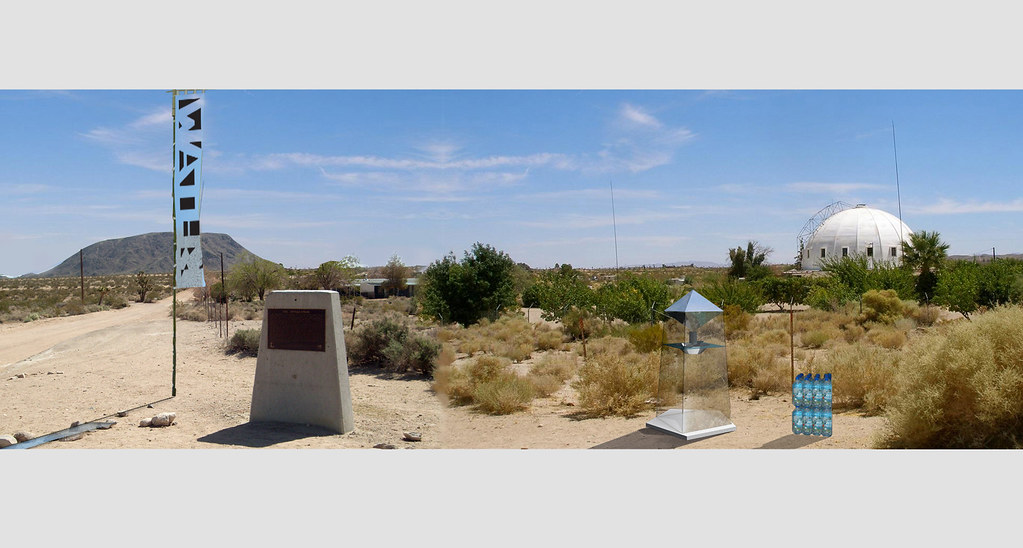
"YOU ARE HERE. TAKE ONE. LEAVE ONE. "


One of the joys of YHBHS is the constant introduction to designers in the Los Angeles area. And sometimes, introductions lead to friendships, as in the case with Scout Regalia. At the moment, it feels L.A. is teaming with designers pushing forward multiple conversations of space, architecture, interiors, and furniture design, as well as what it means "to live" in California: "the city of quartz" or the "city of dreadful paradise."
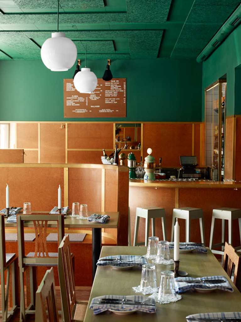
 (you decide)

Scout Regalia "celebrates the inherent design of everyday living," and their studio name can be translated as “humble ornament”- an homage to finding the splendor in something austere and simple. Their studio and home is hidden away in the Echo Park hills with stretching views of the sun-drenched city below. It was the perfect place to understand "why they do, what they do."

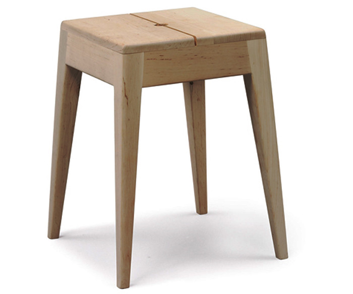
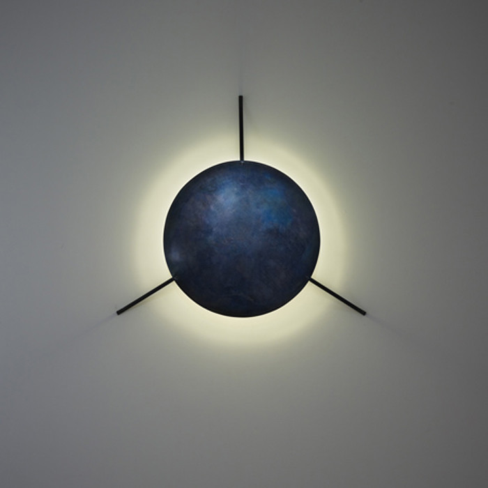
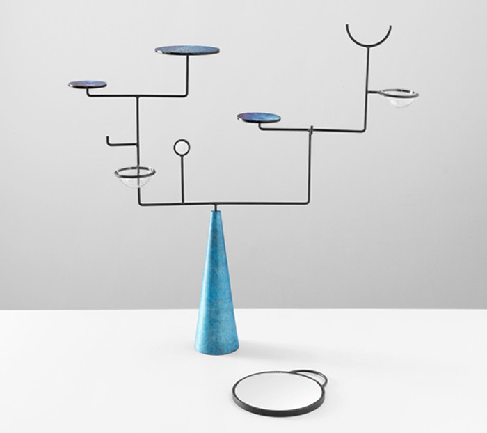
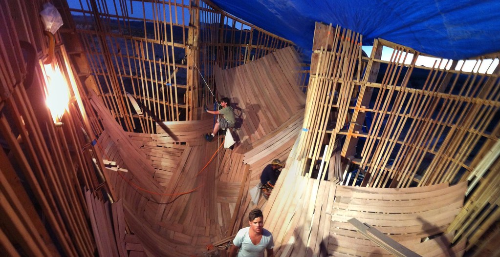
Benjamin Luddy & Makoto Mizutani met in grad school at SCI-Arc in Los Angeles. Individually they have worked in the design offices of Space International Inc, Roman and Williams, Local Brooklyn and M1/DTW. When I asked about the difficulties of moving a design practice from New York to LA, they told me their office flourished creatively. "In fact, our SR Outdoor Table Set was designed when we realized we needed a picnic table for our yard. A lot of our work is inspired by thinking about what people might need or want for their lifestyle. Living in Los Angeles and being able to enjoy the outdoors has definitely been inspiring in our design thinking."

Their latest project at HDTS is opening this weekend in Joshua Tree! Go check it out!
- David John


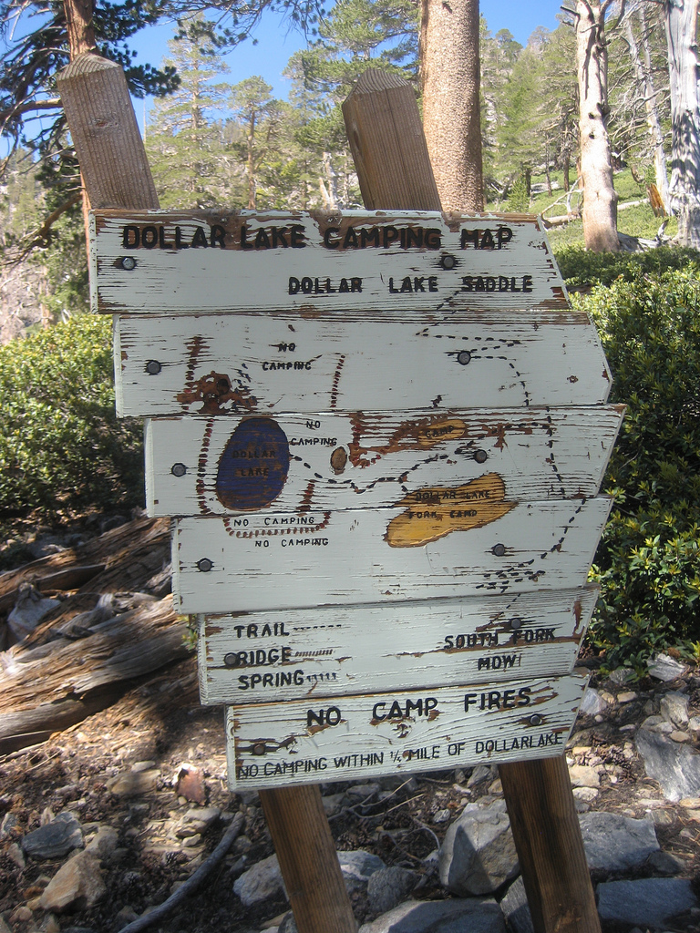
What is your project for HDTS this year? Where is it located?

Our project is called 
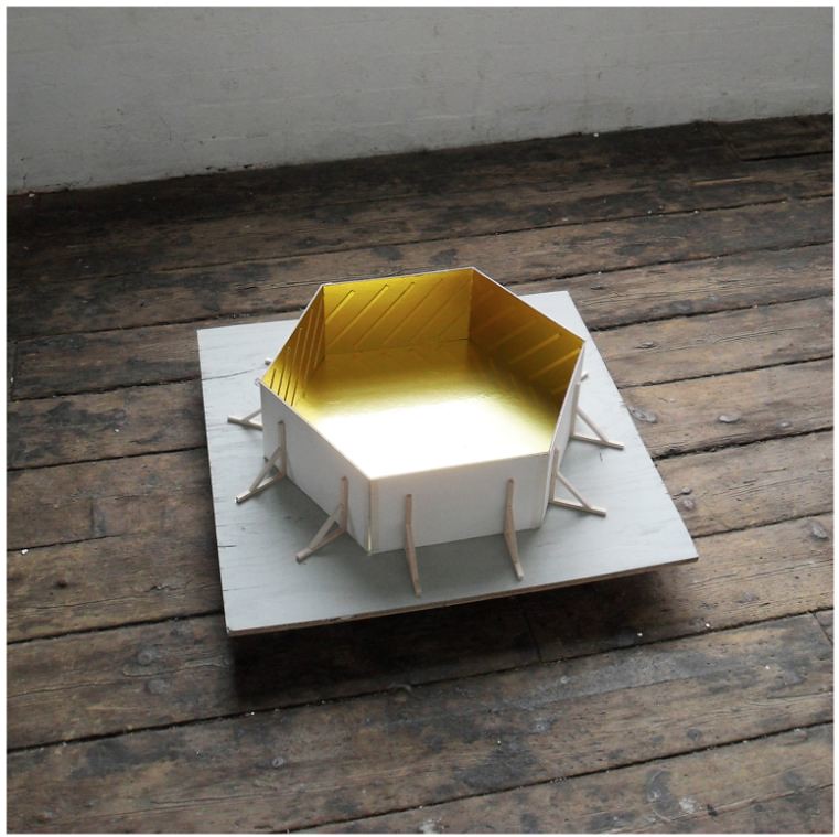
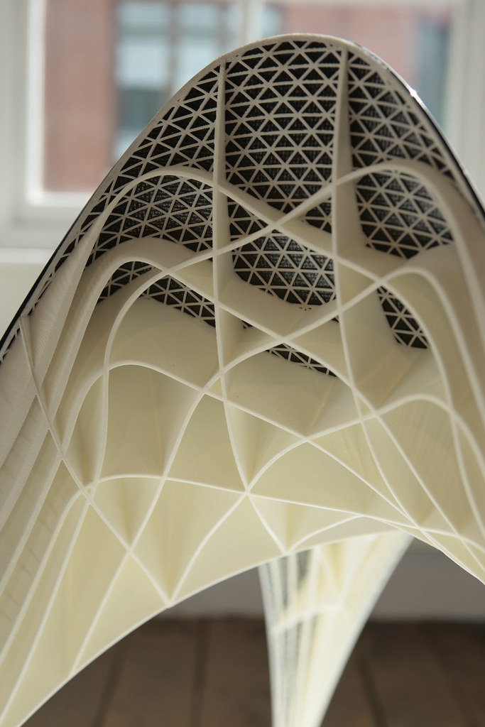
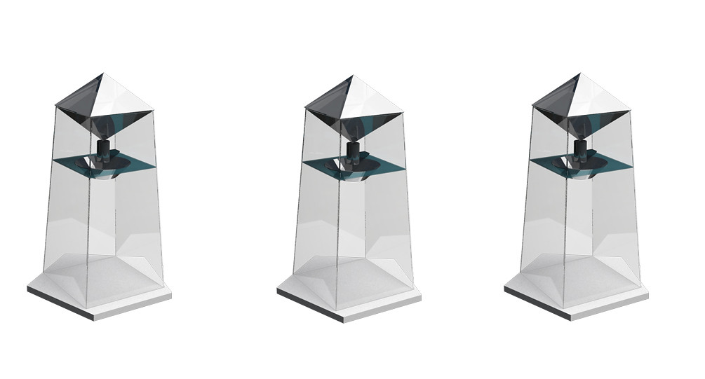
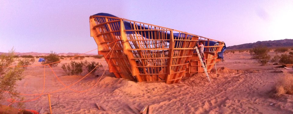
“Trail Registry” and is inspired by the registries found at trailheads. We created this registry to help delineate the entrance to the Pioneertown site, which is full of sculptural pieces but is difficult to find if you don’t know where you’re going. The registry encourages people to leave and/or take a memento tied to the enameled aluminum rods, similar to the way people leave rocks in a pile at the top of a mountain or leave artifacts near trailheads. We’ll have some messages tied to the enameled rods, but we really want to encourage people to leave their own messages and objects on the registry. We hope that this creates a sense of exploration and personal narrative of both the site and the area as a whole. 
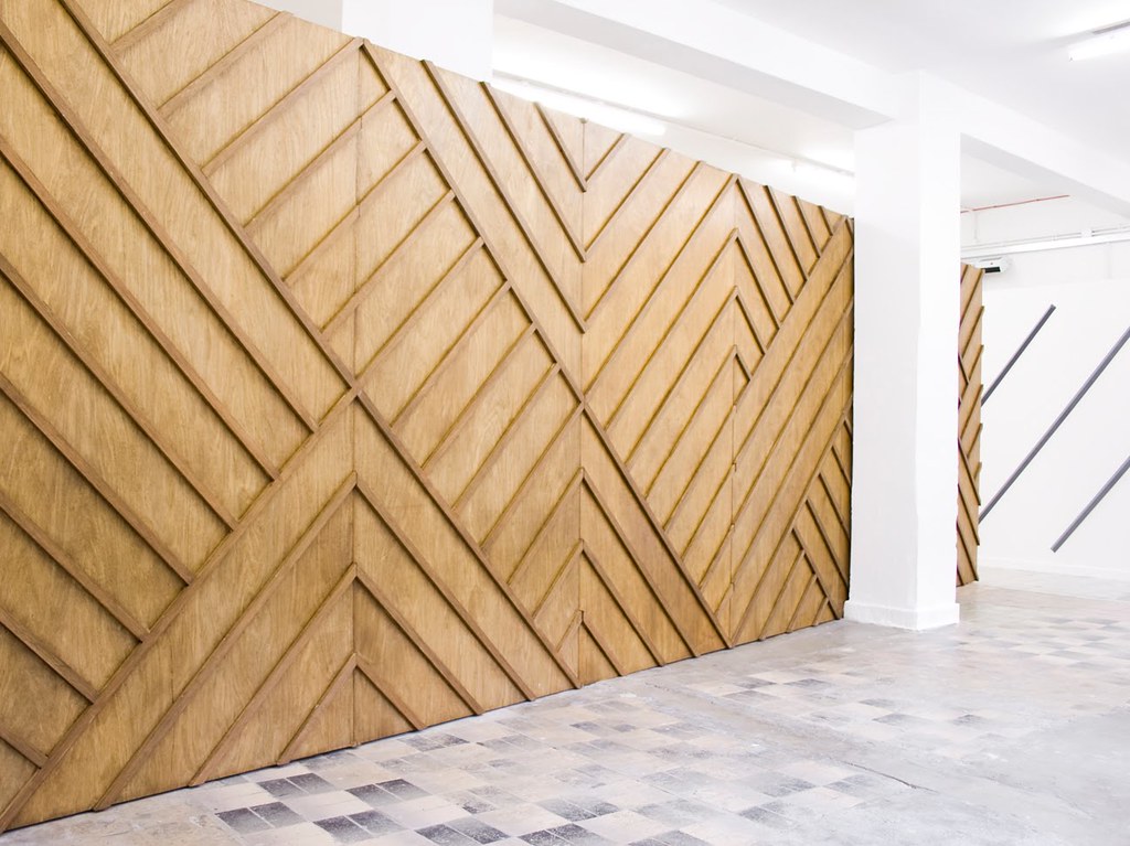
Trail Registry is inspired by totem poles and nudie suits, with representations of the variety of flora and fauna of the high desert. The registry is made of Doug Fir that has been CNC milled to create the form, and includes an aluminum strip in between the "front" and "back" of the two vertical totems, creating a juxtaposition between new and old materials.


Let's talk about those nudie suits.....


We wanted the totems to include some influences of the desert and the West. We really like the representation of nature found in Nudie Suits and the western wear by Manuel. One of the most famous Nudie Suits was the one worn by Gram Parsons, who died in Joshua Tree in 1973. We thought that all those visual influences would work well with the registry.


"In the late 1960s, Gram Parsons became enamored of Joshua Tree National Monument in southeastern California. Alone or with friends, he would disappear in the desert for days searching for UFOs while under the influence of psilocybin or LSD. "
(here)


What is HDTS, and how did you become involved with this project?

High Desert Test Sites is an incubator for some really interesting work in the desert communities of Joshua Tree, Pioneertown, 29 Palms, and other surrounding areas. Since 2002, they’ve had weekend events full of experimental art. Recently they have also introduced architecture and design projects as well. We were brought on to participate in HDTS 2011 through Brooks Hudson Thomas, who has been such a supportive advocate of young designers in Los Angeles. He has given a lot of designers, including us, a chance to showcase work through his Specific Merchandise site, Product Porch, and now as a curator for this year’s HDTS event. We are really honored to be part of the weekend with so many talented designers including WELCOME, ROLU, and Von Tundra, and Ball Nogues.


What is the mission of Scout Regalia?

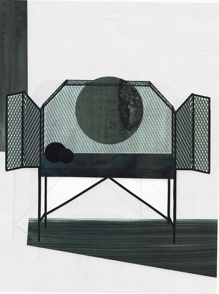
Scout Regalia is a Los Angeles based, multitasking design practice obsessed with the design and fabrication of space, furniture, home products, graphic identities, material processes, and sustainable living. We started working together in 2006 but became a bona fide office in 2008. We work with local fabricators and aspire to embody innovation, discipline, and inquisitiveness in all the work that is produced. Working with fabricators we know and trust and supporting local businesses is really important in the way we do things. We often talk about how design can learn from the food movement. Years ago, organic, local food was considered a novelty or luxury and most people didn’t really think about where the food they were consuming was coming from. Now, there is a growing understanding of how food is produced, processed, and ultimately finds itself in your kitchen. We hope that people start looking at design in a similar light with an awareness of where and how something is designed and fabricated.


How would you describe the Scout Regalia aesthetic, and how does your HDTS project work into the Scout Regalia practice?

We strive for a sense of timelessness in our aesthetic, and we have a vision of design that is neither sterile nor too fussy. As designers, we want to create spaces and products that engage people in meaningful ways and encourage a two-way dialogue in a sense. We aren’t the type of designers who impose our aesthetic in situations that wouldn’t fit the program or the user. We were given a lot of free reign for the HDTS project, and we think that our Trail Registry is right in line with our aesthetic and interests as a whole. The registry is simple and functional with some visually interesting influences such as nudie suits and totem poles. At the same time, we included the exchange of information in the form of leaving/taking objects from the rods as a way to engage personal narratives for each user. It’s a new take on the idea of an informational trail registry- the content is created and curated by visitors to the site.


Douglas fir and aluminum... Any reasons why you chose these materials?

The new doug fir with the enameled aluminum creates a nice juxtaposition between new and old materials- something you see in our products including our SR Outdoor Table Set. We like the way these materials can age together, with the metal starting to visually pull away from graying wood.


Do you have any memorable experiences to talk about regarding trail registries?

We try and go camping as much as possible. When we lived in New York, we did a lot of backpacking in the Adirondacks, hiking through some amazing terrain. In Southern California, we backpack and hike all over the San Gabriel, San Bernadino and San Jacinto ranges. We love the way trails are marked and how registries, signs, and markers can easily fit into the natural landscape- they never seem overly designed or underutilized. We hope that our Trail Registry embodies some of these values as well. It will be a permanent installation and will hopefully be used by visitors and residents alike.


What are you working on next?

We’re always working on new project and products. We’re getting ready to release a new cutsheet project in the next few months, and we’re currently refining a design for a stool. We have dozens of products that we’ve designed and haven’t released yet. It’s a challenge to be a small office and to find the time and resources to bring a product from conceptual design to an actual product. But our office is steadily growing and we’re looking forward to more upcoming opportunities and releasing new products.


go to Scout Regalia here.
go to High Desert Test Sites here...


---------------------


You have read this article art in desert / hdts / hdts 2011 / joshua tree art / mojave desert art / scout regalia / scout regalia interview HDTS / trail registry with the title October 2011. You can bookmark this page URL http://gigibytes.blogspot.com/2011/10/scout-regalia-interview-for-yhbhs.html. Thanks!

Ball-Nogues Interview: High Desert Test Sites

..
"My mind tends to get very big when I’m out here. I don’t mean egotistical, but the expansive space makes most of my thoughts seem pretty insignificant. This is supported by
a long sense of time; a sense of slow time." - Ball-Nogues Studio


High Desert Test Sites is this upcoming weekend! One project I'm looking forward to seeing in person in Ball-Nogues' Yucca Crater. Their work has quickly altered our definitions of current architecture and art, as well as the California landscape. Sunday afternoon, they will be having a pig roast at the Yucca Crater, open to all who are out in the desert roaming the dusty trails, looking at the works of this years' HDTS designers + artists. - David John


Ball-Nogues Studio explores the nexus of art, architecture, and industrial design. As an integrated design and fabrication practices, they create experimental environments to enhance and celebrate the potential for social interaction through sensation, spectacle, and physical engagement. To achieve these results, they work with unusual materials, develop new digital tools, and apply architectural techniques in unorthodox ways.

The partners share an enthusiasm for the fabrication process as it relates to the built object both physically and poetically—they let the properties, limitations, and economic scenarios associated with a material guide a structure’s ultimate form while developing methods to extend the intertwined boundaries of a material’s aesthetics, physical potential and lifecycle.


Describe your project for HDTS 2011, and where is it located? Is there a narrative driving this work? Material Selection?

Located on Iron Age Road east of the town of Joshua Tree, Yucca Crater is a synthetic earthwork that doubles as a recreational amenity. This monumental basin stands 30 feet from rim to low point. Rock climbing holds mounted on the interior allow visitors to descend into a deep pool of water.

Yucca Crater expands on concepts borrowed from land art, incorporating the prospect of the abandoned suburban swimming pools scattered across the Mojave. Ball-Nogues has re-imagined these interventions in the landscape through a method of production where the tools of fabrication transform to be become objects for display in their own right. The plywood structure of Yucca Crater was originally the formwork used to construct another Ball-Nogues work, Talus Dome, in which more than 900 boulder-sized polished metal spheres were assembled to appear as a monumental pile of gravel. The two projects were “cross-designed” such that the method of production used in the first (Talus Dome) has become the central aesthetic for the second (Yucca Crater).

This approach integrates concept, aesthetics, and production, inviting viewers to reconsider their relationship to art by-products while repositioning them within an alternative economic and geographic domain.

Is your work for HDTS site-specific, and if so, how does it relate to the space of the desert? How would you personally describe High Desert/Mojave area?

We were riffing on other artworks that have been produced in the deserts of the American West. Yucca Crater is a synthetic earthwork. It is constructed of manmade materials but assumes the form of a feature we understand as being landscape. We set it into the earth 10 feet to make it feel like it is supposed to be there and so it will hold water.

My mind tends to get very big when I’m out here. I don’t mean egotistical, but the expansive space makes most of my thoughts seem pretty insignificant. This is supported by a long sense of time; a sense of slow time.


Is your work a permanent installation? And if so, how will it change with time?

Yucca Crater is permanent insofar as we will not be removing it from the site; it is intended to remain on Iron Age Road. It will be subject to entropy and eventually will be consumed by the landscape. I imagine it will become a bit like one of the ramshackle remains of one of those homestead houses dotting Yucca Valley, perhaps a bit more mysterious since nobody in the future will know what purpose it served.


How does your HDTS project relate to your ongoing practice as designers?

Aesthetics aside, the work is part of an ongoing investigation into something that might be called “cross design,” where we develop two projects simultaneously –where the production used in the first project becomes the central aesthetic for the second.

We hope that the community will use it over the HDTS weekend. It is kind of an earthwork but it is also kind of an outdoor playground. It caters to our culture of convenience: although twenty miles outside the nearest town, 29 Palms, you don’t need to pilgrimage too deep into the desert to visit an earthwork or find a climbing rock, you can do it all here at Yucca Crater, just off the road!

Future projects?


A public sculpture in Edmonton Alberta entitled Talus Dome – briefly described above. An artwork for the new Bradley West Terminal of Los International Airport entitled Air Garden. An installation in the gallery at the Southern California Institute of Architecture. We hope to use the cross design approach here – the project will be an architectural space constructed of Shaker inspired chairs, each one unique, that come apart at the end of the installation to form an immense dining room set. Two public artworks in the City of West Hollywood. Hopefully time off will become a project; we just haven’t found the time.


go to Ball-Nogues Studio here...

"Benjamin Ball and Gaston Nogues explore the nexus of art, architecture, and industrial design. Their work has been exhibited at major institutions throughout the world, including the Museum of Contemporary Art, Los Angeles; the Museum of Modern Art, New York; the Guggenheim Museum; PS1; the Los Angeles County Museum of Art; arc en rêve centre d'architecture + Musée d'Art Contemporain de Bordeaux; the Venice Biennale, the Hong Kong | Shenzhen Biennale; and the Beijing Biennale.


--------------------
You have read this article abandoned swimming pools / ball nogues / ball nogues yucca crater / earthworks / high desert test sites / joshua tree art with the title October 2011. You can bookmark this page URL http://gigibytes.blogspot.com/2011/10/ball-nogues-interview-high-desert-test.html. Thanks!
Related Posts Plugin for WordPress, Blogger...