weekend warrior, pt 583

"garden of eden"
vs
"cosmopolitan soul"
vs
"secret garden"


Since last week's Mattia Bonetti reception here in Los Angeles at Duke and Duke, I've been submerged in images of Parisian Decor + furniture. For those that enjoy French design, stop by the gallery.... A new favorite book on current French Interiors is "Living in Style Paris" with photographs by Reto Guntli, & text by Debra Derieux Matos.

Rooms that are perverted with decadent style, colors and forms exploding up to the ceiling. Geometerical dances in the moonlight! Turquoise, pinks, blues, blacks, yellows, and mirrored surfaces. Oh me oh my! I'm not entirely sure how French designers are able to pull of such rooms of force with such subtle ease, but they do, and do again, and again, and again.

Welcome to the weekend, warriors. - David John


Living in Style Paris, edited by Caroline Sarkozy... "In Parisian interiors, designers have mixed the traditional with the unexpected and influences from other faraway places, creating a very unique Parisian style....

Edited by renown interior designer Caroline Sarkozy and lavishly illustrated by master photographer Reto Guntli, this book opens the doors to the houses of Diane von Furstenberg, Lenny Kravitz, Jacques Grange, and many more."


-----------------------
You have read this article duke and duke / living in style paris / mattia bonetti / paris interiors with the title July 2011. You can bookmark this page URL http://gigibytes.blogspot.com/2011/07/weekend-warrior-pt-583-garden-of-eden.html. Thanks!
"Whether you comprehend it or not, you don’t understand it all. It’s infinite." - Lynda Benglis
vs
"Like a tower ready to fall, Spinning over the ground" - Mark Eitzel
vs
"anti form: the perpetuation of FORM is functioning idealism" - Robert Morris, 1968


Lynda Benglis EAT MEAT, 1969/75 Bronze


"Like a tower ready to fall, Spinning over the ground
Like the gorilla ride, There's moments and minutes
There's seasons and there's dreams, Glued onto dreams,
And everything's beautiful"
- Mark Eitzel


Lynda Benglis' retrospective finally makes it to the West Coast, after being at the New Museum in New York for the first half of 2011! The opening at MOCA is this weekend, and her work will slowly be slumping into our subconscious. Benglis' "fallen paintings" and post-minimal sculptures shaped my perceptions of space and interiors. I was introduced to her work about the same time I was reading Anne Truitt's Davbook. To this day, I still think of some of Benglis' works as "melted Anne Truitts." It's strange how the mind works.

If "space is the place", then I'd like to be on my back, slumped on "EAT MEAT 1969/1975" staring at the stars, and thinking about collapsing post-modern forms and fallen civilizations. - David John


------------


"But actually it’s really a marriage between the conscious and the unconscious that occupies the creative mind. I find what the materials can do and within that context there is that decision-making. In the beginning I romanticized it; and you can say what you want, it is still confined by the format. I saw visions of clouds yesterday; you couldn’t imagine how complicated they were on all horizons. That’s one reason I love New Mexico! The kinds of images of the clouds are infinite.

I think we deal with an INFINITE imagination!
This is how the artists must get the God-complex! However, the artist is always dealing with the bounds of the material and the unbounded nature of the universe and of the imagination – and trying to mark the time. Whether you comprehend it or not, you don’t understand it all. It’s infinite."


( Lynda Benglis talks to Marina Cashdan, via FRIEZE. take time to read the entire article here.)

lyrics taken from Mark Eitzel's 60 Watt Silver Lining

check out FORMLESS Furniture.... the MAK exhibtion catalog.


--------------------------
You have read this article anne truitt / lynda benglis / MAK center Vienna formless furniture / space is the place with the title July 2011. You can bookmark this page URL http://gigibytes.blogspot.com/2011/07/whether-you-comprehend-it-or-not-you.html. Thanks!

YHBHS interview with MARI ANDREWS

....
"I often make up words for titles, sometimes even in fake Latin. I love all those syllables and how they roll off the tongue. I like to misspell words so the title becomes understood phonetically. Other times I use verbs, or descriptive passages, or lines of poetry. Titles come about in many ways."

- Mari Andrews


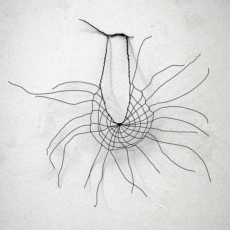
the studio of Mari Andrews....


Mari Andrews has been working for over twenty years with materials that some might walk past, not even stopping to think twice about what they are actually seeing. The first time I discovered Mari's work, I connected to a sense of quiet purpose in her work, a sense of doodling with forms and abandoned materials, creating subtle arrangements in space. Her twisted thorns, lichens, and dangling rocks recall the art of ikebana, a quest for balance and beauty. But her formations of silicone coated wires make me think of mindless afternoons sketching, or the curves of the road that lead to Big Sur, also known as the Pacific Coast Highway. It's as if she has created maps with the objects she has discovered upon her own walks and trips, and drew them on the wall for us to use. If these works are maps to an unknown land, you'll see me on the other-side, looking for bubbling fountains and endless mountain views. Thank you Mari......

Mari Andrews' work is part of a summer group exhibition at JK Gallery in Los Angles.
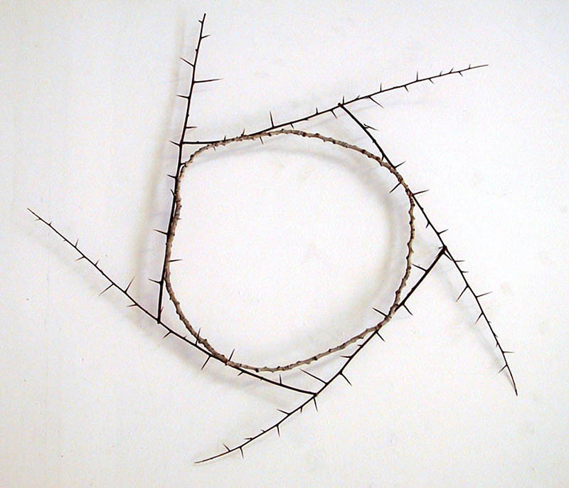


2 untitled works from 2000


Can you talk about your choice of materials you work with for your sculptures? And how they came about?

I work primarily with annealed steel wire which is black. It feels like a pencil line to me. (Almost everything I make I consider to be a continuation of my drawing practice.) Sometimes I add black silicone to the wire, and then it becomes a charcoal line. I combine various man-made and found materials with the wire, to make "hybrids". I have collected found objects for decades and it was very satisfying to bring these objects into the work - a synthesizing Eureka moment actually. Sometimes the collected material will spark an idea for a sculpture. Other times I have a fairly solid concept or drawn-up plans and look about my raw materials to select the right combination of things to carry out that idea. I have also sought out things to make or complete a piece. This is true of the lichen in "Lichen Square" in my upcoming JK Gallery show. I needed a batch of lichen and headed to the Northern California coastal range to collect it.


Where do you collect the materials for your works?

I collect all the time, although I have had to become more discerning for lack of space. I take walks in the city and pick up human detritus from the street. There is rusted metal wire and odd bits on construction and destruction sites, also along railroad tracks. I collect seeds, leaves, pods and branches while hiking, stones while walking river beds, other stuff washes up on coastal shores. I sometimes use kitchen compost like squash or melon seeds, and garden trimmings, too. Once in a great while people will bring me their findings. I take donations .


If you were not a sculptor, you might be.....? A biologist, botanist, geologist, and maybe a sociologist.


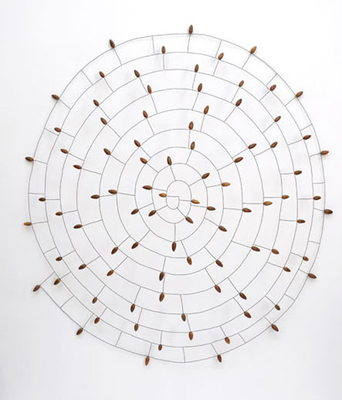
Accoil, 2009, wire and acorns


What does "Acocoil" mean? or "Alphanet"? How do your titles comes about, and what are they referencing?

"Acocoil" is a hybrid of the words Acorn and Coil, I made it up. It is a very basic description of form and materials used in the sculpture. The sculpture "Alphanet" contains 26 manzanita leaves attached to the ends of a wire mesh. Each leaf has an alphabet pasta glued to the face of the leaf. Twenty-five different letters were used with one repeated, so not every letter of the alphabet is represented, one is missing. It couldn't be perfect in my mind, so I made a "purposeful error", like in a Navajo rug. So "Alphanet" is also, a hybrid of a couple of words. I often make up words for titles, sometimes even in fake Latin. I love all those syllables and how they roll off the tongue. I like to misspell words so the title becomes understood phonetically. Other times I use verbs, or descriptive passages, or lines of poetry. Titles come about in many ways.


"For the most part these three-dimensional drawings are presented on the wall. They are made as singular pieces and often come together in larger wall installations. The individual works relate to and play off of each other like words forming sentences or sentences telling a story. "
What are you communicating with your works, what is one of the many stories you are telling?


The quote about "telling a story" is a really a metaphor for the way the sculptures interact with one another. They are like family members, related but different. They can stand alone or be read as a group of "related" elements. When they are presented together I feel that there is a richer, more complete vocabulary of form. I'd like viewers to walk away from my work with a deeper curiosity/observation of one's surroundings. This includes our urban environments as well as the natural ones. Perhaps if we slow down and take in what is around us we will be more inclined to appreciate and protect what we have left of our natural environment. So there is an underlying environmental message.


You mentioned, the objects often times reflect our "human sensitivities and vulnerabilities." Will you talk about this?

I believe that the delicacy and tenderness of some of the materials I use have similar qualities to human emotion, human condition. The objects can be physically fragile; they age, crack, break, fade. Some are sturdy but flexible like the willow. Some are thorny and defensive like cactus spikes. Some look thorny but are soft and pliable - as in silicone. The combination of materials sometimes yield humorous effects - - another very important human quality, I believe. The hundreds of "paperless drawings" I have made are representative of the diversity found in our society; the multitude of people, cultural backgrounds, points of view.


Who or what captivates your attention?
Bees, human psychology, long vistas, my garden, the western state deserts, high altitude streams, liberal politics, petroglyphs, abandoned mines, sense memory, obsolete tools, the oldest living things, spiders, poetry....


Among artists?
Ann Hamilton, Anish Kapoor, Martin Puryear, Gego, Herman de Vries, Terry Winters, Eva Hesse, Kiki Smith.....


Does your work ever frustrate you?
Oh yeah! I'm not technically as proficient as I'd like to be to carry out some ideas. I also find that some ideas are difficult to translate into any materials.


circuit 2006, wire and silicone


please take a look at Mari Andrews' site.

Mari Andrews July 16, 2011 — August 20, 2011
JK Gallery, Los Angeles
2632 S. La Cienega Blvd. Los Angeles, CA 90034


----------------------
You have read this article art / art interview / becomes sculpture / mari andrews / paperless drawings / sculpture / YHBHS interview / yhbhs interview with mari andrews with the title July 2011. You can bookmark this page URL http://gigibytes.blogspot.com/2011/07/yhbhs-interview-with-mari-andrews.html. Thanks!
when a chair became a sculpture
became a chandelier.


"We are artists; we do things for no particular reason – no particular purpose. It’s like painting on a white canvas – you cover it with paint; there is no reason to explain why you want to cover it with paint, or why you use blue and yellow or other colors... But for us there is a reason and it’s always the same one: We want to create a work of art, of joy and beauty

-Interview with artists Christo and Jeanne-Claude (full interview here..)


These days ropes are everywhere in design. Hanging loose, or hanging tight. Restricting or holding us up! Lindsey Adelman's rope chandeliers bring me so much joy, they appear effortless. Especially if they were to hang above a Christo chair. I'm still disappointed I didn't get the chance to meet Christo when he was here in L.A. last year.


Tie me up! Tie me down!

Tie me down! Tie me around, oh my!


1. Christo,Packed Arm Chair, 1965/65

2. 2010 knotty bubles. Heavily inspired by Japanese packaging and maritime culture, Knotty Bubbles is a sculptural light made of hand-blown glass globes tied together with knotted rope. The hand- made nature of the Knotty Bubbles ensures that each is a unique piece. The Knotty Bubble Collection is designed by Lindsey Adelman in collaboration with studio Creative Director Bec Brittain, glass artist Michiko Sakano, and designer Kristin Barron. these are prodcued by Roll and Hill, a fantastic lighting resource.

go to Lindsey Adelman's studio here..
read a YHBHS interview with Bec Brittain here...


"If others want to accumulate money, that’s fine with us. Our aim is different and very specific: We only want to build art. For us, money is like manure. It is good only if you spread it around; only if it helps you do what you want to do."

- Jean Claude...


---------------------------
You have read this article chisto and jeanne-claude / lighting / lindsey adelman studio with the title July 2011. You can bookmark this page URL http://gigibytes.blogspot.com/2011/07/when-chair-became-sculpture-became.html. Thanks!

Sheats / Goldstein House : Los Angeles

Lautner Home tour
A sunny Saturday afternoon in the hills
of Beverly Hills, Los Angeles.


Yesterday afternoon I was invited to take the Lautner home tour, viewing 4 homes built in Los Angeles by Lautner. This tour offered behind-the-scenes access inside four of Lautner’s most significant Los Angeles homes, including the Harpel House (1956), Jacobsen House (1947), Schwimmer House (1982), and Sheats/Goldstein House (1963).

All afternoon, I've been slowly sorting through the images of the homes, and decided to post the Sheats/Goldstein House that was built in 1961-1963. The entrance to the home is down a long lush, narrow driveway that sculpts into the dense hill. Motifs of triangles, water, space, light, concrete, & cutout-forms run rampant in the design of this home. The house was serene and cool, even on a hot LA summer afternoon. At times, I felt like I was in an eagle's nest, high among the trees, and the smog of the city below.

I dare to dream of the colors of dusk these views would allow. I overheard lots of conversation about the hats, "touching with your eyes," and an all mirrored bathroom with a retractable ceiling (oh man!). But another one of the questions of the afternoon people kept asking is, "Who is James Goldstein, (the man who owns this home)?"


When a home became a sculpture
became a triangle
that opened a door to the future.


cardboard model of the James Turrell installation on the property.


"The skyspace, also called "Above Horizon" is an art installation located on a steep slope below the residence. The skyspace was designed by light artist, James Turrell, in collaboration with architect, Duncan Nicholson. The project is built in the same construction materials as the home. Originally, James Goldstein conceived this art installation as a collaboration between John Lautner and James Turrell, but Lautner died before being able to work extensively on the project. Now finished, the room features two portals, made by a local aerospace engineer, which fold away using carbon fiber composite materials. The room also contains a built-in concrete lounge to enjoy the thousands of hidden LEDs that flood the room every evening for the sky and light show." (more here)

still want to know more about a skyspace?
watch this video here...


Who the Hell is James Goldstein?, an excerpt from Interview Magazine.

"I realize I’ve become somewhat of a legend, yes.
And that has brought stories with it. . . .
But I like that."


"I didn’t know much about Lautner when I stumbled upon this house, but I knew I wanted it. Someone else had it under contract, and when he tried to renegotiate the purchase, I stepped in and bought it. When I was ready to start working on the house, I brought Lautner in to see it. He was shocked to see what had happened to it. One of the previous owners had just destroyed the place—he painted the concrete ceilings green and yellow. So we worked together for almost 15 years before he died, and I think he was really thrilled with the opportunities I gave him. As far as I know, it was the first time he was given the opportunity to design furniture and really work on the entire house, inside and out, and bring it up to its full potential."

"High in the hills of 90210 sits Goldstein’s humble abode. Originally built by Lautner in 1963, the house juts out in concrete triangles and clear glass rhombuses over a panoramic view of the city. Goldstein bought the place in 1972 and has been renovating, updating, and expanding it since 1980. It features all the accoutrements of a lifelong bachelor pad: TV screens come out of ceilings, portholes in the pool look into his bedroom, a James Turrell sky space sits on the bottom of a hill, parts of the clear glass roof retract to reveal a private jungle planted around the manse, and photos of Goldstein posing with famous people line the walls of the interior. “There has been construction going on literally every day for the past 30 years,” Goldstein says. His latest megaproject is a new structure in his backyard that will eventually contain his office, a fully functional nightclub, an offshoot terrace, and guest rooms—all located beneath a tennis court."


please read the whole interview with James Goldstein here..

Want to know more about the John Lautner Foundation, go here.

Mak Center.....


---------------------------------------
You have read this article james goldstein / james goldstein lautner / lautner home tour / shets goldstein tour with the title July 2011. You can bookmark this page URL http://gigibytes.blogspot.com/2011/07/sheats-goldstein-house-los-angeles.html. Thanks!

THE MINIMAL LOFT : materials + light

.
"Earlier in my career I didn't think I had a look, but in the past five years, or so,
we've developed a spare look, that could be considered minimalist, although in spirit it is fairly modest"

- David Mann, MR Architecture + Decor


The images above are of a SOHO Penthouse Loft by MR Architecture + Decor, a firm based in New York, led by David Mann. A loft based on the repeated square, of sorts, and referencing Japanese design and minimalism. Rooms such as this one make me think of Lee Ufan, and Becky Beasely. An open box in the middle of the room floating on a sea of shiny blackness.

The materials are simple, raw, industrial, and quietly epic. MR Architecture + Decor continues to melt my mind with their projects, creating these timeless voids, where form + materials become the conversation. - David John


"MR Architecture + Decor is a 20-person studio led by founding partner David Mann, in collaboration with associates William Clukies, Robin Corsino and Robert Fuller. Based in New York City, the firm’s scope of work extends from ground-up construction and renovation to interior architecture, design and decoration for residential, retail and other commercial spaces.

The MR aesthetic is characterized by diversity and unified by an essential clarity. Design evolves out of intimate dialogue: between the client and the architect, between the architect and the site. The results reflect clients’ needs and desires, their unique characters as filtered through the MR vision; and reveal a beautifully calibrated balance between form and function.

With no singular mandated style, MR is free to take on widely disparate clients and projects. The common denominator throughout is a disciplined aesthetic that focuses on revealing the poetry in the most rational approach to space, proportion and light."


text above taken from MR Architecture + Decor

quote taken from 1st dibs profile here..

You have read this article david mann / interior of a loft / loft / mr architecture / weekend warrior / when materials take flight with the title July 2011. You can bookmark this page URL http://gigibytes.blogspot.com/2011/07/the-minimal-loft-materials-light.html. Thanks!

PRODUCT PORCH


a 6 month retail experiment at

Museum of Contemporary Art San Diego.....

"Nobody thought much about the front porch when most Americans had them and used them. The great American front porch was just there, open and sociable, an unassigned part of the house that belonged to everyone and no one, a place for family and friends to pass the time."

- Kahn, Preserving Porches


When Brooks Hudson Thomas of SPECIFIC asked me to come down to San Diego to talk about his latest project with Blaire Dessent of The Vitrine, I jumped at the opportunity. August 4, Thursday evening, will be the opening of PRODUCT PORCH in San Diego, and I could not be more thrilled to be there talking about their take on design, interiors, art, and craft. I have to admit, I've spent many afternoons in Brooks' LA store, in utter amazement of the work he has shown, and the environment he has created. SPECIFIC has been a constant source of inspiration for me, and I am happy to see the store continue to transform other cities. - David John


"Specific Merchandise
and Vitrine are excited to announce a new pop-up project:
PRODUCT PORCH, a six-month retail-experiment at the Museum of Contemporary Art San Diego. Invited by chief curator, Kathryn Kanjo, Brooks Hudson Thomas and Blaire Dessent are taking over the MCASD museum shop in the Downtown MCASD location at 1001 Kettner Blvd. throughout the run of the exhibition Phenomenal, which will be on view through January 22, 2012.


Among the artists and designers to be included in the shop are Jason Meadows, Brendan Ravenhill, Fern, Dino Sanchez, Sarah Crowner, Smockshop, Design Bitches, Tanya Aguiñiga, todosomething, , Soledad Proaño¿Adonde?, WELCOME, Workstead, Kimmel Kids, Objeti, SCOUT REGALIA, Makelike, and more....


"PRODUCT PORCH will serve as a laboratory for what a museum-shop could be and will feature new design objects, furniture and accessories made by emerging and established artists and designers, and will serve as a destination for new design and creative retail in San Diego. Continually rotating merchandise along with a series of interactive programs inspired by the exhibition will offer a reason for people to continue to return to the Museum.

Please join us at MCASD’s TNT (Thursday Night Thing) on August 4 from 7-10 PM opening celebration for the PRODUCT PORCH. Titled “TNT: Emerge,” the evening focuses on emerging design, music, and taste. Brooks + Blaire will be joined by David John of You Have Been Here Sometime , the acclaimed art and interiors blog, for an informal discussion about the PRODUCT PORCH and their respective projects. In addition to the debut of Product Porch, this will also be the first opportunity for many people to view the work of artists Larry Bell, Mary Corse, and James Turrell, whose work is being installed on a staggered schedule leading up to the official grand opening of Phenomenal: California Light, Space, Surface on September 25. Guests can also enjoy cocktails, art-making activities, artist talks, and live music....


See you there!


-----------------------------
You have read this article blaire dessent / brooks hudson thomas / museum of contemporary art san diego / product porch / the vitrine with the title July 2011. You can bookmark this page URL http://gigibytes.blogspot.com/2011/07/product-porch.html. Thanks!

THE ARCHITECTURE OF A LOFT


6 views

of a loft in Brugges


6 views
of a loft in Brugges

by Dujardin Filip via here...


--------------------------------
You have read this article belgium / interior of a loft / loft / the architecture of a loft with the title July 2011. You can bookmark this page URL http://gigibytes.blogspot.com/2011/07/the-architecture-of-loft.html. Thanks!
the sea pt 3.

"I feel enlarged and encouraged. "
- Frank Llyod Wright

"I wanted to get in touch with something more primitive
than my wandering and skipping brain.
"
- Vija Clemins


the sea pt 1.
"the sea is a long, long way from me
I'd go there if I had the time
but lying here will do just fine" - low


VIJA CELMINS: "Well, I found the work of the photorealists a bit dead, but I got interested in the photograph. I used the photograph as a guide, so I would not have to worry about the image. They are images within an image within an image -drawings of two-dimensional images. I was trying to bring the images back to life by putting them in a real space that you confront. I don't think anyone else was making work like this at the time, not clippings of disastrous events. Now they look a bit ridiculous to me.

They look almost too contrived. Of course, I didn't really think like that at the time. I remember thinking that the making of the image was reason enough to do it. It was about finding a touch; a way that the image could sit on the surface. The whole point for me was that even though art has been through a million things, I wanted to get in touch with something more primitive than my wandering and skipping brain." (here)


Mike Wallace: When you go out into a big forest with towering pines and [experience] almost a feeling of awe that frequently you do get in the presence of nature...do you not feel insignificant? Do you not feel small?

Frank Llyod Wright: On the contrary, I feel large. I feel enlarged and encouraged. Intensified. More powerful.


two into one: background art by vija clemins, chairs by frank llyod wright.
-----------------------------------
You have read this article chairs / frank llyod wright / vija clemins / when paintings become chairs with the title July 2011. You can bookmark this page URL http://gigibytes.blogspot.com/2011/07/the-sea-pt-3.html. Thanks!
into the light.
they went.


"into the light.
they went."

a recent color board for: "a room created for the sea"

the daylight is scarce there, though the winds howl at night, like they are conversing with each other. a conversation of sorts between dawn and dusk. a fight for the right shade of green. A few of my favorite rooms & objects, compacted into one. Enjoy the layers separately, or together.

images combined:
vasa's light sculptures (i remember the day i visited his studio here in los angeles, and saw the light being made for the first time. here... I chatted with him, as assistants dusted the blocks into a shine. one called him "the most sensuous and sensational colorist of the southern California artists working in plastic." i could not agree more.

2 interior images by james huniford interiors, and axel vervoordt.
i've looked at these images for awhile now. the electric green monochrome painting has been colorized, adjusted, and compacted for our viewing pleasure. enjoy the square.

off to the sea to taste the salt.


---------------------------------------
You have read this article color crush / james huniford / off to the sea to tase the salt / when images become one with the title July 2011. You can bookmark this page URL http://gigibytes.blogspot.com/2011/07/into-light.html. Thanks!
Swedish Sconce vs. Greene and Greene ("Rape of the Blacker House")

But oh ain't the nighttime so lovely to see?

Don't all the nightbirds sing sweetly?

You'll never know how happy I'll be

When the sun's going down.


- Gillian Welch


Swedish Sconce vs. Greene and Greene.

But oh ain't the nighttime so lovely to see?

Don't all the nightbirds sing sweetly?

You'll never know how happy I'll be

When the sun's going down.


- Gillian Welch


"The Robert R. Blacker House house was purchased by Mr. and Mrs. Max Hill in the 1950s. In 1985, recently widowed, Mrs. Hill sold the property to Barton English, a Princeton graduate and rancher from Texas, and Michael Carey, a prominent dealer of Arts and Crafts era antiques from New york City. Shortly after close of escrow, Mr. English hired a well known local antique dealer to remove more than forty eight original lighting fixtures for him. Later he also removed some of the leaded art glass doors, windows, and transom panels; only after commissioning a well known local studio to produce exact reproductions of the doors and windows that were to be removed.

Many of the original pieces were sold on the art market. This incident has been referred to as the "Rape of the Blacker House". National media attention to this sad sequence of events was facilitated through the efforts of Pasadena Heritage executive director Claire Bogaard. Articles appeared in the Los Angeles Times, Washington Post and New York Times. Pasadena enacted an emergency ordinance, known as the Blacker Ordinance, which attempted to limit the ability of people owning homes designed by Greene and Greene to dismantle or otherwise destroy artifacts therein. Although not a direct prohibition, the ordinance delayed for up to one year any changes or alterations, subject to review of a committee of the Planning Commission. Conservation-minded citizens guarded the Blacker house day and night to keep further fixtures from being removed." (from here)


S A D N E S S (via here)


You have read this article blacker house / greene and greene / swedish sconce / what will be left when we return / when houses have stories with the title July 2011. You can bookmark this page URL http://gigibytes.blogspot.com/2011/07/swedish-sconce-vs.html. Thanks!

over and over.


vincent van duysen
vs tredici & co. vs andre sornay

"over and over and over and over and over
the joy of repetition really is in you"
aka
"I'm a complicated being with love songs to beat.
I'm a problem solving baby who could march all night." - hot chip


"under and under and under and under and under
the smell of repetition really is on you
and when i feel this way i really am with you"


3 inspiring works by:
1. vincent van duysen for b & b italia
2. coffee table by tredici & co.
3. andre sornay


"André Sornay (1902-2000) attended the École des beaux-arts (fine art school) in Lyon before taking over the family business following his father's death in 1919. He completely revolutionised the company's production line, moving away from period furniture to create resolutely modern pieces. Influenced by Bauhaus and by the Stijl movement, which were both marked by the desire to synthesize art and architecture, Sornay belonged to a new generation of architects, artists and decorators who wanted to create new forms that were suited to modern life.

The UAM (Union of Modern Artists) counted a number of avant-garde artists among its members, including Pierre Chareau, Francis Jourdain, Le Corbusier and Charlotte Perriand, all eager to break away from tradition and to democratise art. André Sornay's creations are characterised by pure geometric lines, harmonious proportions and great practicality.

(text taken from Gallery Marcelpoil Gallery Paris, here)


The materials he used reflect the traditional and the modern; they include precious woods, permatex, rubber, Duco lacquer and metal. The clarity of his vision regarding the use of space prompted him to become an interior designer for a number of his local clients. "


all musical lyrics by the incredible hot chip.
"this is a warning, i'll spell it out for you."

-------------------------------
You have read this article andre sornay / b and b italia / the grid / the grid goes on forever and ever / tredici and co. / when furniture becomes sculpture with the title July 2011. You can bookmark this page URL http://gigibytes.blogspot.com/2011/07/over-and-over.html. Thanks!

Michael Graves' Residential Projects


"In our residential projects, we explore themes of domesticity and habitation through the organization and articulation of rooms, as well as in the design and selection of interior furnishings. For developers, we have designed single speculative houses, model houses for large-scale national developments, kit homes, and single room kits called Pavilions.
"


1. HOUSE AT INDIAN HILL 1999
Cincinnati, OH, United States Located on a 3.5-acre lot adjacent to heavily wooded public parkland and overlooking the Little Miami River, the residence is arranged in an L-shaped configuration to engage the surrounding landscape. The massing consists of 10 distinct pavilions carefully arranged within a building area constrained by zoning requirements. The pavilions evolved from different programmatic uses and are formally individualized through distinctive, shapes, colors, and materials

2. CEDAR GABLES HOUSE 1998-1999 Minnetonka, MN, United States Cedar Gables, named for its distinctive three-gabled cedar-shingled roof, was designed for the 1999 “Parade of Homes” show-house tour in the Minneapolis area. Showcasing the breadth of the firm’s work, Cedar Gables epitomizes Graves’ interest in designing “the house and everything in it.” The interiors incorporate light fixtures, plumbing fixtures and fittings, and door and drapery hardware designed by the firm. Furnishings include custom-designed furniture and textiles as well as housewares and decorative accessories from the initial launch of the Michael Graves Design® collection for Target.

3. TARGET CLUB WEDD HOUSE Benbrook, TX, United States Target Stores commissioned MGA to design a single-family house to be given away as first prize in a sweepstakes for couples enrolled in Club Wedd, the store’s bridal registry. At the time, MGA was exploring options for modular construction and pre-fabrication and, since the location of the house was unknown, MGA collaborated with Lindal Cedar Homes on a “kit house” that could be built anywhere in the U.S. The architectural character of the house was derived from the post and beam construction system and was expressed through the timber frame detailing and wood siding, available in a variety of options.

4. HOUSE AT COOLIDGE POINT 1997 Manchester-by-the-Sea, MA, United States This single-family house is located on a bluff along the rocky New England coast, approximately 60 feet from the Atlantic Ocean. In response to both program and site, individual pavilions - a residence, an office, guest quarters, swimming pool, pool house, and garden elements - are given their own identities. The casual nature of the composition in plan is reminiscent of New England compounds developed over time.


all images and text are sourced from Michael Graves portfolio here..


-------------------------------------
You have read this article michael graves architecture / residential architecture with the title July 2011. You can bookmark this page URL http://gigibytes.blogspot.com/2011/07/michael-graves-residential-projects.html. Thanks!

John Lautner 100th Birthday Home Tour

...
"You know, many people have a psychological or emotional problem with modern architecture.
Many people do not want the new, or TODAY, or TOMORROW. They want YESTERDAY. This is secure, because it is known and very predictable. If they’re that way, I don’t feel they’re open-minded. One man, I remember, had an English country house living room like a museum. He thought this was the only way, the only kind of architecture, the beginning and the end of the world. I can’t talk to guy like that, just forget it."

- John Lautner, 1971 AD interview


images of Schwimmer House, 1982


Next Saturday, July 23, for John Lautner's 100th Birthday (1911- 1994), The John Lautner Foundation is offering a special tour of 4 of his key homes in the L.A. area.

I'll be touring them!
When these architectural home tours in LA come around, I jump on the opportunity. A chance to see Lautner's homes in person does not happen very often. Last time I heard, there are a few left, before the event is sold out. Plus, all the proceeds will benefit The Lautner Foundation and the MAK Center; both are non-profit organizations that help preserve and highlight the region's modern architecture. Buy a ticket here... - David John


John Lautner 100th Birthday Home Tour
July 23, 2011, 10:00 am-6:00 pm Price: $100
General Admission | $90 MAK Center friends, John Lautner Foundation members, and students.
This tour series offers unique, behind-the-scenes access inside four of Lautner’s most significant Los Angeles homes, including the Harpel House (1956), Jacobsen House (1947), Schwimmer House (1982), and Sheats/Goldstein House (1963).


"People resist getting involved with art, antiques, architecture or interior design because they just don’t feel they know enough. I would encourage the neophyte by trying to explain the vast potential of architecture. It’s non-ending. It’s untouched. If they want a more interesting life, a life more worthwhile, they couldn’t do anything better than live with fine architecture.

- John Lautner


photography by Tycho Saariste


---------------------------------------
You have read this article 1982 architecture / architecture / john lautner 100th birthday home tour / lautner home tour / los angeles architecture / schwimmer house with the title July 2011. You can bookmark this page URL http://gigibytes.blogspot.com/2011/07/john-lautner-100th-birthday-home-tour.html. Thanks!

"If You Lived Here, You'd Be Home By Now"


An Exhibition Cocurated by Josiah McElheny, Tom Eccles, and Lynne Cooke

June 25 Through December 16 @ CCS Bard Hessel Museum of Art

"Significantly, the exhibition does not present the viewer with a series of period rooms; instead, visitors are invited to use or inhabit examples of relatively unique domestic furniture while they look at the art on display, an interactive opportunity virtually unheard of in a museum setting. Here they can sit and relax in the Hessel Museum’s public spaces that are now furnished with important designs by R.M. Schindler, Frederick Kiesler, Jean Prouvé, Paul Evans, and Charlotte Perriand, among others."


"If You Lived Here, You'd Be Home By Now"

"For this exhibition, McElheny participates not only as curatorial collaborator, but also as an artist. He stages a number of interventions in the galleries, wall paintings and drawings that investigate ways of “remembering” or perhaps even “collaborating” with Blinky Palermo. In the process of creating these works, McElheny has attempted to inhabit the working methods of Palermo—as he has done earlier with the work of Allan Kaprow— responding to space, place, and cultural situation today, all the while interpreting the logic of specific, historic temporary wall works executed by Palermo from the late Sixties and early Seventies"


If you lived here, you’d be home by now
presents a number of works on loan from Marieluise Hessel’s private collection—works which she has lived with over a number of years—including paintings and sculpture by Gerhard Richter, Sigmar Polke, Agnes Martin, Louise Bourgeois, Carl Andre, and Dan Flavin. Hessel’s engagement with contemporary art began in the mid-Sixties in Munich, Germany, where she first encountered (and collected) the work of Palermo and his contemporaries. A number of these early acquisitions are on public view here for the first time. Also included in the exhibition are a series of recent additions to the Hessel Collection, which is housed at the Center for Curatorial Studies. These works by Chantal Ackerman, RH Quaytman, Moyra Davey, Saul Fletcher, Jason Simon, Michel Auder and others, highlight notions of intimacy and raise issues of privacy, obsession, and how we experience both interior spaces and our inner lives.

If you lived here, you’d be home by now is also an investigation of how an exhibition contextualizes objects within a given space, and how new meanings for objects are produced by the vantage points from which we experience them. The exhibition is based on a series of inversions and infiltrations: from transposing how the work of art is viewed in a collector’s private home into a public space to physically shifting and personalizing the sometimes passive viewing experience of a museum; from recreating aspects of the domestic interior to choosing artworks that speak about the psychic interior to new works that intentionally blur the relationship between abstraction and décor. In this vein, the Hessel Museum’s architecture has been reconfigured to echo a series of domestic settings; various galleries have been converted into spaces that suggest a living room, bedroom, dining room, hallway, vestibule, and library or study.


In spring 2012, CCS Bard will publish a book connected to the exhibition, constructed as a broad “reader,” that will be edited by Lynne Cooke, Josiah McElheny, and Johanna Burton (Director of the CCS Bard Graduate Program). This volume will take up the expanded context of the exhibition and include new and reprinted essays on the themes of intimacy and interiority.


all text taken from here...

Installation view from If You Lived Here You’d Be Home By Now,
Center for Curatorial Studies, Hessel Museum of Art, Bard College, Annandale-on-Hudson, NY,
June 25 – December 16, 2011.
Curated by Tom Eccles, Josiah McElheny, and Lynne Cooke.

Photo: Chris Kendall 2011.


--------------------------------------

You have read this article bard / center for curatorial studies / hessel museum of art / If You Lived Here You’d Be Home By Now with the title July 2011. You can bookmark this page URL http://gigibytes.blogspot.com/2011/07/you-lived-here-you-be-home-by-now.html. Thanks!
Related Posts Plugin for WordPress, Blogger...